Motivating example: We want to understand how multiple explanatory variables (e.g. petal area, anther-stigma distance, petal color etc.) are simultaneously associated with a response (e.g. the proportion of hybrid seeds produced by Clarkia RILs).
Learning goals: By the end of this section, you should be able to:
Visualize data with >1 explanatory variable.
Match a visualization to the additive linear models presented in this section.
Recognize why two continuous predictors are hard to visualize, and do your best to present reasonable visualizations in this case.
Always Be Visualizing!
Data visualization is among the most important steps in data analysis because it allows us to understand key trends, notice extreme data points, see the shape of the data, and think about what kind of model may be appropriate. When building complex models with numerous predictors, visualizations of the raw data become even more valuable, because it is easy to lose track of the actual observations under a mound of complex analyses.
Unfortunately, visualizing multivariate data is also a real challenge. There is not one perfect way to draw a response variable as a function of two or three predictors. The best plot depends on the biological question and on the model we are trying to understand. So in this section, I introduce the idea of making visualizations that match your model.
This becomes especially important when presenting our results, as we would like our visualizations to match our model. As we saw in the previous section, here we focus on simple additive models - with no interactions. This means that each explanatory variable contributes additively to the expected response, without its contribution depending on the value of another explanatory variable. Unfortunately, ggplot makes it difficult to plot an “additive no interaction model.” So, I developed a package, honestlm to make this easier. Because my package is on GitHub and not CRAN, installing it requires the remotes package. So first type: install.packages("remotes") if remotes is not yet installed. Then
library(remotes)
install_github("yanivjb/honestlm")  # To get my package
Then load as usual:
library(honestlm) # To load my package
A continuous and categorical explanatory variable
With one categorical and one continuous explanatory variable, we usually map the continuous explanatory variable onto the x-axis, and distinguish between the values of the categorical explanatory variable with color, shape, or separate panels. But before worrying about layout, let’s focus on the model question.
Let’s return to our interest in seeing if anther-stigma distance (ASD) is associated with the proportion of hybrid seed after adjusting for another related phenotype. So, e.g. we ask here:
Does the proportion of hybrid seeds increase with ASD after accounting for petal color?
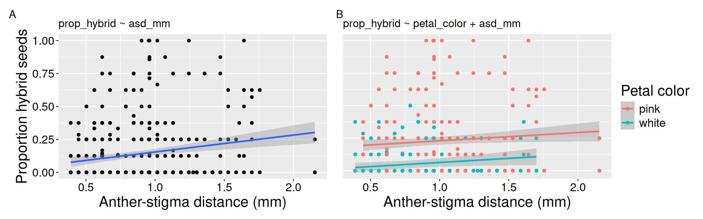
You can see that our model has just one slope, but a simple geom_smooth will show two slopes (see below for an example). Petal color shifts the expected proportion of hybrid seeds up or down, but the ASD slope is shared by both petal colors. So the fitted lines should be parallel.
We also see that including petal color roughly halves the slope, as we also noted in interpreting the coefficients in the previous subsection. The unadjusted ASD slope is about 0.128, but after adding petal color it is about 0.063. So the plot should help us see why the coefficient changed, not just decorate the result. In Figure 1, panel A shows the simple relationship between ASD and hybrid seed proportion. Panel B adjusts for petal color and shows the additive model we are actually fitting.
To minimize distraction, I hid the code for the complete plot (Click “Code” to unhide). The code for Figure 1 B looks like this:
library(honestlm)ggplot(rils, aes(x = asd_mm, y = prop_hybrid, color = petal_color)) +geom_point() +geom_lm_smooth()
Figure 1: Adding petal color changes how we visualize the relationship between ASD and hybrid seed proportion. (A) The simple model shows proportion hybrid seeds as a function of ASD alone. (B) The additive model includes both ASD and petal color; petal color shifts expected hybrid seed proportion, while ASD has one shared slope.
Comparing separate slopes geom_smooth(method = "lm") to a shared slope geom_lm_smooth()
In the next chapter I introduce the idea of statistical interactions. In models with interactions, we ask if e.g. the association between petal area and proportion of hybrid seed differs for white- and pink- petaled RILS (i.e. is the slope difference for white and pink).
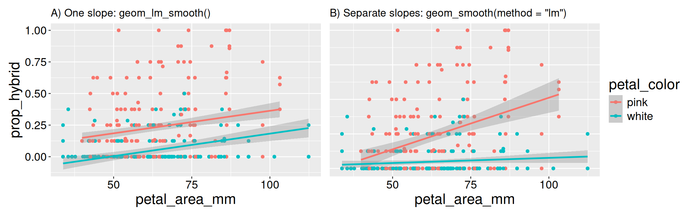
The difference between geom_smooth(method = "lm") and geom_lm_smooth() is easier to see if we switch from ASD to petal area. Here the separate fitted slopes by petal color differ more visually. That might be interesting! But it is not the model we are fitting yet. In this chapter, we build models in which explanatory variables contribute additively to the response. That is, we ask what is the relationship between petal area and hybrid seed proportion after accounting for petal color, without allowing that relationship to differ by petal color?
term
coefficient
(Intercept)
0.0070
petal_colorwhite
-0.1807
petal_area_mm
0.0036
The coefficients from the simple additive model (see margin) describe the contribution of each explanatory variable to the expected response without its effect depending on the value of another explanatory variable. As described in the previous section, we make predictions by simply adding up the contribution of each trait to proportion hybrid seed.
This simple additive model is reflected in Figure 2 A. By contrast Figure 2 B shows a model with different slopes for pink- and white-flowered RILs. Both models represented by the panels in Figure 2 are reasonable. The goal here is to make sure our plots match the model so as not to mislead the reader.
Code
geom_lm_smooth_plot <- rils |>ggplot(aes(x = petal_area_mm, y = prop_hybrid, color = petal_color))+geom_point()+geom_lm_smooth()+ggtitle("A) One slope: geom_lm_smooth()")geom_smooth_plot <- rils |>ggplot(aes(x = petal_area_mm, y = prop_hybrid, color = petal_color))+geom_point()+geom_smooth(method ="lm")+ggtitle("B) Separate slopes: geom_smooth(method = \"lm\")")(geom_lm_smooth_plot + geom_smooth_plot ) +plot_layout(guides ="collect", axes ="collect_y", axis_titles ="collect_y")
Figure 2: Two ways to visualize the relationship between petal area, petal color, and the proportion of hybrid seeds. (A)geom_lm_smooth() draws the additive no-interaction model, with one shared petal-area slope and different intercepts for petal color. (B)geom_smooth(method = "lm") fits separate lines for each petal color, visually suggesting an interaction.
The next chapter introduces statistical interactions - in which the contribution of one variable depends on the value of another (e.g. different slopes like Figure 2 B). Interactions are super interesting, both biologically and statistically, but a bit complicated to understand. So we will hold off for now.
Two categorical explanatory variables
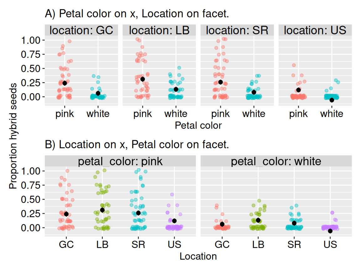
With two categorical explanatory variables, the major choice we must make is: which variable goes on the x-axis and which variable defines the facets. These two plots show the same data, but arrange the predictors differently. As you compare panels A and B in Figure 3, think about what each plot reveals, highlights, and hides. Does one arrangement better highlight differences among locations, differences between petal colors, or both? Which plot most effectively communicates the key result of this study?
lm(formula = prop_hybrid ~ petal_color + location, data = rils)
This model compares petal colors after accounting for location, and compares locations after accounting for petal color. Again, because our model does not include an interaction, we are not asking whether the difference between pink and white flowers changes from one location to another. We will address this question of interactions in the next chapter.
library(honestlm)rils |>ggplot(aes(x = petal_color, y = prop_hybrid, color = petal_color)) +geom_jitter() +facet_wrap(~location, nrow =1) +stat_lm_means(color ="black")
Code
A <- rils |>ggplot(aes(x = petal_color, y = prop_hybrid, color = petal_color)) +geom_jitter(height = .025, width = .2, show.legend =FALSE, alpha = .4) +facet_wrap(~location, nrow =1, labeller ="label_both") +stat_lm_means(interaction =FALSE, color ="black", size = .3) +labs(x ="Petal color", y ="Proportion hybrid seeds", title ="A) Petal color on x, Location on facet.")B <- rils |>ggplot(aes(x = location, y = prop_hybrid, color = location)) +geom_jitter(height = .025, width = .2, show.legend =FALSE, alpha = .4) +facet_wrap(~petal_color, nrow =1, labeller ="label_both") +stat_lm_means(interaction =FALSE, color ="black", size = .3) +labs(x ="Location", y ="Proportion hybrid seeds", title ="B) Location on x, Petal color on facet.")A / B +plot_layout(axes ="collect_y", axis_titles ="collect_y") &theme(axis.title =element_text(size =12),axis.text =element_text(size =12))
Figure 3: Two ways to see the proportion of hybrid seed as a function of petal color and location. (A) Proportion hybrid seeds by petal color, shown separately for each location. Points show individual RILs; black points and intervals show additive model-predicted means and confidence intervals. (B) Proportion hybrid seeds by location, shown separately for each petal color. Points show individual RILs; black points and intervals show the same kind of additive model-predicted means.
The panels in Figure 3 provide two ways to view the data.
After reflecting on these plots, complete this Google questionnaire below, or via Google Forms.
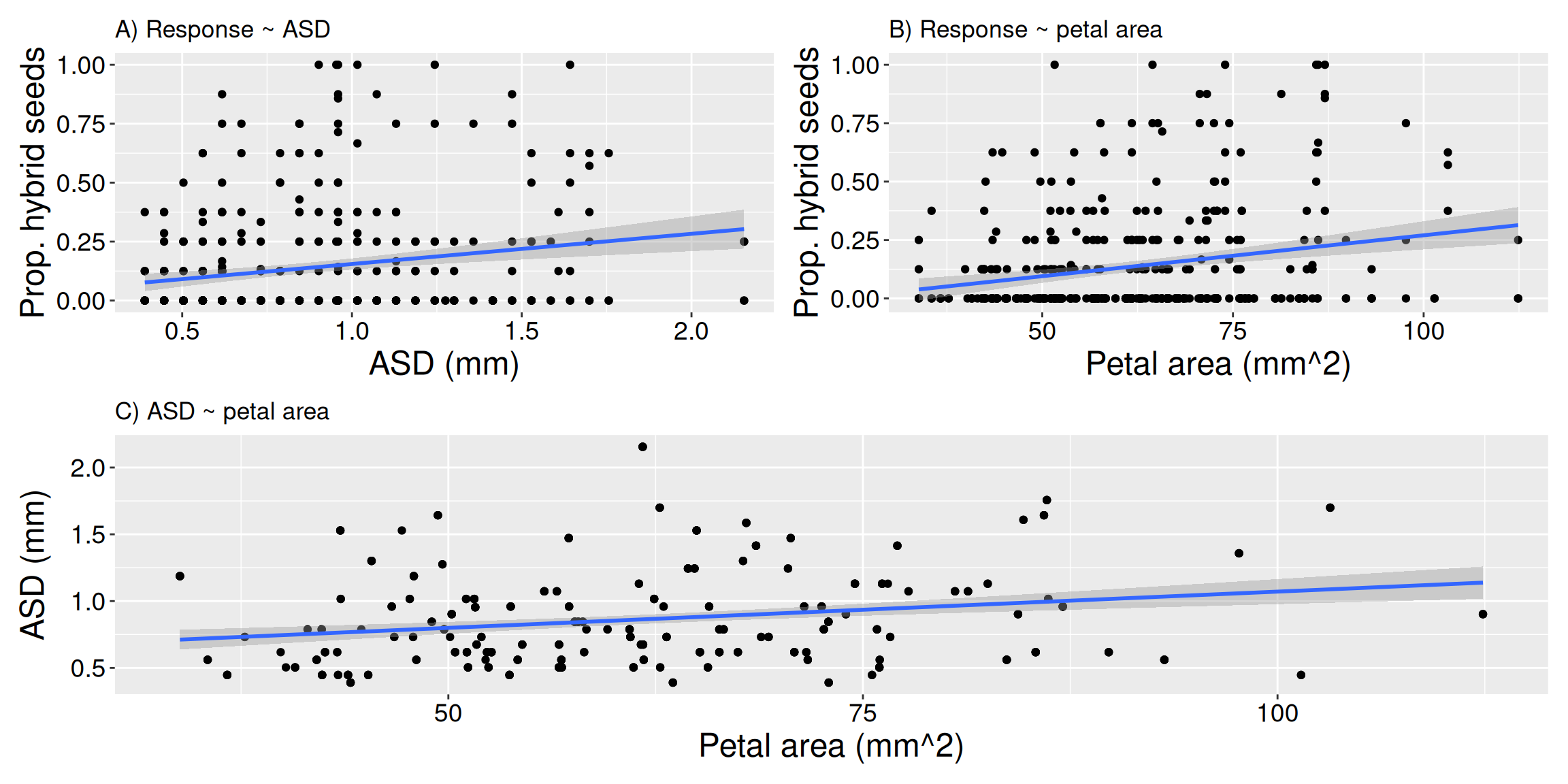
Figure 4: Pairwise views of a model with two continuous predictors. (A) Proportion hybrid seeds as a function of ASD. (B) Proportion hybrid seeds as a function of petal area. (C) The relationship between the two explanatory variables, ASD and petal area. Together, these plots show pieces of the multivariable problem, but no one panel shows the full additive model.
Visualizing a continuous response as a function of two continuous explanatory variables is difficult. With a simple scatterplot, our eyes are pretty good at reading horizontal and vertical position: we can see how a response variable changes along an explanatory variable. But our eyes and brain have more trouble picking out patterns with 3D plots, or by trying to present a quantitative variable mapped onto color or point size.
For example, suppose we want to ask whether the proportion of hybrid seeds is associated with both ASD and petal area:
lm(formula = prop_hybrid ~ asd_mm + petal_area_mm, data = rils)
term
coefficient
(Intercept)
-0.133
asd_mm
0.100
petal_area_mm
0.003
Now both explanatory variables are quantitative. There is no obvious grouping variable to put in color or facets. We can still make useful plots, but we should be honest that no single flat figure will show the whole model perfectly.
So, here are my usual strategies for dealing with these data:
I begin by plotting all three pairwise combinations of the variables as simple scatterplots: y against x1, y against x2, and x1 against x2. This helps me see the relationship between each explanatory variable and the response, and also tells me whether the two explanatory variables are strongly related to each other (Figure 4). While this can be helpful - and is often sufficient - these fitted lines show the unadjusted pairwise associations, not the coefficients from the two-predictor model.
Next, I often give in to temptation and map one of the continuous explanatory variables to color, size, or transparency. For example, I might plot y against x1, while using color to show x2. This sometimes helps, especially when the pattern is strong, but fails roughly nine times out of ten. Or I decide to try to make a 3D plot, or a fitted response surface only to realize they rarely work well.
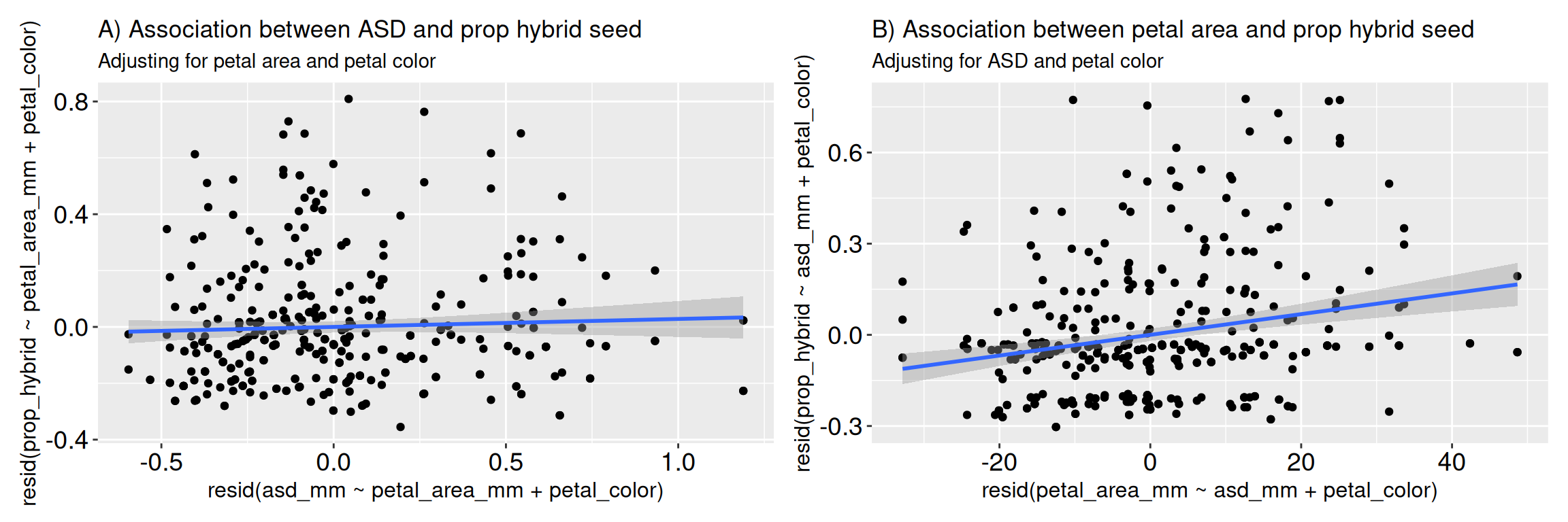
To get a better sense of the adjusted association of a focal explanatory variable of interest, I sometimes generate an added variable plot. Here the X-axis displays the residual value of the focal explanatory variable after accounting for the other explanatory variables, and the Y-axis displays the residual value of the response variable after accounting for those same other explanatory variables.
The code below uses the av_transform() and av_labs() functions in my honestlm package to generate an added variable plot. This goes a step further than above as it adjusts for both petal area and petal color. So, instead of asking “is ASD associated with hybrid seed production?”, this plot asks “among RILs with similar petal area and petal color, do RILs with unusually large ASD also have unusually high or low hybrid seed production?”
The slope in this plot is the same as the coefficient for the focal explanatory variable in the full linear model. So Figure 5 A shows almost no linear association between ASD and proportion hybrid seed after adjusting for petal area and petal color, while Figure 5 B shows a strong linear association between petal area and proportion hybrid seed after adjusting for ASD and petal color.
Code
library(honestlm)av_data <-av_transform(rils,y = prop_hybrid,x = asd_mm, adjust =c(petal_area_mm, petal_color)) a <-ggplot(av_data,aes(x = .adjusted_asd_mm, y = .adjusted_prop_hybrid))+geom_point() +geom_smooth(method ="lm")+av_labs(av_data)+theme(axis.title =element_text(size =12))+labs(title ="A) Association between ASD and prop hybrid seed", subtitle ="Adjusting for petal area and petal color")av_data <-av_transform(rils,y = prop_hybrid,x = petal_area_mm, adjust =c(asd_mm, petal_color)) b <-ggplot(av_data,aes(x = .adjusted_petal_area_mm, y = .adjusted_prop_hybrid))+geom_point() +geom_smooth(method ="lm")+av_labs(av_data)+labs(title ="B) Association between petal area and prop hybrid seed", subtitle ="Adjusting for ASD and petal color")+theme(axis.title =element_text(size =12))a + b
Figure 5: Added variable plots showing the adjusted associations between floral traits and the proportion of hybrid seeds produced by Clarkia RILs. In each panel, the X-axis shows the part of the focal explanatory variable left over after accounting for the other explanatory variables, and the Y-axis shows the part of hybrid seed production left over after accounting for those same other variables. The fitted line visualizes the coefficient for the focal explanatory variable in the corresponding additive linear model.
TL;DR: This is hard, and you can rarely do better than simple scatterplots two variables at a time.
One quick warning before moving on
While you have tremendous leeway in how to present data with multiple predictors, map quantitative values onto the x- or y-axis whenever possible. Color, size, opacity, and shape can be useful for grouping or highlighting, but they rarely communicate quantitative values as clearly as position.