lm(n.species ~ Biomass + taxon, bmass)
Call:
lm(formula = n.species ~ Biomass + taxon, data = bmass)
Coefficients:
(Intercept) Biomass taxonplant
11.41031 0.01751 -6.64545 Motivating scenario: A straight-line model assumes that each additional unit of \(x\) has the same expected effect on \(y\). But linear models need not be limited to straight lines. E.g. with interactions, the effect of increasing \(x_1\) can depend on the value of \(x_2\). In polynomial regression, we allow the effect of \(x\) on \(y\) to depend on the value of \(x\) itself. This allows us to describe curved relationships. Although this approach can add biological realism, it can also complicate interpretation and increase the risk of overfitting.
Learning goals: By the end of this section, you should be able to:
We have seen that linear models can include more than one term, and even “interactions” between these terms. So, the “linear” part of a linear model is not that it makes a clean, straight line, but rather, that we find \(\hat{Y_i}\) by adding up all the components of the linear model equation.
Here, I introduce polynomial regression, another classic tool we can use to better capture biological reality by adding curvature to our linear model. The most common polynomial regression includes an explanatory variable and its square (below). You can include cubic, quartic, or still higher-order terms. But, as always, think about what you’re putting in your model and why.
\[ \widehat{Y}_i = a + b_1X_i + b_2X_i^2. \tag{1}\]
Adding a squared (or higher-order) term can make a better model. But each additional term complicates interpretation, and, most importantly, can overfit the data. Let your biological intuition and statistical reasoning guide you.
As a quick break from the Clarkia data, let’s consider data describing the relationship between pond productivity and the number of species found in each pond. Productivity may affect diversity through two opposing forces. At low productivity, increasing productivity may provide enough additional resources for more species to persist. At high productivity, however, competition may intensify, allowing a few species to dominate and reducing species richness.
To investigate these questions, Chase & Leibold (2002) collected data on the number of plant and animal species and the productivity of 30 ponds. Looking at the data, a straight line does not seem to describe this relationship very well (Figure 1).
link <- "https://raw.githubusercontent.com/yanivjb/biostats-book-data/refs/heads/main/speciesXproductivity"
bmass <- read_csv(link)
bmass |>
    ggplot(aes(x = Biomass, y = n.species, color = taxon)) +
    geom_point(size = 4) +
    labs(x = expression("Productivity (g " * cm^{-2} * "/15 days)"),
         y = "Number of species") +
    geom_lm_smooth(method = "lm", linewidth = 1) +
    labs(title = "Linear term")+
    facet_wrap(~taxon, ncol = 1, scales = "free_y")+
    theme(axis.text = element_text(size = 30),
          axis.title = element_text(size = 30),
          title = element_text(size = 30),
          legend.position = "none",
          strip.text = element_text(size = 40))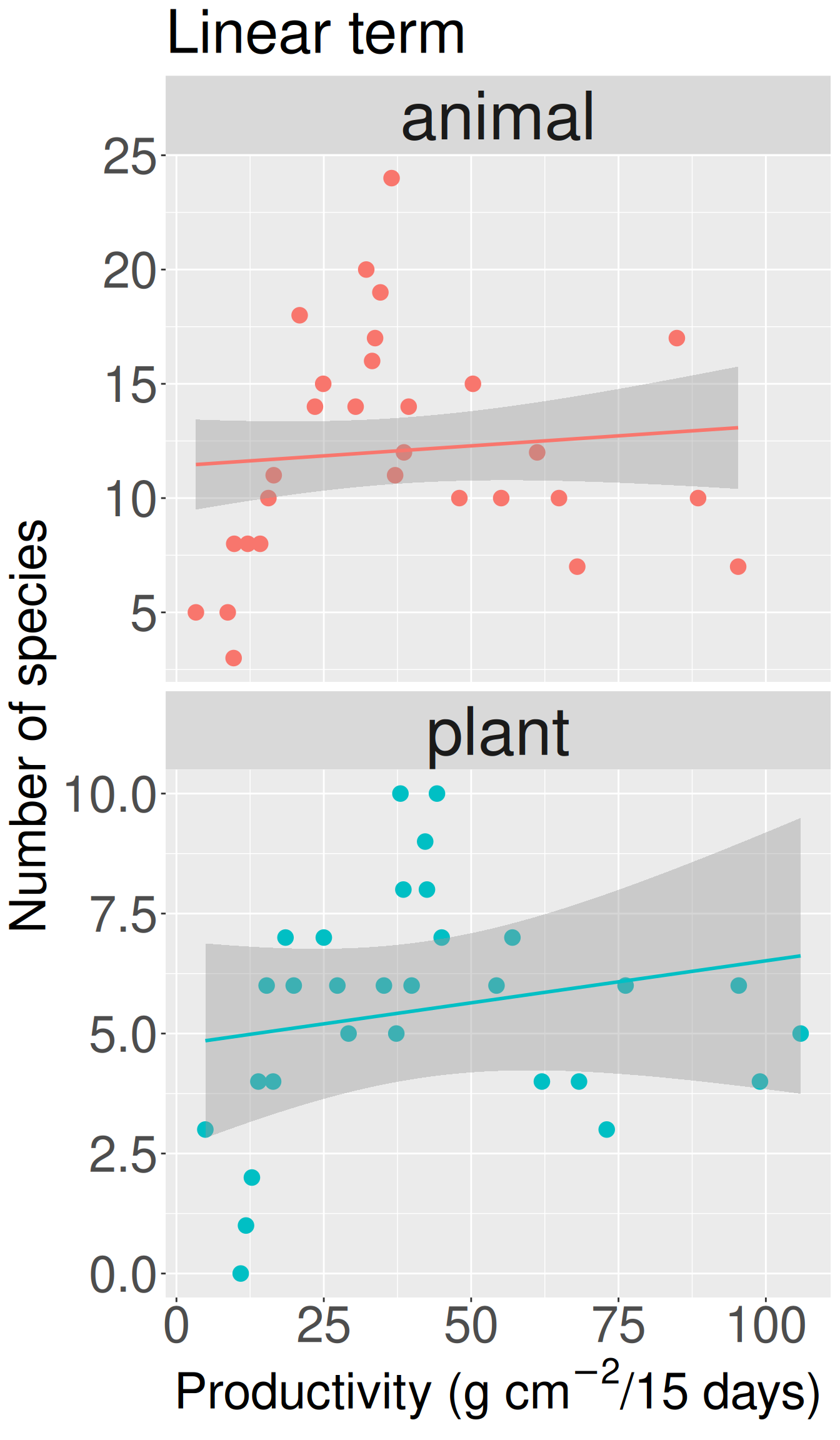
lm(n.species ~ Biomass + taxon, bmass)
Call:
lm(formula = n.species ~ Biomass + taxon, data = bmass)

Coefficients:
(Intercept)      Biomass   taxonplant
11.41031 0.01751 -6.64545 library(car)
lm(n.species ~ Biomass + taxon, bmass) |> Anova()| term | sumsq | df | F value | Pr(>F) |
|---|---|---|---|---|
| Biomass | 12.04 | 1 | 0.80 | 0.374 |
| taxon | 646.57 | 1 | 43.14 | 1.79 × 10-08 |
| Residuals | 839.32 | 56 | NA |
Note. A formal statistical model fails to reject the null of no straight line between the number of species and productivity, adjusting for taxon (plant/animal, above). But even if we did reject the null, the model would still be bad because it’s a poor fit to the data (Figure 1).
While Figure 1 did not show a linear relationship, there does appear to be a hump shaped relationship. If true, this would imply two countervailing factors:
The linear model looks like this:
\[\text{N.SPECIES = CONSTANT + TAXON + PRODUCTIVITY + PRODUCTIVITY}^2\] We can write this in R as:
lm(n.species ~ taxon + Biomass + I(Biomass^2), bmass)
Call:
lm(formula = n.species ~ taxon + Biomass + I(Biomass^2), data = bmass)

Coefficients:
 (Intercept)    taxonplant       Biomass  I(Biomass^2)
    6.786893     -6.549411      0.280441     -0.002613
We wrap Biomass^2 in I() to tell R to treat the expression inside the parentheses as ordinary arithmetic.
R also provides the poly() function for fitting polynomial regressions. I prefer Biomass + I(Biomass^2) here because it makes the terms in our model explicit and easier to connect to the model equation.
The model above has:
The intercept is the predicted number of animal species at a productivity of zero. As usual, we should be cautious about interpreting an intercept that lies outside the range of our data.
The Biomass and I(Biomass^2) coefficients work together to describe the curved relationship. The coefficient for Biomass does not mean that species richness always increases with productivity. Likewise, the negative coefficient for I(Biomass^2) does not describe a separate biological effect of “squared productivity.” Together, the two terms produce a curve that rises and then falls.
For animals, the indicator variable for plants equals zero, so we predict:
\[ \begin{aligned} \widehat{\text{n.species}}_{\text{animal},\,\text{Biomass}=50} &= 6.787 + 0.2804 \times 50 -0.002613 \times (50^2) \\ &\approx 14.28. \end{aligned} \]
For plants, we also add the coefficient for taxonplant:
\[ \begin{aligned} \widehat{\text{n.species}}_{\text{plant},\,\text{Biomass}=50} &= 6.787 -6.549 + 0.2804 \times 50 -0.002613\times (50^2) \\ &\approx 7.73. \end{aligned} \]
We can add a quadratic fit to our ggplot by specifying formula = y ~ x + I(x^2) in geom_lm_smooth() in my honestlm package (Figure 2). Of course, you could do the same in geom_smooth(), but that will fit different curves for the different categories.
bmass |>
  ggplot(aes(x = Biomass, y = n.species, color = taxon)) +
  labs(x = expression("Productivity (g " * cm^{-2} * "/15 days)"),
       y = "Number of species",
       title = "Linear + squared term") +
  geom_point()+
  geom_lm_smooth(formula = y ~ x + I(x^2), linewidth = 1) +
  facet_wrap(~taxon, scales = "free_y")+
  theme(legend.position = "none")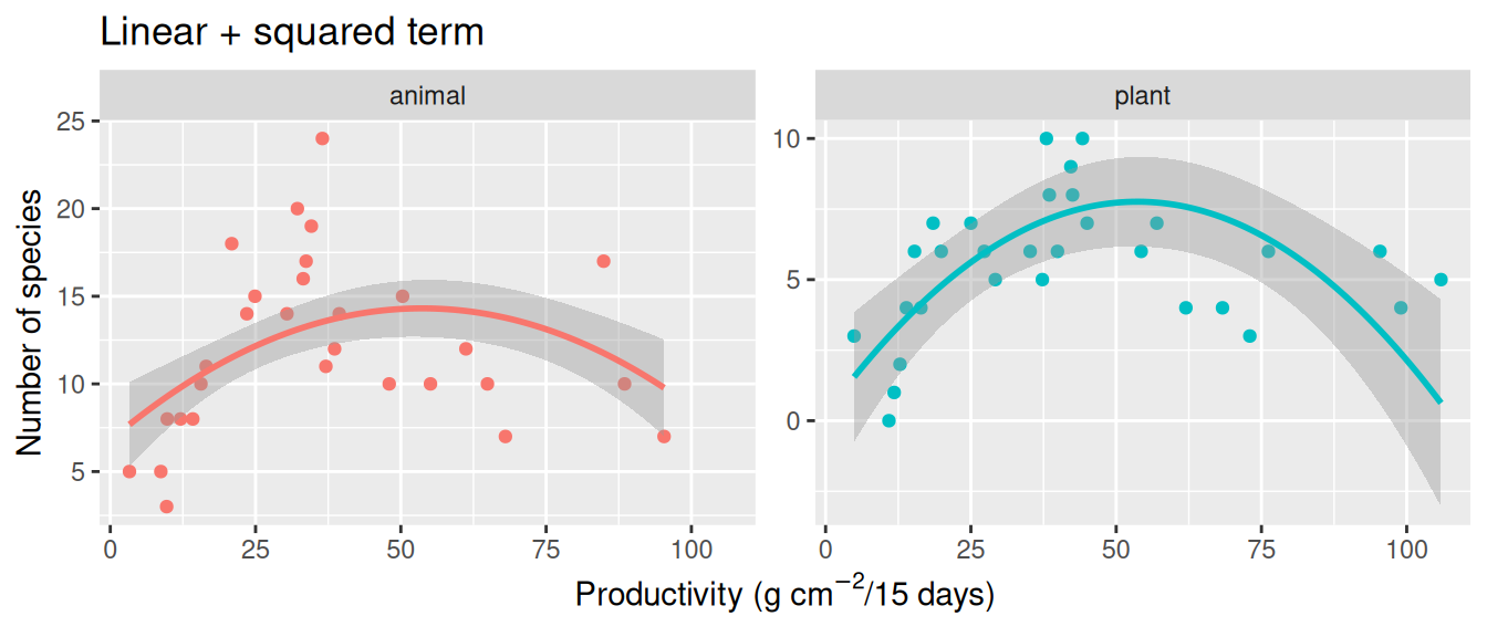
geom_smooth()
You can fit separate polynomial models with geom_smooth(method = "lm", formula = y ~ x + I(x^2)) or with geom_lm_smooth(method = "lm", formula = y ~ x + I(x^2), interaction = FALSE). Here, I show what happens with geom_smooth().
If you look closely at Figure 3, you can see different curve shapes for plants and animals, while these shapes are identical in Figure 2.
bmass |>
    ggplot(aes(x = Biomass, y = n.species, color = taxon)) +
    geom_point(size = 4) +
    labs(x = expression("Productivity (g " * cm^{-2} * "/15 days)"),
         y = "Number of species") +
    geom_smooth(method = "lm", formula = y ~ x + I(x^2)) +
    labs(title = "Linear + squared term")+
    facet_wrap(~taxon, ncol = 2, scales = "free_y")+
    theme(legend.position = "none")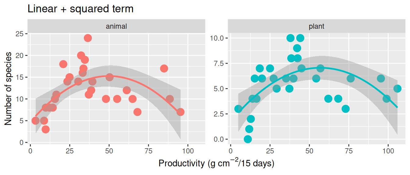
geom_smooth(). Because the data are grouped by taxon, each taxon receives its own intercept, linear term, and quadratic term; these curves therefore represent a different model from the additive quadratic model in Figure 2.
We evaluate significance with Type II sums of squares, adjusting for the others (including the squared term) when evaluating the significance of a focal term.
lm(n.species ~ taxon + Biomass + I(Biomass^2), bmass) |> Anova() |> tidy()|> rename("F value" = statistic , "Pr(>F)" = p.value) |> mutate(`Pr(>F)` = format_scientific(`Pr(>F)`)) |> mutate(`F value` = round(`F value`, digits = 2))|> mutate(sumsq = round(sumsq, digits = 2))|>kable(escape = FALSE)| term | sumsq | df | F value | Pr(>F) |
|---|---|---|---|---|
| taxon | 627.64 | 1 | 55.92 | 6.21 × 10⁻¹⁰ |
| Biomass | 233.52 | 1 | 20.81 | 2.88 × 10-05 |
| I(Biomass^2) | 222.06 | 1 | 19.79 | 4.26 × 10-05 |
| Residuals | 617.26 | 55 | NA |
A small p-value for I(Biomass^2) provides evidence that the relationship is curved rather than adequately described by a straight line.
QUESTION: What’s the deal with the low p-value for Biomass? Our sums of squares for Biomass in the “straight line” model were approximately twelve, and our F value was less than one. Why does adding the squared term make our linear term significant (SS = 233, \(F_\text{1,55} = 20.8\)) and what does this mean?
ANSWER: The linear and squared terms work together to describe the curve. So, this means that having a linear term (representing the “instantaneous slope” at zero productivity) improves the model, not that there is a linear increase. For this reason, I sometimes prefer to evaluate the significance of both linear and squared terms at once with the poly() function. Here, the 2 means we want the linear and 2nd order (i.e. squared) term, and the raw = TRUE means that it will give us coefficients in the scale of our linear model (if we ask for them).
lm(n.species ~ taxon + poly(Biomass ,2, raw = TRUE), bmass) |> Anova()Anova Table (Type II tests)
Response: n.species
Sum Sq Df F value Pr(>F)
taxon 627.64 1 55.925 6.209e-10 ***
poly(Biomass, 2, raw = TRUE) 234.10 2 10.430 0.0001445 ***
Residuals 617.26 55
---
Signif. codes: 0 '***' 0.001 '**' 0.01 '*' 0.05 '.' 0.1 ' ' 1A polynomial curve can behave wildly outside the range of the observed data. As always, be cautious about extrapolation. Also, do not add higher-order terms simply because R lets you—each new term makes the curve more flexible and easier to overfit.