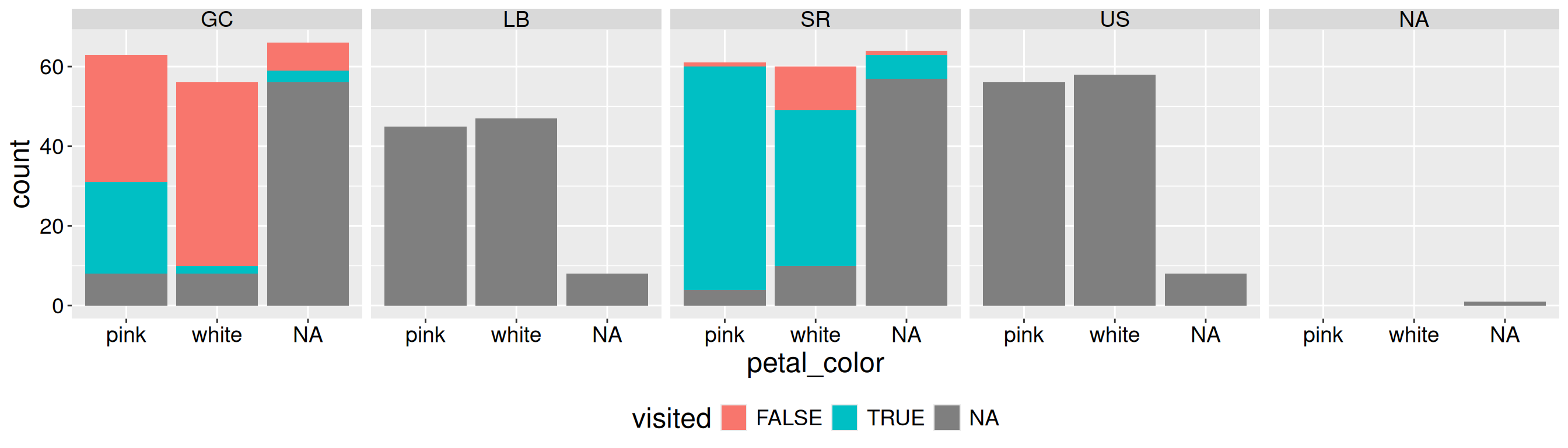
Figure 1 is not good. Most of the space is wasted on NA values. Not only is this wasteful and distracting, but it makes it difficult to spot any true pattern. The solution is clear - we should remove cases in which we did not record pollinator visits (i.e. when visits are NA). Below I show how to use dplyr’s filter function to achieve this!
ril_data |>ggplot(aes(x = petal_color, fill = visited))+geom_bar()+facet_wrap(~location, nrow =1)+theme(legend.position ="bottom")
Figure 1: Counts of pink and white Clarkia RILs by location, including cases with missing pollinator visit data.
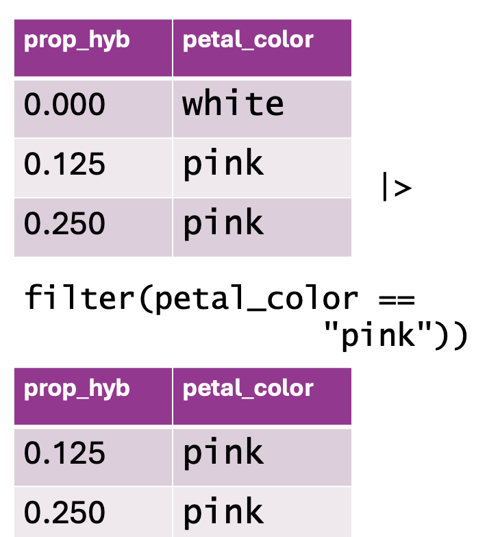
Remove rows with filter()
Figure 2: Using filter() to subset data based on a condition. The top table contains two columns: prop_hyb (proportion of hybrids) and petal_color (flower color), with values including both “white” and “pink” flowers. The function filter(petal_color == "pink") is applied to retain only rows where petal_color is “pink.” The resulting dataset, shown in the bottom table, excludes the “white” flower row and keeps only the observations where petal color is “pink.”
Removing NA data is a common reason to remove certain rows, but it is not the only one. You may want to:
Remove very large values that you know to be mistaken entries.
Focus on observations from (or not from) a certain treatment, or some other subset of the data.
And so on.
Use the syntax below to use dplyr’s filter function to subset your data:
TIBBLE_NAME |> dplyr::filter(LOGICAL CONDITION FOR ROWS TO KEEP)
So to remove NA values you want the data that are not NA. Recall that ! means not, and is.na() asks the logical question – “is this NA?” So, to remove rows with NA values for a focal column:
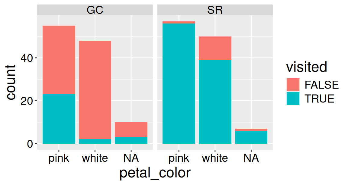
Now that we have removed the missing data, Figure 3 clearly reveals that a higher proportion of Clarkia RILs planted at SR receive a pollinator visit than those planted at GC. Figure 3 also clearly shows that at both locations a larger share of pink plants appear to receive visits as compared to white plants. Note that because we filtered on visits and not petal_color, the NA category still appears on the x-axis.
ril_data_no_missing_visits |>ggplot(aes(x = petal_color, fill = visited))+geom_bar()+facet_wrap(~location, nrow =1)
Figure 3: Counts of pink and white Clarkia RILs by location after removing rows with missing pollinator visit data.
Pay attention to two choices I made above.
Above, I used the dplyr::filter() syntax. I did this because the stats package that loads automatically with R contains a different function called filter(). Without explicit direction, R might use the wrong filter function and give us weird errors. I therefore always specify which function I want by typing dplyr::filter() or by using conflict_prefer() from the conflicted package:
I did not overwrite ril_data. When I add, rename, or change columns with mutate(), I usually overwrite the original object to avoid cluttering my workspace with multiple slightly different versions of the same tibble. However, when filtering, I often assign the result to a new object because I don’t want to lose observations that were removed by the filter.