Figure 1: Generalist bees visiting another Clarkia species. From The sunmonsters Instagram. See their post here.
Motivating Scenario:
You are continuing your exploration of a fresh new dataset. You have figured out the shape, made the transformations you thought appropriate, and now want to summarize associations between a categorical and a numeric variable.
Learning Goals: By the end of this subchapter, you should be able to:
Calculate and explain conditional means: You should be able to do this with basic math and with R code.
Calculate and explain Cohen’s D as a measure of effect size. In addition to being able to calculate Cohen’s D, you should be able to distinguish between “large” and small “effect sizes”.
Visualize differences between means: with pen and pencil as well as ggplot.
Be sure to show all the data!
We might expect that parviflora plants known to have attracted a pollinator would produce more hybrid seeds than those that were not. After all, pollen must be transferred for hybridization to occur, and visits from pollinators are the main way this happens. That seems biologically reasonable. Of course, in statistics, such expectations must be tested with actual data.
In this section, we explore how to visualize and quantify associations between a categorical explanatory variable (e.g., whether a plant was visited by a pollinator) and a numeric response variable (e.g., the proportion of that plant’s seeds that are hybrids). We’ll see how group means and other summaries can reveal patterns in the data — and how to interpret what those patterns might mean biologically.
Summarizing associations:
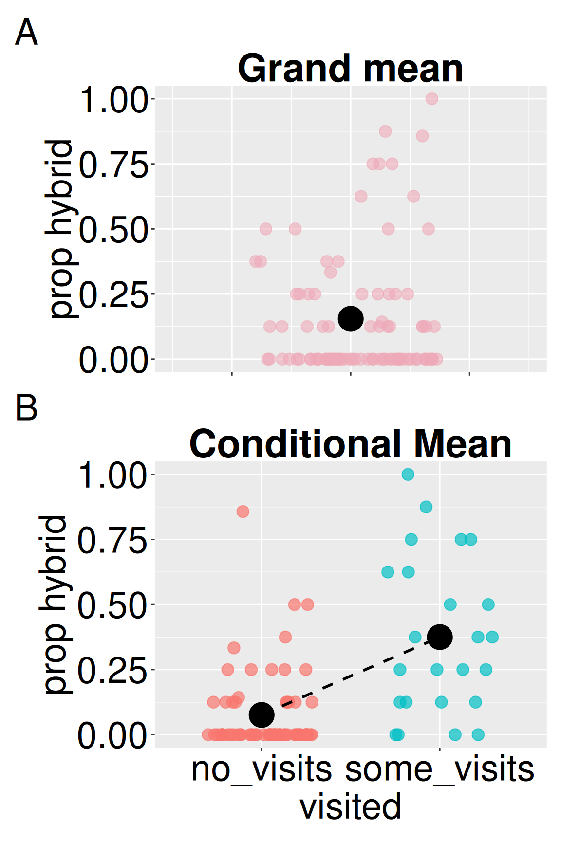
Say we want to know the average proportion of hybrid seeds from RIL plants grown at site GC. We could simply average across all plants:
Figure 2: (A) Distribution of hybrid seed proportions across all GC plants. The black point shows the grand mean, representing the expected proportion for a randomly chosen plant. (B) Hybrid seed proportions by pollinator visitation status. Points show individual plants; black points show group means. The dashed line highlights the difference between conditional means.
Difference in conditional means
The value above is the grand mean – it describes a RIL plant taken at random from GC. But plants differ from one another. If we knew something about the plant (e.g., the color of its flowers, if we observed a pollinator visit etc.) we could provide a more refined estimate. The mean value of a response variable for some value of an explanatory variable is called a “conditional mean.”
dplyr’s group_by() function makes it quite easy to calculate conditional means - take your data, group by the variable of interest and summarize it! For example, the proportion of hybrid seeds at GC, conditional on observing a pollinator visit, is:
Common summaries of the association between a categorical explanatory variable and a numerical response are the difference in conditional means and the ratio of conditional means across groups. In this case, plants that we saw visited by a pollinator had 0.29 more hybrid seeds than plants we did not observe pollinators visiting. This is nearly a five-fold difference!
pivot_wider() in the tidyr package makes data “wide”. You don’t need to know how to do this… you could just take the output and type:
# Difference in conditional means 0.361-0.074
[1] 0.287
# Ratio of conditional means 0.361/0.074
[1] 4.878378
But, as your R skills improve, it is best to avoid “hard coding” things. That is, deal with R objects rather than specific values
no_visits
some_visits
difference
ratio
0.076
0.375
0.299
4.943
Summarizing associations: Cohen’s D
Above, we found that on average, visited plants produced 0.287 more hybrids than not visited ones. That might seem like a big difference, but raw differences can be hard to interpret on their own. Is 0.287 a lot? A little? To better understand how meaningful that difference is, we can compare it to the variability in hybrid seed production.
Cohen’s D helps us do just that. Cohen’s D standardizes the difference in means by the variability within groups (the pooled standard deviation), allowing for more intuitive comparisons across studies and systems. For this dataset, that gives us a D of 1.4 (see calculation below) — a very large effect size (see guide in margin). This suggests that being visited (during our observation window) is strongly associated with producing more hybrid seeds.
\[\text{Cohen's D} = \frac{\text{Difference in means}}{\text{pooled sd}}\]
Cohen’s D the difference in group means divided by the “pooled standard deviation” allows us to better interpret such difference.
Pooled standard deviation a weighted average of the within-group standard deviations, where groups with more observations contribute more.
pooled sd \(= \sqrt{\frac{s^2_1\times(n_1-1) + s^2_2\times(n_2-1)}{n-2}}\) Where: * \(s^2_i\) is the variance in the \(i^{th}\) group. * \(n_i\) is the size of each group, and *n is the total sample size, \(n_1+n_2\).
Don’t be confused by “effect size.” Cohen’s D is called an “effect size” but it is just a measure of an association. A large effect size tells us the groups are very different, but it does not tell us why.
We can find the pooled sd and Cohen’s D in R as follows:
Interpreting Cohen’s D: There aren’t hard and fast rules for interpreting Cohen’s D — this varies by field — but the rough guidelines are presented below. Our observed Cohen’s D of 1.4 is very large.
Size
Range of Cohen’s D
Not worth reporting
< 0.01
Tiny
0.01 – 0.20
Small
0.20 – 0.50
Medium
0.50 – 0.80
Large
0.80 – 1.20
Very large
1.20 – 2.00
Huge
> 2.00
Cohen’s D with the effectsize package.
The calculations above are somewhat tedious. The cohens_d() function in the effectsize package calculates Cohen’s D. After installing the package (install.packages("effectsize")) type:
library(effectsize)cohens_d(prop_hybrid ~ visited, data = gc_rils)
Cohens_d
CI
CI_low
CI_high
-1.473
0.95
-1.984
-0.956
This shows both Cohen’s D and a 95% confidence interval about this estimate. We will discuss confidence intervals in Chapter XXX.
Visualizing a categorical x and numeric y
Visualizing the difference between means is surprisingly difficult. One particular concern is overplotting — because categorical variables have only a few possible values on the x-axis, data points can stack or overlap, which can obscure patterns in the data. Below I show some ways to best visualize such data. As in the previous section, our focus is on the clarity and honesty of presentation. We will make the plots prettier later.
Visualizing two distributions
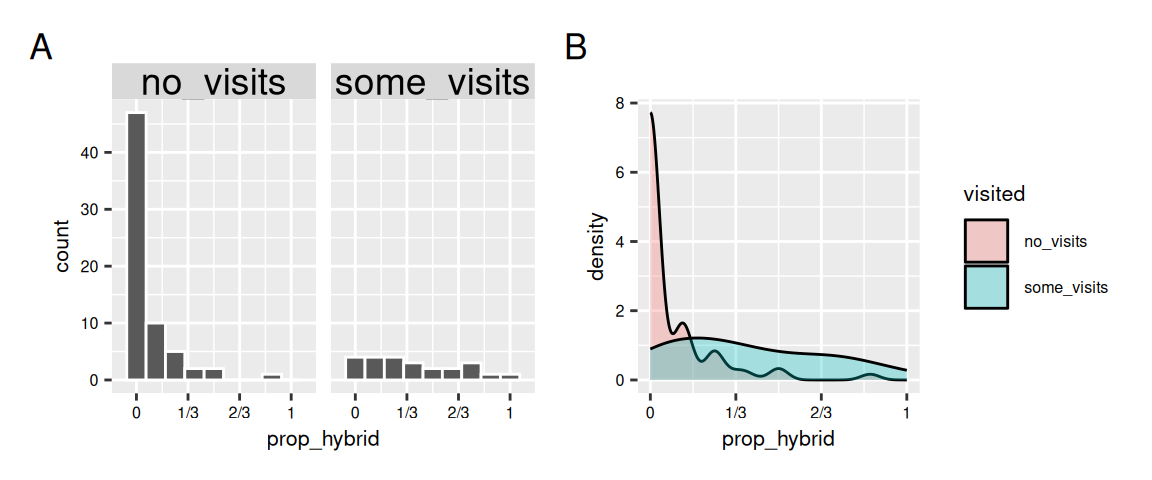
We can visualize differences in a numeric variable by values of a categorical variable by comparing distributions with e.g. histograms or density plots (Figure 1).
Figure 3: Comparing hybrid seed proportions between plants that received no pollinator visits and those that received some visits. (A) With two histograms, and (B) With a density plot.
Visualizing two sets of points
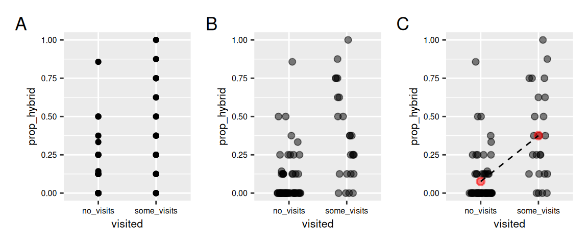
Sometimes showing the distribution may not reveal patterns. I often like to show the data and highlight trends as in Figure 4. Note that, geom_point() can sometimes hide the data. geom_jitter() shows the data by spreading it out, but it’s important to ensure that y-values do not change and that the two categories can be distinguished on the x-axis (height = 0, width = .2). Finally, it helps to add guides to show and compare means.
#plot a) ggplot(gc_rils, aes(x = visited, y = prop_hybrid))+geom_point()#plot b) Jitteringggplot(gc_rils, aes(x = visited, y = prop_hybrid))+geom_jitter(height =0, width = .2, alpha = .5, size =2)#plot b) Bells and whistlesggplot(gc_rils, aes(x = visited, y = prop_hybrid))+geom_jitter(height =0, width = .2, alpha = .5, size =2)+stat_summary(fun ="mean",color ="red", ,alpha = .5)+stat_summary(aes(group =1), fun="mean", geom ="line", linetype =2)
Figure 4: Visualizing hybrid seed proportion by pollinator visitation. (A) Raw points without jitter show heavy overlap and obscure the distribution. (B) Jittering reveals individual observations more clearly. (C) Jittered points with group means (red points) and a dashed line connecting means highlight the difference in conditional means.
Slide Show
Below I work through a brief slide show working you through the steps in the code above.