Motivating scenario: We can build models with more than one explanatory variable while assuming that each variable independently influences the response. But now we are interested in whether the influence of one variable changes depending on the value of another.
Learning goals: By the end of this section, you should be able to:
Explain what a statistical interaction is.
Fit linear models containing interactions using : and *.
Use coefficients from interaction models to calculate predicted values.
Explain why main-effect coefficients are conditional when an interaction is present.
Visualize interaction models and use the observed range of the data to interpret fitted patterns.
Review: Linear models without interactions
We aim to understand how numerous floral traits influence the proportion of hybrid seeds on a parviflora RIL. In the previous chapter, we increased the sophistication of our analysis by modelling the proportion of hybrid seed as a function of two or more explanatory variables. In those analyses, we assumed that the contributions of explanatory variables to our response were independent.
lm(prop_hybrid ~ petal_color + petal_area_mm, data = rils)
name
value
(Intercept)
0.0070
petal_colorwhite
-0.1807
petal_area_mm
0.0036
So, for example, to find the predicted proportion of hybrid seeds for a pink-flowered RIL with a petal area of \(100\ \text{mm}^2\):
We start with the intercept (0.0070).
We add one hundred times the coefficient for petal area (\(100 \times 0.0036\)) equals 0.367.
We do not include a petal color coefficient because pink was the reference level.
To find the predicted proportion of hybrid seeds for a white-flowered RIL with a petal area of \(100mm^2\),
We add the coefficient for petal_colorwhite to our previous prediction for a predicted proportion of \(0.367 - 0.180 = 0.187\).
Building models with interactions with lm()
Specifying interactions in lm()
You specify an interaction between variables inside lm() with a colon. So, e.g. petal_color:petal_area_mm tells lm() to model an interaction between petal color and petal area. So to explicitly model main effects and an interaction, we type:
lm(y ~ x1 + x2 + x1:x2, data = dat1)
Alternatively, you can simultaneously specify main effects and interactions with a * as follows:
lm(y ~ x1 * x2, data = dat1)
These two approaches give the same answer, the first is more explicit and the second is more concise.
Linear models with an interaction
Without an interaction, the model adds a single coefficient for white petals and uses the same petal-area slope for pink- and white-petaled RILs. With an interaction, the slope relating petal area to proportion hybrid seed differs between petal colors.
lm(prop_hybrid ~ petal_color + petal_area_mm + petal_color:petal_area_mm, data = rils)
name
value
(Intercept)
-0.2356
petal_colorwhite
0.2373
petal_area_mm
0.0075
petal_colorwhite:petal_area_mm
-0.0067
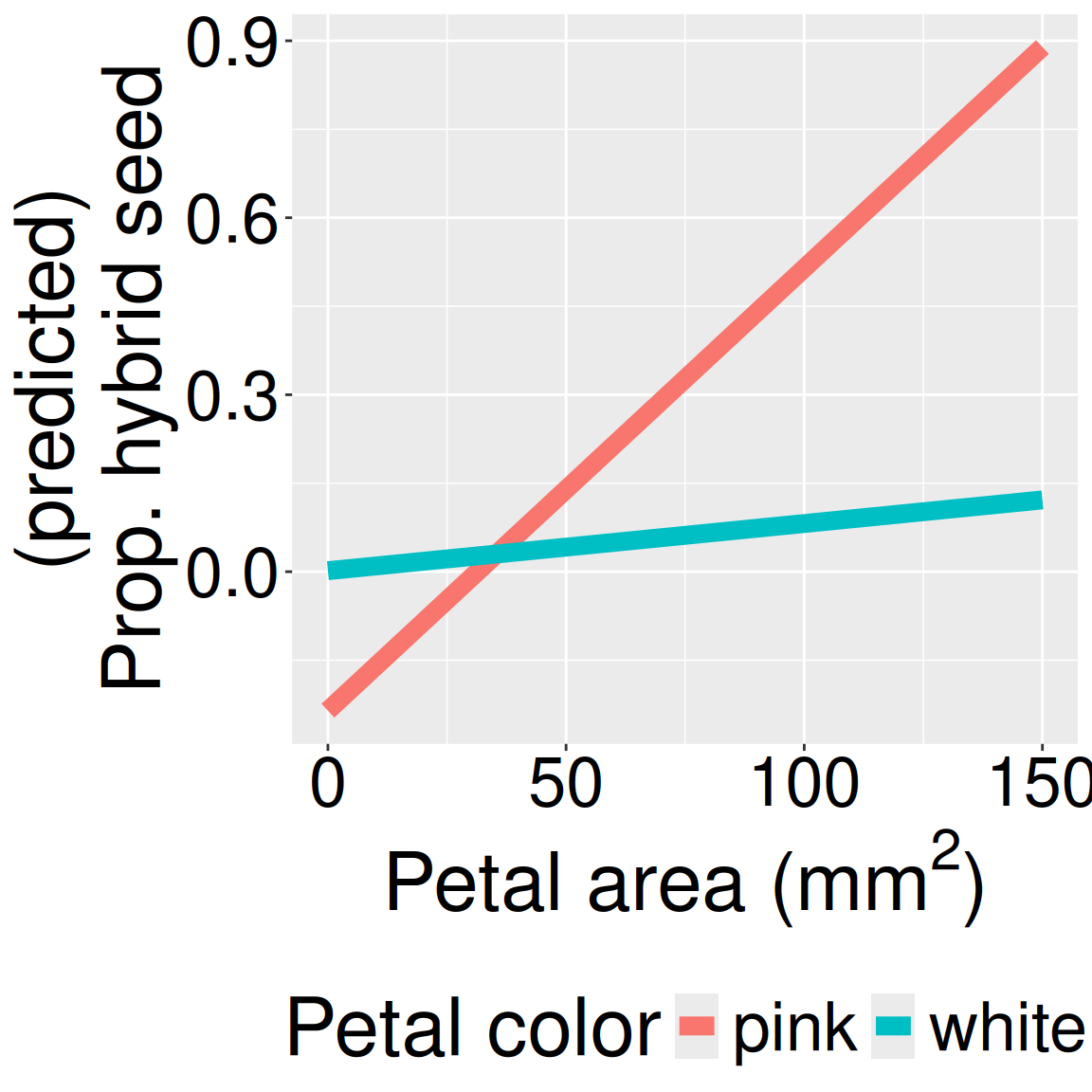
Figure 1: Predicted proportion of hybrid seed across petal area for pink- and white-petaled flowers under a linear model with an interaction.
To help understand what this model implies, I drew it out in Figure 1, and show the math for pink and white flowers separately, below. Note that the interaction term acts to make the slope – which is quite steep for pink flowers – nearly zero in white flowers (0.0075 - 0.0067 = 0.0008).
\[\hat{Y}_\text{i|pink} = -0.2356 + \text{PETAL AREA} \times 0.0075\]\[\hat{Y}_\text{i|white} = -0.2356 + 0.2373 + \text{PETAL AREA} \times (0.0075 - 0.0067)\] From a quick glance at this model, you may be confused to see that the coefficient for white petals is large and positive. This should strike you as weird, as everything else we have seen shows that white-petaled RILs have a lower proportion of hybrid seed. To resolve this confusion, remember that the petal_colorwhite term refers to the deviation from the “(Intercept)” at zero petal area (Bottom left corner of Figure 1).
So the model predicts a 0.0017 proportion of hybrid seeds on white-petaled RILs with a petal area of zero, compared to a -0.236 proportion of hybrid seeds on pink-petaled RILs with a petal area of zero.
But these “predictions” are meaningless, as we know not to extrapolate beyond the range of the data. This does not mean that we should ignore the negative intercept or the large positive coefficient for white-petaled RILs (See more on marginal effects soon), it just means we should think of these as cogs to make the model go, not biologically meaningful information. The biologically meaningful information is the prediction within the range of our data.
Visualizing a linear model with an interaction
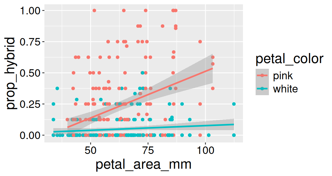
To look into this more, let’s view our data and the model in the range of our data. Because we are considering a statistical interaction, the default behavior of geom_smooth(method = 'lm') is appropriate:
ggplot(rils, aes(x = petal_area_mm, y = prop_hybrid, color = petal_color))+geom_point()+geom_smooth(method ="lm")
Figure 2: Observed proportion of hybrid seed and fitted relationships with petal area for pink- and white-petaled RILs. The fitted slopes differ between petal colors.
Figure 2 now clearly shows that, despite the large positive coefficient for white-petals, pink-petaled RILs are predicted to have a higher proportion of hybrid seed than white petaled RILs through nearly all of the range of our data. This highlights the need for visualizing your data and the model, and for carefully interpreting linear model coefficients in the presence of interactions.
NoteKey finding
Our model predicts a similarly low proportion of hybrid seeds for the smallest pink- and white- petaled RILs. As petal area increases, however, the predicted proportion of hybrid seed rises strongly among pink-petaled RILs, and hardly changes for white-petaled RILs. So, the difference in hybridization between petal colors is small for small-petaled RILs, and increases with petal area.
Interactions between categorical explanatory variables
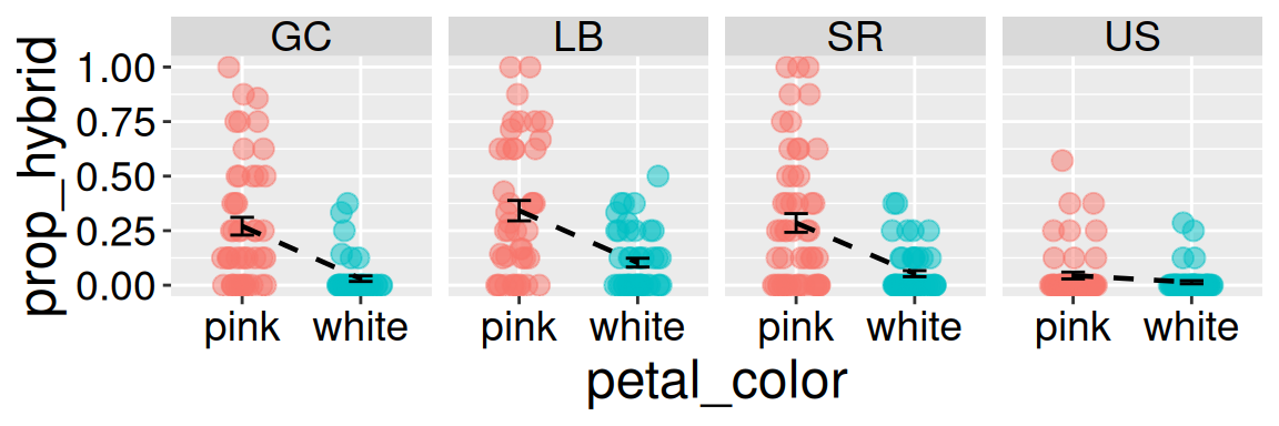
In Figure 2, the association between petal area and hybrid seed production depends on petal color. We can “see” this interaction as the steeper slope for pink petaled RILs than white-petaled RILs.
The same idea applies to interactions between two categorical explanatory variables. Although such variables do not have proper “slopes” we can connect group means by lines. Figure 3 shows that the lines connecting the mean proportion of hybrid seeds of pink- and white-petaled RILs are steep at GC, LB, and SR, but shallow at US. From this plot we can see that the proportion of hybrid seeds is associated with petal color, planting location and their interaction.
Code
ggplot(rils, aes(x = petal_color, y = prop_hybrid, color = petal_color))+geom_jitter(height =0, width = .2, size =3, alpha = .5) +stat_summary(geom ="errorbar", width = .2, color ="black")+facet_wrap(~location, nrow =1) +stat_summary(aes(group=1),geom ="line", linewidth = .8, color ="black", lty=2)+theme(legend.position ="none")
Figure 3: Proportion of hybrid seed for pink- and white-petaled RILs across planting locations. Points show individual RILs, error bars summarize each group, and dashed lines connect the group means within each location. Data are facetted by location.
I generate the linear model coefficients, below. Let’s think about how to use this to find \(\hat{Y}\).
We start with the intercept.
We then have our first variable, location, for which there are three potential coefficients. Recall that these are “indicator variables” so we multiply the coefficient by one if we are in that location and zero if we are not. The reference location, GC, does not receive its own coefficient because it is already represented by the intercept.
We then hit our second variable, petal color. Again this is an indicator variable, which we multiply by one if white, and by zero otherwise. The reference petal color, pink, does not receive its own coefficient because it is already represented by the intercept.
We then hit our interaction between petal color and location. This is the product of the two previous indicators. Now we multiply the coefficient by one if we are in that location and zero if we are not, and we multiply this number by one if we are white and zero otherwise. In other words, we add the interaction term if we fall into both categories.
Note the very small numbers for all interaction terms except locationUS:petal_colorwhite. Note also the weirdness of the strong positive interaction for locationUS:petal_colorwhite.
lm(prop_hybrid ~ location * petal_color, data = rils)
name
value
(Intercept)
0.270
locationLB
0.071
locationSR
0.015
locationUS
-0.226
petal_colorwhite
-0.240
locationLB:petal_colorwhite
0.002
locationSR:petal_colorwhite
0.008
locationUS:petal_colorwhite
0.210
As in the previous example, this might make you initially misinterpret these coefficients. For example, you may think that this combination was awesome for proportion hybrid seed. But it does not. Rather, this means that their predicted value is higher than the negative 20% of hybrid seeds we would predict by simply subtracting these coefficients from the intercept.
We can use these coefficients to find \(\hat{Y}_i\) for all combinations of petal color and planting location. I present a few of these below:
The app below shows predictions from the interaction model and compares it to a model without interactions. Play with it to find \(\hat{Y_i}\) for different combinations of petal color and location in models with and without interactions
Interaction Prediction Explorer
Interaction Prediction Explorer
Term
Coef.
Use
Add
Prediction
Interactions between continuous explanatory vars.
Of course, the interaction between two continuous explanatory variables can also contribute to our predictions. Here I will model the proportion of hybrid seeds as a function of petal area and anther stigma distance. We can build this interaction model as before:
NOTE: from our previous analyses, it seems likely that ASD does not influence the proportion of hybrid seed. But it is highly correlated with petal color which likely does.
lm(prop_hybrid ~ petal_area_mm * asd_mm, data = rils)
It is very hard to visualize more than two continuous variables. It is even harder to spot nonlinear trends in such cases. Rather than forcing all three variables into one plot, let’s try making the problem easier.
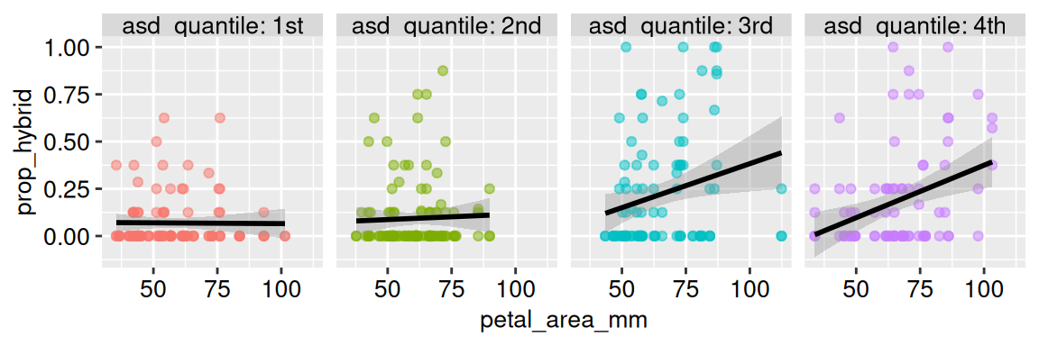
I usually turn one of the continuous predictors into an ordinal variable, and then visually compare slopes. For example, in Figure 4, I break anther stigma into quartiles. I then compare the relationship between petal area and the proportion of hybrid seed across ASD quartiles. Figure 4 shows a slope near zero for the bottom two quartiles, but a sharp slope for larger values of ASD. Thus, while this does not perfectly reproduce our model, it is giving interaction.
Figure 4: Relationship between petal area and the proportion of hybrid seed across four anther–stigma distance groups. Points show individual RILs, and black lines show separate linear fits within each ASD quartile group.
My biological interpretation of this result is as follows. I suspect that this pattern does not primarily reflect a direct effect of ASD. But, because asd is associated with petal color, plants with large asd are more likely pink. Thus, Figure 4 is just Figure 2 in a trench coat.