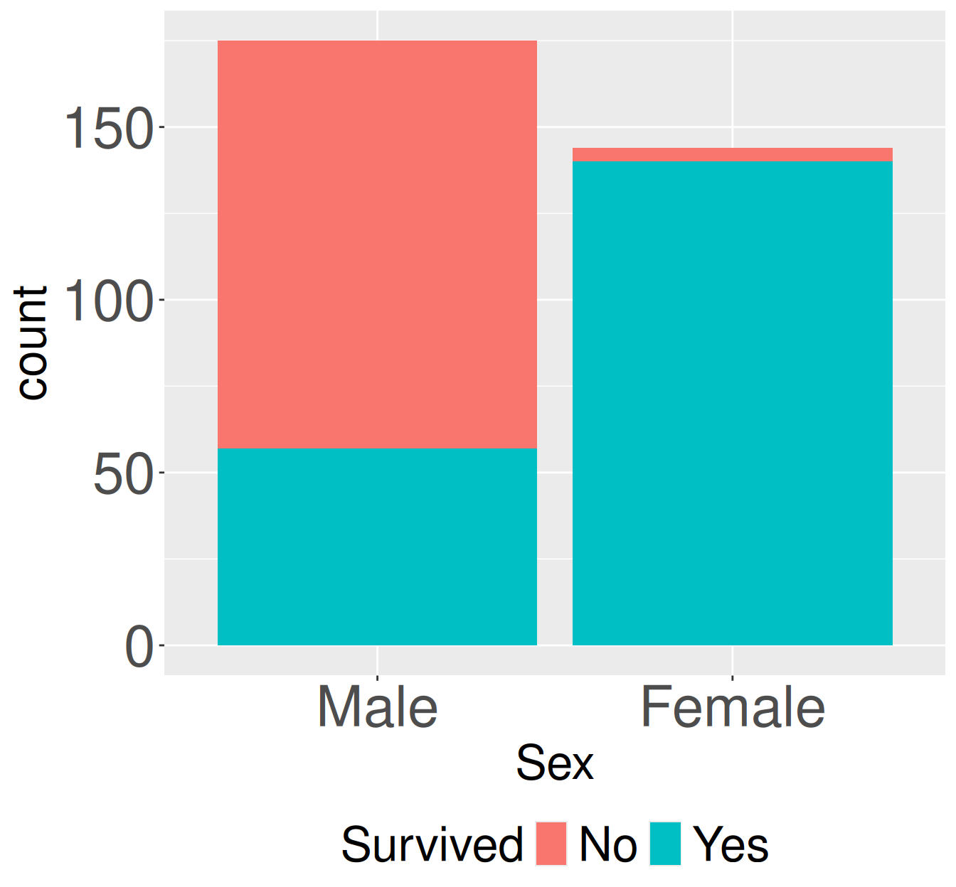
Figure 1: Survival counts for adult first-class passengers on the Titanic by sex. Stacked bars show the number of adult first-class passengers who did or did not survived, separated by sex.
Here’s a brief run down of the key functions and pipelines used in this chapter.
Two categorical variables
Lets return to the survival of adults sitting first class on the Titanic from the previous chapter. Again, the code below takes the data from old-R style into the tidyverse framework we’re used to.
Figure 1 shows the pattern we previously quantified and the conditional probability – survival was lower for males than females. The code below quantifies this as a both a covariance and a correlation. We’ll do so with R’s built in cov() and cor() functions because they are clean and easy.
titanic_first_class_adults |># turn sex and survival into new, logical columnsmutate( female = Sex =="Female", lived = Survived =="Yes") |>summarise(sample_cov =cov(female, lived),sample_cor =cor(female, lived))
sample_cov
sample_cor
0.1606
0.662
Two continuous variables
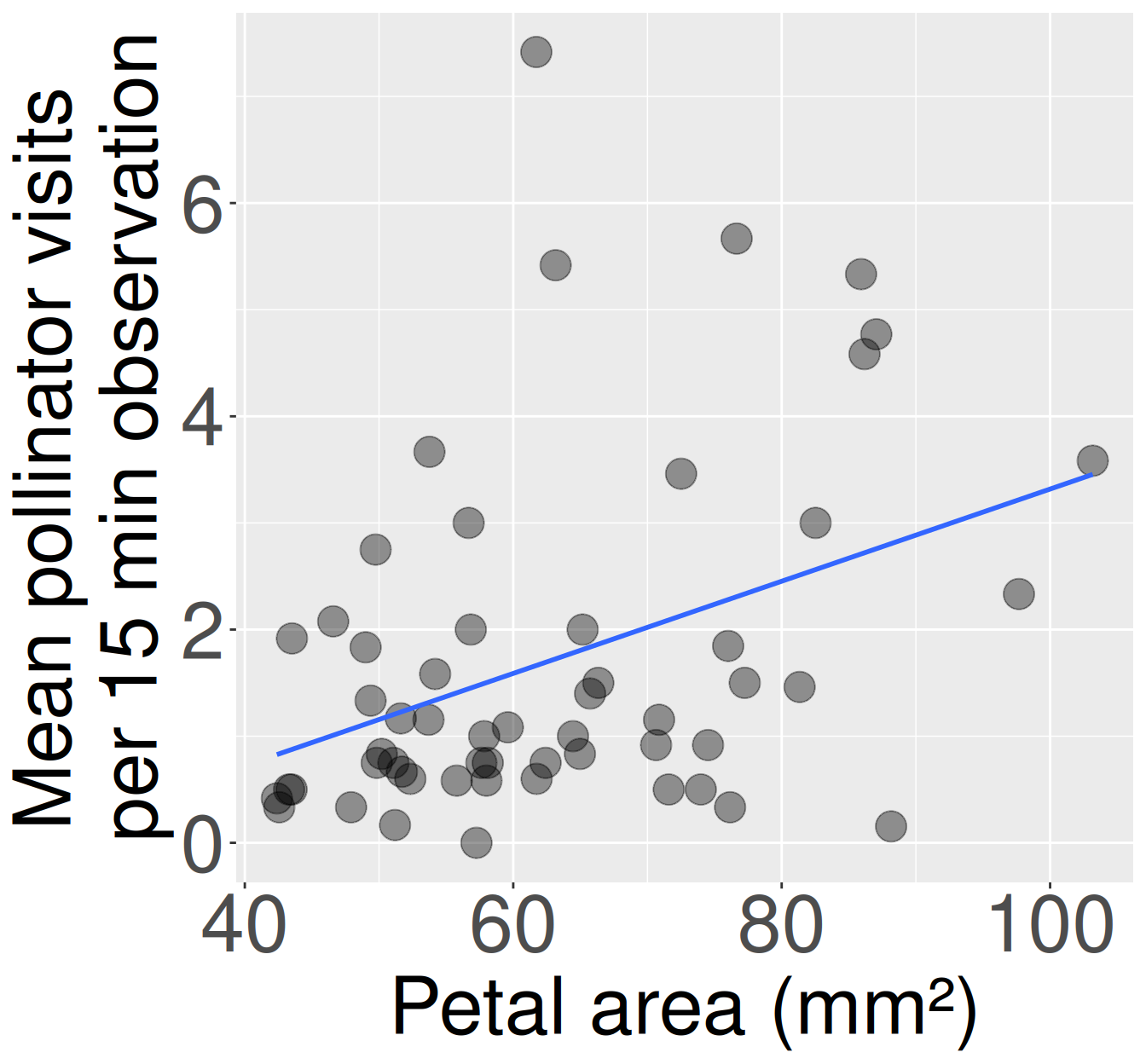
Returning to Clarkia RIL’s let’s examine the association between the petal area of pink plants at Sawmill Road (SR) that were and were not visited by pollinators. First we format the data:
Then we make a plot and summarize the association. Note that this covariance is much higher than the example above, but the relationship is actually weaker as the correlation is smaller.
Figure 2: Association between petal area and pollinator visits in pink-flowered Clarkia xantiana RILs at the SR site. Each point represents one plant. Plants with larger petals tended to receive more pollinator visits, though the relationship is noisy and many plants received few visits. The blue line shows the linear trend used to summarize the association.
library(effectsize)library(ggplot2)library(dplyr)# Make a plotpink_sr_rils |>ggplot(aes(x = petal_area_mm, y = visits))+geom_point(size =6, alpha = .4)+geom_smooth(method ="lm", se =FALSE)+theme(axis.text =element_text(size =35),axis.title =element_text(size =40))# Covariance & Correlationpink_sr_rils |>summarise(cov_petal_area_visited =cov(petal_area_mm, visits),cor_petal_area_visited =cor(petal_area_mm, visits))