Motivating Scenario:
You are continuing your exploration of a fresh new dataset. You have figured out the shape, made the transformations you thought appropriate, and now want to summarize associations between two categorical variables.
Learning Goals: By the end of this subchapter, you should be able to:
Calculate and explain conditional proportion: You should be able to do this with basic math and with R code.
Visualize associations between two categorical variables. With pen and paper and R code.
Even the most complex analysis should begin with clear summaries and visualizations on our data. So, before describing associations between categorical variables, let us revisit our univariate summaries and consider how to summarize categorical variables.
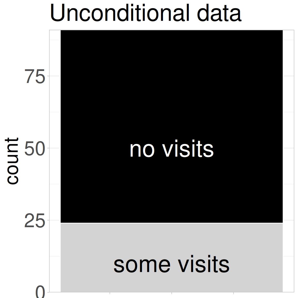
Figure 1: The number of plants that did (light grey) or did not (black) receive a visit from a pollinator.
First, we visualize!Figure 1 shows that only a quarter of flowers were visited by a pollinator under our watch. We learn how to do this below. But for now, consider the choices available to you. I report the data as counts, and as a “stacked” barplot. But these could be presented side-by-side and/or as proportions. I will pepper in some guiding data visualization principles as we go, and dive deeper into data visualization later in the book. But for now, let these principles guide you:
Show all the data.
Show the data honestly.
Make patterns easy to see.
Next, we summarize! A proportion (e.g., the proportion of pink flowers) is a special kind of mean where one outcome (e.g., pink flowers) is set to 1 and the other (e.g., white flowers) is set to 0. So we can calculate a proportion as the number of pink flowers divided by the total number of plants with known petal color.
We summarize categorical variables in R by taking advantage of the fact that R considers TRUE to equal one and FALSE to equal zero. Within dplyr’s summarise(), we find counts with sum() and proportions with mean():
There are many ways to quantify associations between two categorical variables. Rather than go through them all, I focus here on some key concepts.
Conditional proportions
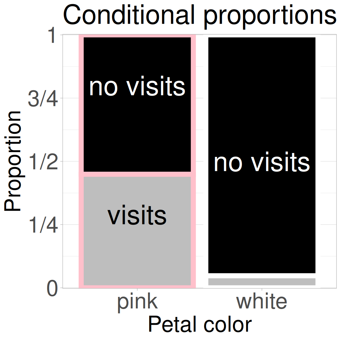
Figure 2: The association between petal color and pollinator visitation. Petal color is on the x-axis and visit status is shown within bars. We see that pink-flowered plants are more likely to receive a visit from a pollinator.
We found that about one quarter of the RILs planted at GC received no pollinator visits under our watch. But this overall average obscures the key fact – that not all plants are the same. We may believe, and Figure 2 shows, that the proportion of plants receiving visits differs conditional on the petal color! While nearly half of pink-flowered plants received a visit from a pollinator under our watch, only about five percent of white-flowered plants did.
Using the notation of probability theory, \(P_{A \mid B}\) or P(A|B), meaning the “probability of A conditional on B,” or alternatively, “The probability of A given B”
P(Visit | Pink) \(\approx\) 0.50.
P(Visit | White) \(\approx\) 0.05.
Below, I introduce janitor’s tabyl() function to aid in these calculations:
If two categorical variables are independent, the conditional probabilities would be equal. It’s clear that, in this case, the probability of us observing a pollinator visit differs conditional on petal color. Pink-flowered RILs had about 10× higher probability (or more technically “relative risk of \(\approx\) 10”) of being visited by a pollinator than did white-flowered RILs.
Additional summaries of associations between categorical variables.
At this point many textbooks would introduce two other standard summaries – odds ratios and relative risk (calculated above). I am not spending much time on them here. That is not because they are not useful (they are) – but because
They can get complicated.
They don’t lead naturally to the next steps in our learning journey.
Feel free to read more about each on Wikipedia (links above) or in conversation with your favorite large language model.
We will also introduce two additional summaries - covariance, and correlation in the next chapter on associations.
Visualizing categorical variables
We have previously introduced making plots with ggplot2. As a quick refresh, let’s consider how to visualize categorical data. Note this section is about how to get a reasonable ggplot up and running - and we will only consider high-level decisions that make plots clear and easy to interpret. Later in the book we will consider how to make better plots.
One categorical variable
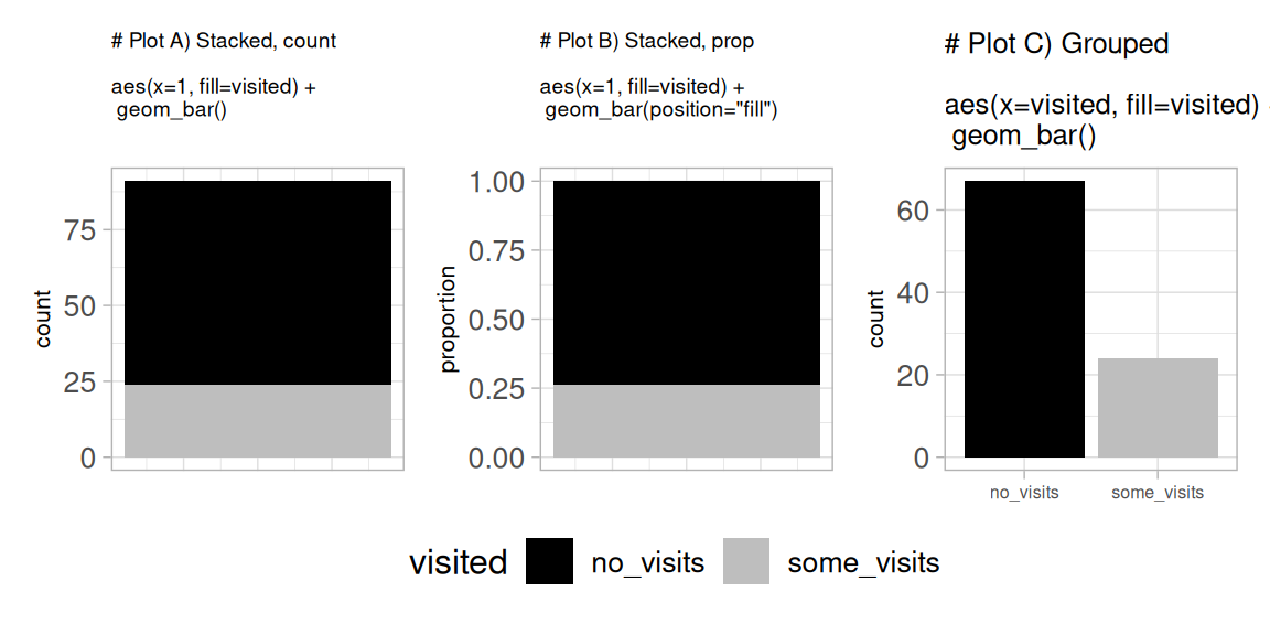
The code below shows three ways to visualize one categorical variable: counts, proportions, and side-by-side (aka grouped) comparisons. Each plot (shown in Figure 3) highlights a different aspect of the association. These options can help you choose the visualization that most honestly and clearly displays patterns in your data.
# I am adding this to each plot to clean up the x-axis labelling. Ignore if you likeadded_theme <-theme_light()+theme(axis.text.x =element_blank(), axis.title.x =element_blank(), axis.ticks.x =element_blank(), legend.position ="bottom")# PLOT A ggplot(gc_rils,aes(x =1, fill = visited))+geom_bar()+ added_theme # PLOT B ggplot(gc_rils,aes(x =1, fill = visited))+geom_bar(position ="fill")+labs(y ="proportion")+ added_theme # PLOT C ggplot(gc_rils,aes(x = visited, fill = visited))+geom_bar()
Figure 3: Three ways to visualize visited status of plants.
Two categorical variables
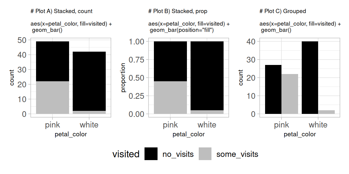
As above, the code below produces three plots (Figure 4) to show the same data in different formats: counts, proportions, and side-by-side (aka grouped) comparisons. Each plot highlights a different aspect of the association.
# I am adding this to each plot to clean up the x-axis labelling. Ignore if you likeadded_theme <-theme_light()+theme(axis.text.x =element_blank(), axis.title.x =element_blank(), axis.ticks.x =element_blank(), legend.position ="bottom")# PLOT A ggplot(gc_rils,aes(x = petal_color, fill = visited))+geom_bar()# PLOT B ggplot(gc_rils,aes(x = petal_color, fill = visited))+geom_bar(position ="fill")+labs(y ="proportion")# PLOT C ggplot(gc_rils,aes(x = petal_color, fill = visited))+geom_bar(position ="dodge")
Figure 4: Three ways to visualize pollinator visits (yes/no) by petal color.
Covariance
A common quantification of the association between two binary variables is the covariance. This quantification follows some simple mathematical logic:
If two categorical variables, A & B are independent, the probability of observing both A and B (aka, \(P_{AB}\)) should equal the product of their unconditional probabilities: \[P_{AB \mid \text{independence}} = P_A \times P_B\]
The covariance is the deviation from this expectation: \[COV_{AB} = P_{AB} - P_A \times P_B\]
So for the association between petal color and being visited, the covariance is:
\[COV_{\text{visited, pink}} =P_{\text{visited and pink}} - P_{\text{visited}} \times P_{\text{pink}}\]
Our answer and formula are slightly off. We used a denominator of \(n\), while the sample covariance has a denominator of \(n-1\). To get the precise covariance – as R calculates – multiply this by \(\frac{n}{n-1}\) (this is known as Bessel’s correction). But when \(n\) is big, this is close enough.
p_pink_and_visited
p_pink
p_visited
cov_pink_and_visited
0.2418
0.5385
0.2637
0.0997
Alternatively, R can calculate the covariance with the cov() function. This only works if the values are numbers or boolean (TRUE [1] / FALSE [0]). Note the slight mismatch between our calculation due to “Bessel’s correction (see margin)
Covariance gives us a numerical measure of how far our data deviate from what we’d expect under independence. In this case, the value is 0.10 — but is that meaningful? We’ll build up more intuition for interpreting covariances as we shift to continuous variables in the next chapter.