7. Associations: Part II
Motivating Scenario:
You’re curious to know the extent to which two variables are associated and need background on standard ways to summarize associations.
Learning Goals: By the end of this chapter, you should be able to:
Recognize the difference between correlation and causation
- Memorize the phrase “Correlation does not necessarily imply causation,” explain what it means and why it’s important in statistics, and know that this is true of all measures of association.
- Identify when correlation may or may not reflect a causal relationship.
- Memorize the phrase “Correlation does not necessarily imply causation,” explain what it means and why it’s important in statistics, and know that this is true of all measures of association.
Explain and interpret summaries of associations between two binary or two continuous variables
- Describe associations between two binary variables using observed and expected joint probabilities.
- Understand the mathematics behind covariance, correlation, and sums of cross products.
- Use R to calculate and interpret summaries of association.
- Use R to visualize associations between variables.
- Describe associations between two binary variables using observed and expected joint probabilities.
Correlation is still not causation
Correlation means that two variables are associated.
Causation means that changing one variable produces a change in the other.
We dicussed that process including coincidence, confounding and reverse causation, can generate correlations without the causation we wish to imply. So we cannot make causal claims or even good predictions from correlations alone. Let’s push a bit more on this below.
Causation without correlation
Not only does correlation not imply causation, but causation doesn’t always generate an association.
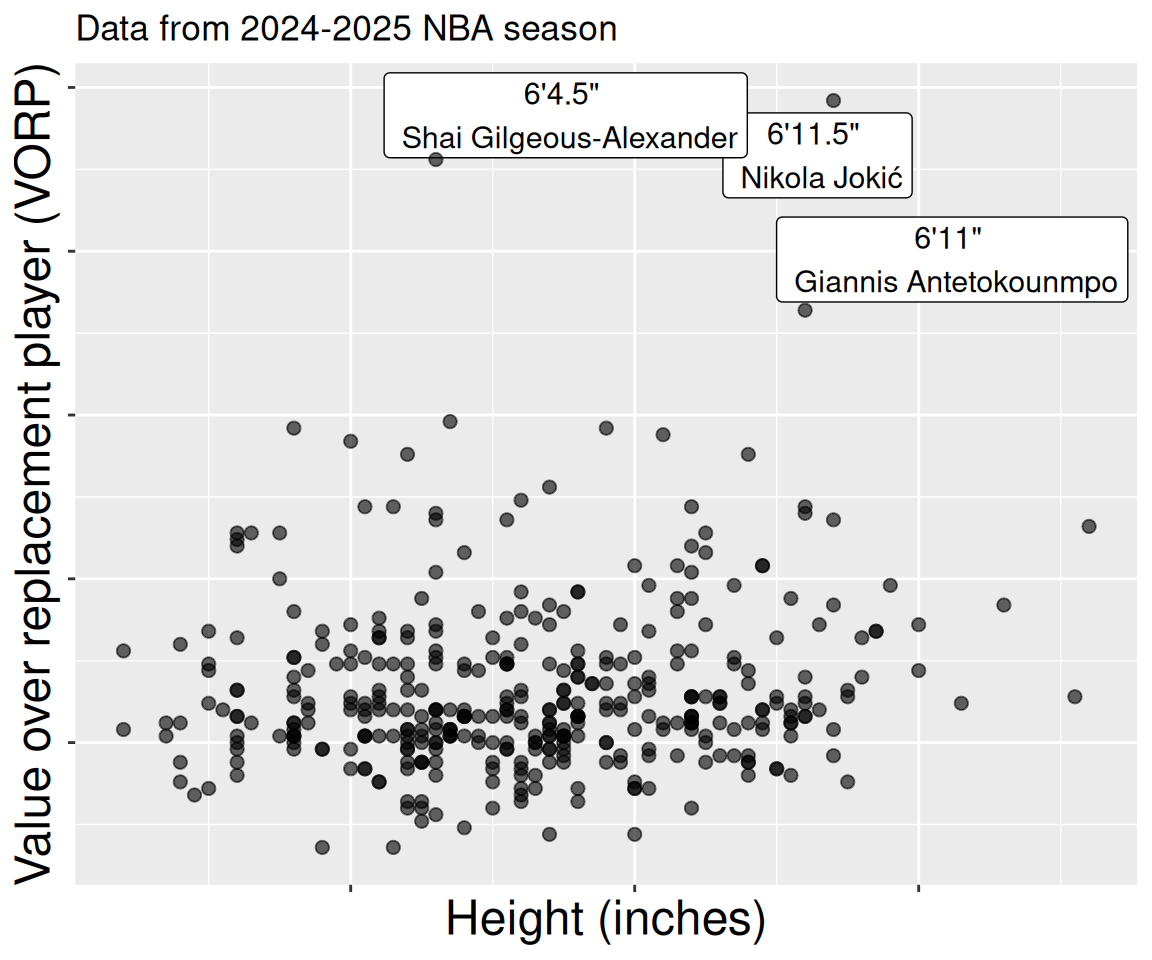
For example, no one will doubt that height gives a basketball player an advantage. Yet if we look across all NBA players, we see no relationship between height and standard measures of player success (e.g. salary, or “Value of Replacement Player” etc Figure 2), How can this be? The answer is that to make it to the NBA you have to be very good or very tall (and usually both) – so (6 foot 4, Shai Gilgeous-Alexander) has a value just a bit higher than (6 foot 11) Giannis Antetokounmpo.
A related, but different issue – known as Countergradient variation is observed in ecological genetics. Here, measures of some trait, like growth rate, are similar across the species range (e.g. between northern and southern populations), but when grown in a common environment, the populations differ (e.g. the northern population grows faster). This might reflect divergence among population as a consequence of natural selection that may favor greater efficiency or acquisition of energy in northern regions.
Making predictions is hard
Making predictions is hard, especially about the future.
– Attributed to Yogi Berra
Associations describe data we have – they do not necessarily apply to other data. Of course, understanding such associations might help us make predictions, but we must consider the range and context of our data.
Their are different kinds of predictions we might want to make.
We may want to predict what we would expect for unsampled individuals from the same population as we are describing. In this case, a statistical association can be pretty useful.
We may want to predict what we would expect for individuals from a different population than what we are describing. In this case, a statistical association might help, but need some care.
We may want to predict what we would expect if we experimentally changed one of the value of an explanatory variable (e.g. if “I experimentally decreased anther-stigma distance, would plants set more hybrid seed?”) This is a causal prediction!
Misalignment between expectations and the reality is a common trope in comedy and drama. For example, hilarity may ensue when an exotic dancer in a firefighter or police costume is mistaken for a true firefighter or policeman (See the scene from Arrested Development below (youtube link)). Such jokes show that we have an intuitive understanding that predictions can be wrong, and that the context plays a key role in our ability to make good predictions.
We again see such a case in our RIL data - leaf water content reliably predicts the proportion of hybrid seed set at three experimental locations, but is completely unrelated to proportion of hybrid seed at Upper Sawmill Road (location: US, Figure 3).
Code to make the plot, below.
filter(ril_data, !is.na(location)) |>
  ggplot(aes(x= lwc,y =prop_hybrid))+
  facet_wrap(~location,labeller = "label_both",nrow=1)+
  geom_point(size = 2, alpha = .2)+
  geom_smooth(method = "lm",se = FALSE, linewidth = 2)+
  labs(x = "Leaf water content",
       y = "Proportion hybrid")+
  scale_x_continuous(breaks = seq(.78,.88,.04))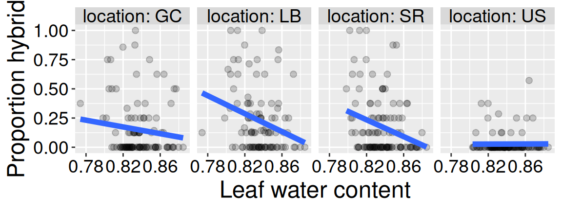
There is still value in finding associations
The caveats above are important, but they should not stop us from finding associations. With appropriate experimental designs, statistical analyses, biological knowledge, and humility in interpretation, quantifying associations is among the most important ways to summarize and understand data.
The following sections provide the underlying logic, mathematical formulas, and R functions to summarize associations.
Let’s get started with summarizing associations!
The following sections introduce how to summarize associations between variables by:
- Revisiting our descrition of associations between two categorical variables, by introducing the covariance.
- Describing associations between two continuous variables, including the covariance and the correlation.
Then we summarize the chapter, present practice questions, a glossary, a review of R functions and R packages introduced, and present additional resources.
Luckily, these summaries are remarkably similar, and build off of what we learned last chapter so much of the learning in each section of this chapter reinforces what was learned in the others.