Motivating Scenario: You understand the idea of a correlation and covariance, as well as what linear models are doing. You now want to build and understand a linear model predicting a numeric response from a numeric explanatory variable.
Learning Goals: By the end of this subchapter, you should be able to:
Describe linear regression as a modeling tool
Recognize that a regression line models the conditional mean of the response variable as a function of a predictor.
Explain the meaning of slope and intercept
Interpret slope as expected change in the response per unit change in the predictor.
Interpret the intercept and understand when it is or isn’t meaningful.
Use the equation from a linear regression to find the conditional mean for a given x value.
Understand residuals
Define and calculate residuals as observed minus predicted values.
Use R to fit and explore a linear model
Build models with lm().
Inspect residuals and predictions with augment() from the broom package.
Know that predictions are only valid within the range of the data
A review of covariance and correlation
We have previously quantified the association between two numeric variables as:
A covariance: describe how \(x\) and \(y\) jointly deviate from their means in an individual.
While these measures summarize the strength of an association, neither allows us to model a numeric response variable as a function of a numeric explanatory variable.
Linear regression set up
So, how do we find \(\hat{y}_i\)? The answer comes from our standard equation for a line — \(y = mx + b\). But statisticians have their own notation:
\[\hat{y}_i = b_0 + b_1 \times x_i\] The variables in this model are interpreted as follows:
\(\hat{y}_i\) is the conditional mean of the response variable for an individual with a value of \(x_i\). Note this is a guess at what the mean would be if we had many such observations - but we usually have one or fewer observations of y at a specific value of x.
\(b_0\) is the intercept – the value of the response variable if we follow it to \(x = 0\).
\(b_1\) is the slope – the expected change in \(y\), for every unit increase in \(x\).
\(x_i\) is the value of the explanatory variable , \(x\) in individual \(i\).
Connection to a categorical predictor
In the previous section, we modeled proportion hybrid seed as a function of petal color. In that case
The “intercept” was the mean hybrid seed proportion in our reference group (pink).
The “slope” was the difference in mean hybrid seed proportion between groups.
The value of the explanatory variable was zero for plant sin the reference group and 1 for plants in the other group.
Thus, comparing two groups (and in fact all linear models) can be considered as special cases of linear regression.
Math for linear regression
Slope: The slope, \(b_1\), is the covariance divided by the variance in x. \(b_1 = \frac{cov_{x,y}}{s^2_x}\).
Intercept: The intercept, \(b_0\) (sometimes called \(a\)), equals \(b_0 = \bar{y}-b_1\bar{x}\).
Using the lm() function
Rather than doing this math, we can have R’s lm() function fit the model for us. As before, we build a linear model in R as lm(response ~ explanatory). So to predict the proportion of hybrid seed as a function of petal area (in mm) type:
The intercept of -0.200 means that if we followed the line down to a petal area of zero, the math would predict that such a plant would produce a nonsensical negative 20% hybrid seed. This is a mathematically useful construct but is biologically and statistically unjustified (see below). Of course, we can still use this equation (and implausible intercept), to make predictions in the range of our data.
The slope of 0.005659 means that for every additional \(mm^2\) increase in area, we expect about a half percent (i.e. about 0.0057 or 0.57%) additional proportion of hybrid seeds.
CONCEPT CHECK Predict the “mean” proportion hybrid seed for a plant with a petal area of 100 \(mm^2\).
Predictions from a linear model are only valid within the range of our observed data. For example, while our model estimates an intercept of –0.208, we certainly don’t expect a microscopic flower to receive less than zero percent hybrid seed. Similarly, we shouldn’t expect a plant with a petal area of \(300 \text{ mm}^2\) to produce more than 150% hybrid seeds.
More broadly, we cannot trust model predictions beyond the range of data we collected, even if predictions are not biologically implausible.
Residuals
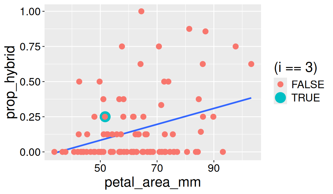
As seen previously, predictions of a linear model do not perfectly match the data. Again, the difference between observed, \(y_i\), and expected, \(\hat{y}_i\), values is the residual \(e_i\). Try to estimate the residual of data point three (green point) in Figure 1.
Code
ggplot(gc_rils|>mutate(i =1:n()), aes(x = petal_area_mm, y = prop_hybrid))+geom_smooth(method ="lm", se =FALSE)+geom_point(aes(color = (i==3), size = (i ==3)))+scale_size_manual(values =c(3,6))
Figure 1: The same scatterplot showing the relationship between petal area as in Figure 2. The highlighted point in turquoise marks plant 3, used as an example in the residual calculation. This point’s vertical distance from the regression line represents its residual
CONCEPT CHECK Looking at Figure 1, visually estimate \(e_3\) (the residual of point three in green)
Solution: The green point (\(i = 3\)) is at y = 0.25, and x is just a bit more than 50. At that x value, the regression line (showing \(\hat{y}\)) is somewhat below 0.125 (I visually estimate \(\hat{y}_{\text{petal area} \approx 50 mm}= 0.090\)). So 0.250 - 0.090 = 0.160.
Math Approach: As above, let’s visually approximate the petal area of observation 3 as 51 mm. Plugging this visual estimate into our equation (with coefficients from our linear model):
As before, we can find the predicted values (.fitted), and the residuals (.resid) from broom’s augment() function:
library(broom)lm(prop_hybrid ~ petal_area_mm, data = gc_rils) |>augment()
CONCEPT CHECK: Use the augment function to find the exact residual of data point 3 to three decimal places .
Residual Sum of Squares & Residual Standard Deviation
Again we can calculate the sum of squared residuals, and the residual standard deviation. Either with the augment() output:
lm(prop_hybrid ~ petal_area_mm, data = gc_rils) |>augment() |>mutate(sq_resid=.resid^2)|>summarise(SS_resid =sum(sq_resid), n =n(),sd_resid =sqrt(SS_resid / (n -2)))
# A tibble: 1 × 3
  SS_resid     n sd_resid
     <dbl> <int>    <dbl>
1     4.95    99    0.226
For technical reasons we will see later, we calculate the residual standard deviation as \(SS_\text{resid}\) divided by n - # parameters estimated in our linear model. For the case with a mean only this was n-1. For the case with a binary predictor it’s n-2, as the two parameters are the slope and intercept (as in the previous section).
lm(prop_hybrid ~ petal_area_mm, data = gc_rils) |>sigma()
[1] 0.2259478
Conclusion: Including petal area in the model reduced the residual standard deviation compared to a “mean only” model, but did not predict as well as a “petal color only” model. In the next section we will learn how to include both factors in our model. Later in the book we will introduce formal tests of how these models compare to null expectations.
Looking forward.
You’ve now seen how we can model a linear relationship between two numeric variables, how to calculate the slope and intercept, and how the best-fitting line is the one that minimizes the sum of squared residuals. You’ve also interpreted these model components in a biological context, visualized residuals, and learned how to fit and explore a linear model in R.
In the next section, we extend linear models to include two explanatory variables.
Later in this book, we’ll introduce concepts of uncertainty and hypothesis testing and model evaluation to deepen our understanding of what these models can (and cannot) tell us, and when to be appropriately skeptical about their predictions.
Stop here unless you’re extra curious.
This material is optional / advanced:
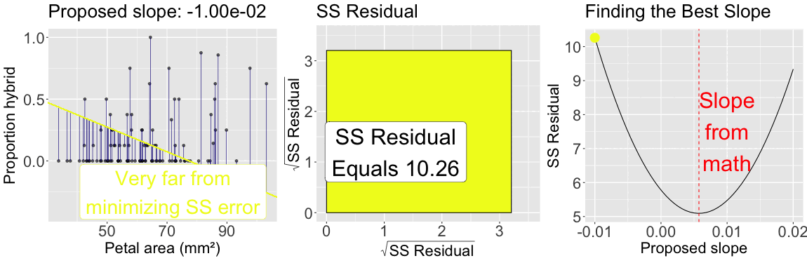
The slope minimizes \(\text{SS}_\text{residuals}\)
As seen for the mean, by looping over many proposed slopes (from \(-0.01\) to \(0.02\)) the plot below illustrates that the slope from the formula above minimizes the sum of squared residuals: The sum of squared residuals for a given proposed slope (with intercept plugged in from math) is shown: In color on all three plots (yellow is a large sum of squared residuals, red is intermediate, and purple is low); Geometrically as the size of the square, in the center plot; On the y-axis of the right plot.
Figure 2: The slope minimizes the sum of squared residuals: The left panel shows observed data points along with a proposed regression line. Vertical lines connect each point to its predicted value, illustrating residuals. The color of the line corresponds to the total residual sum of squares. The center panel visualizes the total squared error as a square whose area reflects the sum of squared residuals. The right panel plots the sum of squared residuals as a function of the proposed slope, with a moving point highlighting the current slope value. The slope that minimizes the sum of squared residuals defines the best-fitting line.