Motivating example: Each multiple regression coefficient is an estimate. But we know that estimates come with uncertainty, and that it is best practice to accompany estimates with statements of uncertainty. In this subsection we look into quantifying and communicating uncertainty in multiple regression coefficients.
Learning goals: By the end of this section, you should be able to:
Use emmeans() to estimate model-adjusted means and their uncertainty.
Distinguish raw means from model-adjusted means.
Report and visualize estimates with uncertainty.
Let’s start by describing uncertainty in our estimated coefficients from our model. We can do this using Base R’s confint() function or broom’s tidy() function. Here I do the latter because it provides more useful output.
library(broom)library(dplyr)full_model <-lm(prop_hybrid ~ asd_mm + petal_color + petal_area_mm + location, data = rils )# Because tidy provides a column called `p.value` which can mislead us, # I make sure we don't see it with select(-p.value). # I also rename the column `statistic` to t_value, so its meaning is more obvious broom::tidy(full_model, conf.int =TRUE)|> dplyr::select(-p.value)|>rename(t.value = statistic)
term
estimate
std.error
statistic
conf.low
conf.high
(Intercept)
0.010
0.050
0.191
-0.089
0.108
asd_mm
0.031
0.029
1.051
-0.027
0.088
petal_colorwhite
-0.174
0.021
-8.468
-0.214
-0.133
petal_area_mm
0.003
0.001
4.777
0.002
0.005
locationLB
0.073
0.029
2.517
0.016
0.130
locationSR
0.018
0.028
0.626
-0.038
0.073
locationUS
-0.114
0.028
-4.144
-0.169
-0.060
Uncertainty in model-adjusted means
While confidence intervals for model coefficients are useful, it can be more natural to consider uncertainty in means. Because we are dealing with a multiple regression, these means are adjusted for the other terms in the model. We can find them with emmeans() function in the emmeans package:
library(emmeans)emmeans(full_model, ~ location)
 location emmean     SE  df lower.CL upper.CL
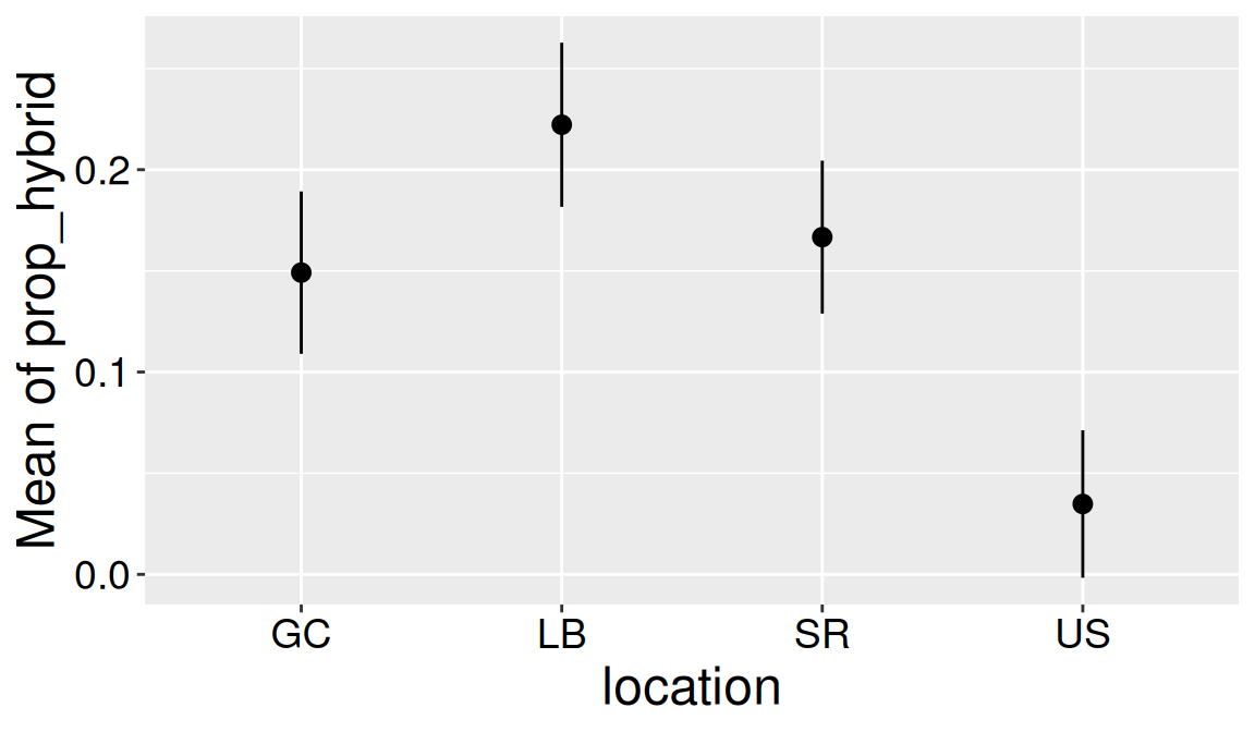
 GC       0.1491 0.0204 395  0.10899   0.1893
 LB       0.2222 0.0206 395  0.18163   0.2628
 SR       0.1667 0.0192 395  0.12890   0.2045
 US       0.0348 0.0185 395 -0.00165   0.0712

Results are averaged over the levels of: petal_color
Confidence level used: 0.95
Note that these are marginal means (i.e. accounting for the other variables). Thus, they can differ from a simple estimate of the mean. For example, comparing the marginal mean proportion hybrid seed by petal color and the actual means reveals a modest difference (see below).
emmeans(full_model, ~ petal_color)
 petal_color emmean     SE  df lower.CL upper.CL
 pink        0.2301 0.0143 395   0.2021   0.2581
 white       0.0563 0.0142 395   0.0284   0.0842

Results are averaged over the levels of: location
Confidence level used: 0.95
# A tibble: 2 × 2
  petal_color simple_mean
  <chr>             <dbl>
1 pink             0.228
2 white            0.0483
You can similarly use the modelbased package introduced below. For example to report uncertainty by petal_color with the estimate_means() function from model based, type:
Estimated Marginal Means

petal_color | Mean |   SE |       95% CI | t(395)
-------------------------------------------------
pink        | 0.23 | 0.01 | [0.20, 0.26] |  16.14
white       | 0.06 | 0.01 | [0.03, 0.08] |   3.96

Variable predicted: prop_hybrid
Predictors modulated: petal_color
Predictors averaged: asd_mm (0.87), petal_area_mm (62), location
Visualizing uncertainty in estimates
Sometimes it is easier to interpret pictures than tables. So, in multiple regression you may want to visualize your estimates and/or your uncertainty in them. The modelbased package can do this for us!
Visualizing uncertainty in a continuous explanatory variable
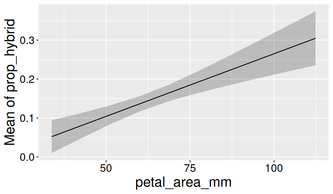
For example, to visualize uncertainty in the association between the proportion of hybrid seeds and petal area (adjusted for all other variables in the model), type:
estimate_means(full_model, by ="petal_area_mm") |>plot()
Figure 1: Model-based predictions for the association between petal area and proportion of hybrid seeds. The line shows predicted values from the multiple regression model, adjusted for the other explanatory variables, and the shaded region shows uncertainty around those predictions.
Visualizing uncertainty by levels of a categorical explanatory variable
To visualize uncertainty in the estimated marginal mean proportion of hybrid seeds across levels of a single categorical explanatory variable, type:
estimate_means(full_model, by ="location") |>plot()
Figure 2: Estimated marginal mean proportion of hybrid seeds by location. Points show model-based means from the multiple regression model, adjusted for the other explanatory variables, with intervals showing uncertainty.
Visualizing uncertainty by two categorical explanatory variables
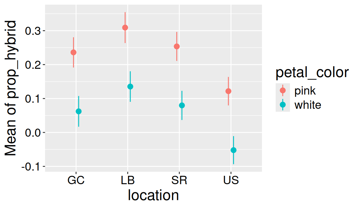
To visualize uncertainty in the estimated marginal mean proportion of hybrid seeds across levels of two categorical explanatory variables, type:
estimate_means(full_model, by =c("location", "petal_color")) |>plot()
Figure 3: Estimated marginal mean proportion of hybrid seeds by location and petal color. Estimates come from the multiple regression model and are adjusted for the other explanatory variables.
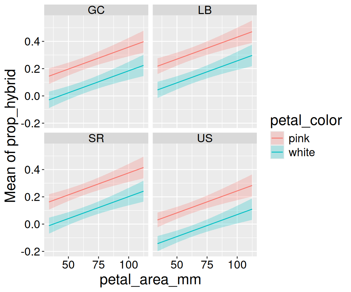
Visualizing uncertainty by many explanatory variables
We can expand this to include more explanatory variables. The plotting function will make some choices for us:
Figure 4: Model-based predictions for proportion of hybrid seeds across petal area, petal color, and location. Estimates come from the multiple regression model and are adjusted for the other explanatory variables.