Motivating example: We have now fit a linear regression to our data. But before getting carried away in our analyses, we want to see if the model is a reasonable summary of the data and whether the assumptions behind our uncertainty estimates are plausible.
Learning goals: By the end of this section, you should be able to:
Name the main assumptions of linear regression.
Evaluate whether the data collection process fits the assumptions of unbiased sampling and independence.
Generate diagnostic plots and use them to evaluate whether the modeled data meet linear model assumptions.
Identify possible next steps when data do not meet the assumptions of a linear model.
That is, we found that for each \(1\text{ mm}^2\) increase in petal area, we expect a 0.57 percentage point increase in proportion hybrid seeds.
Now we must ask how much we can trust this equation to describe the data, and how much we can trust the linear modeling framework to estimate uncertainty and test null hypotheses. Thus we must consider how well our model meets the assumptions of linear models.
Assumptions of Linear Models
Figure 1: I just wanted a fun meme here.
Linear regression relies on the same general assumptions as other standard linear models. However, these assumptions take on slightly different meanings when \(X\) is numeric.
Unbiased data collection: The data were collected in a way that lets us answer the biological question without systematic bias.
Independence: Observations, and therefore residuals, are independent of one another after accounting for the predictors in the model.
Linearity: The model describes the expected value of the response by adding up components of the model. For a linear regression this means that we assume we can make reasonable predictions by adding \(b \times X_i\) to the intercept.
Normality of residuals: The residuals are approximately normally distributed. In a two-sample t-test or ANOVA, we could take a shortcut to evaluating this idea by evaluating normality within groups. In a linear regression, we cannot take this shortcut (because there are not “groups”), so we evaluate the normality of residuals \(e_i\).
Homoscedasticity: The variance of residuals is roughly constant across fitted values, \(\hat{Y}_i\). In a two-sample t-test or ANOVA this meant that we expected equal variance among groups. In a linear regression this means that variance in the residuals should be roughly constant as we move across the \(X\) axis.
Linear regression makes very few assumptions about \(X\).
Linear regression does not assume that \(X\) is normally distributed.
Linear regression does not assume that \(X\) is sampled randomly from a population.
Evaluating assumptions
The standard list of assumptions of linear models consists of two types of assumptions.
One class is about how the data are collected (e.g. without bias, and independently). Others are about whether this particular linear model is a reasonable approximation of the data (e.g. the linearity and normality assumptions).
Evaluating if study design meets assumptions
The assumptions that data are collected without bias and that observations are independent are more easily evaluated by looking at the design of the study than by looking at the data themselves.
Independence: In this study, we considered one plant from each RIL at site GC. This avoids “repeated measures” from the same individual or line. If, however, we had measured more than one plant from each RIL, or if some plants were close relatives while others were unrelated, our observations would not be independent. Similarly, if we planted rows of white-flowered RILs followed by rows of pink-flowered RILs, we would have a problem of non-independence. Because nearby plants may share a pollinator environment, observations within rows may be more similar to one another than observations from different rows. This non-independence (if not addressed by a more complex model) would fool us into thinking our estimates are more precise than they really are, and we will be more likely to reject a true null than the desired \(\alpha\).
“Repeated measures” are not a bad thing – in fact they can be a powerful research design. However, analyzing data from these designs requires an approach that models this non-independence.
Unbiased data collection: Say that small-petaled plants flowered earlier than large-petaled plants. If we grew all plants at the same time, the small-petaled plants might be more mature by the time we measured hybridization. This could result in bias. Rather than learning about the effect of petal size on hybridization, as we hoped to, we could actually be seeing the effect of flowering time or developmental stage. A linear model cannot rescue us from this kind of bias. So before interpreting the model, we should ask whether the groups we are comparing are otherwise treated identically. Think hard about this, because such biases can be subtle.
Evaluating if data meet assumptions.
To show you how these plots are made, I will build these from augmented_hybrid_lm with standard ggplot syntax. Because these plots are so useful, R makes them easy to build (see below).
With base R, typing plot(<THIS LM>) e.g. in our example, typing (plot(hybrid_lm)), will generate these “diagnostic plots” + a few more.
With ggplot2 and the ggfortify package, the autoplot(<THIS LM>) function will do the same.
The other standard assumptions of linear models (Linearity, Normality of residuals, and Homoscedasticity) must be addressed by considering the actual data - not just the study design. Like our evaluation of normality, these assumptions are better addressed visually than by formal statistical tests.
So, to get started, we will build our linear model, and pass the output to broom’s augment() function which provides helpful information about each data point in the model.
library(broom)hybrid_lm <-lm(prop_hybrid ~ petal_area_mm, data = gc_rils)augmented_hybrid_lm <-augment(hybrid_lm)
To help us focus, the table below excludes columns: .sigma, .cooksd, and .hat which we are not using or thinking about in this section.
NOTE:Here is a great resource that works through these plots in more detail. Check it out if you want more details.
Evaluating linearity with the residual vs fitted plot
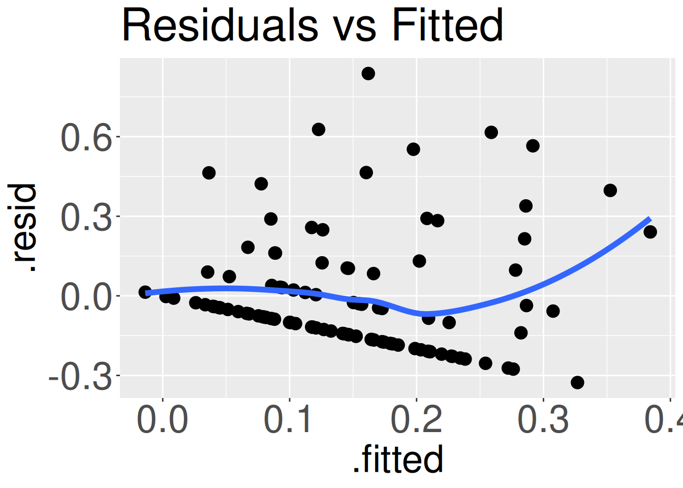
Figure 2: A residuals vs fitted plot from our data. If the relationship was linear, there would be no discernible patterns in these points.
The residual vs fitted plot (Figure 2) shows the fitted value, \(\hat{Y_i}\), on the x-axis, and the residual, \(e_i\), on the y-axis. Ideally, we should see no patterns at all in these data. The curvature of the blue trend line and the distinct downward slope of the set of points in Figure 2 suggest that this model does not fully fit the data. The set of points with that distinct downward slope are all plants with zero hybrid seeds. Later in this book we will see how to model such data. For now however, these issues are noticeable, but not severe.
# Code for residuals vs fitted plotggplot(augmented_hybrid_lm, aes(x = .fitted, y = .resid)) +geom_point()+geom_smooth(se =FALSE)
Evaluating homoscedasticity with the Scale-Location plot
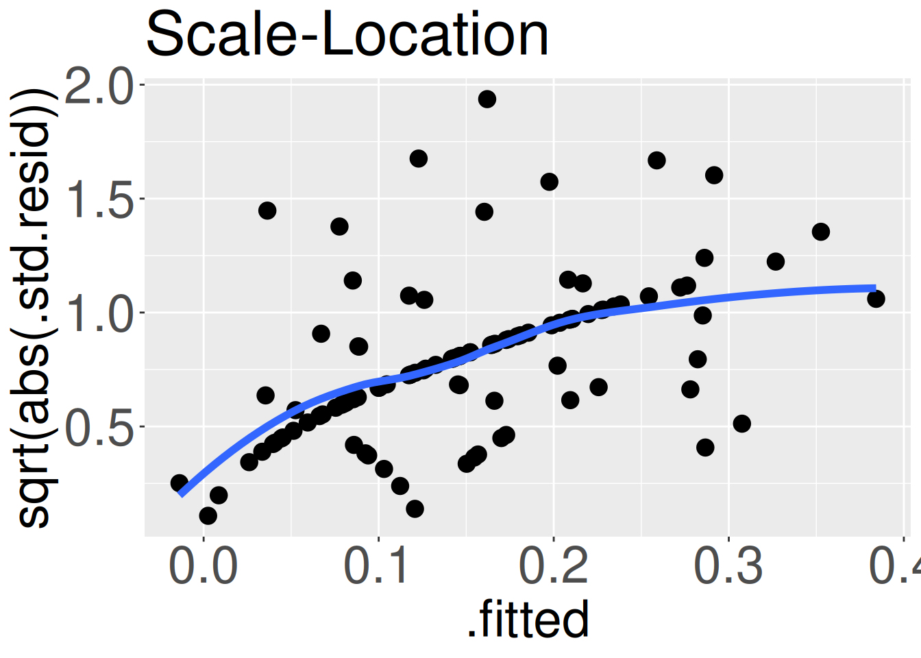
Figure 3: The Scale-Location plot from our model. If residual variance was equal across predicted values, points would randomly deviate about a flat line.
The Scale-Location plot (Figure 3) shows the fitted value, \(\hat{Y_i}\), on the x-axis, and the square-root of the absolute value of the residuals (divided by the standard deviation in residuals) on the y-axis. While that y-axis is a mouthful, it simply communicates how far data are from their predicted value. If the variance of the residual does not change with the prediction (as assumed in linear regression), we should see a cloud of points. Noticeable trends in the best-fit line suggests heteroscedasticity. The positive slope in Figure 3 informs us that the variance in residuals increases with the predicted value. Again, this violation of assumption is real and worth noting, but does not necessarily invalidate any linear regression-based analysis.
# Code for Scale-Location plotggplot(augmented_hybrid_lm, aes(x = .fitted, y =sqrt(abs(.std.resid)))) +geom_point()+geom_smooth(se =FALSE)
Evaluating normality of residuals with a QQ plot
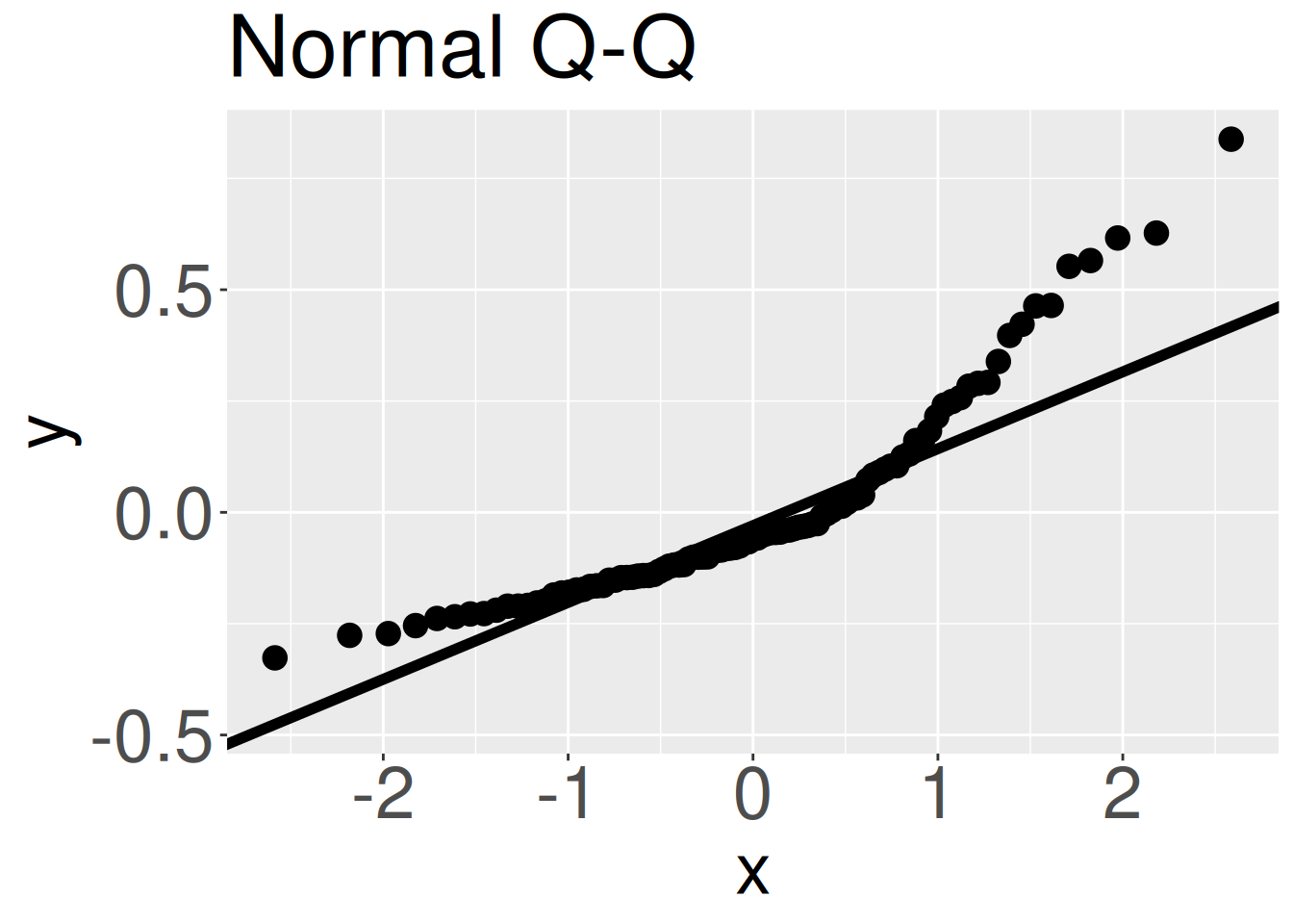
Figure 4: A Q-Q plot from the model. If residuals were normally distributed data points would roughly land along the one-to-one line.
As seen in our introduction to the normal distribution, the assumption of normality is better assessed visually, by, for example, a Q-Q plot, rather than by a formal statistical test. When evaluating the normality of residuals in a linear model, we again use a QQ plot, now plotting residuals from our model rather than raw data. As a reminder, if residuals were normally distributed, the QQ plot would be nearly a straight line. The curving away from the expected one-to-one line in Figure 4 shows that the residuals are not normally distributed. This deviation from the assumption of normality is real, but we know that linear models are often robust to such violations. What to do now?
# Code for Normal QQ plotaugmented_hybrid_lm |>ggplot( aes(sample = .resid)) +geom_qq()+geom_qq_line()
Easily making all of these plots at once
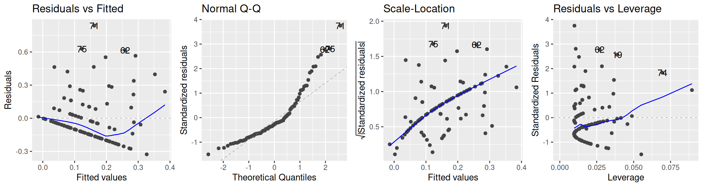
As noted above, you would rarely write the code (like I did) to make these diagnostic plots. Rather, you would use the [autoplot()] function in ggfortify or the plot() function in Base R (no packages needed) to make these plots for you, as in Figure 5.
library(ggfortify)autoplot(hybrid_lm,nrow =1) # or plot(hybrid_lm)
Figure 5: All three diagnostic plots shown above, plus the Residuals vs Leverage plot which shows if any data points have a particularly large influence on our model.
What to do?
The good news is that our study design is pretty straightforward, so we need not worry about violations of the assumptions of unbiased data collection or non-independence. The bad news is that data are somewhat nonlinear, the variance increases with the predicted value, and the residuals are not normally distributed.
There are numerous ways to analyze data that do not meet assumptions of your model, including:
Bringing the model closer to the data by building a more complex model that better matches the data-generating process. This could include adding in another explanatory variable or a polynomial term into the model, or for example, building a mixed effect model to model non-independence, or a generalized linear model to model data whose distribution is better described by a standard parametric but non-normal distribution (e.g. poisson, binomial etc…).
Bringing the data closer to the model by transformation. For example, if \(Y\) grows exponentially with \(X\) a log transform of \(Y\) may make the relationship more linear. When transforming your data, make sure that the transformation both follows the rules of data transformation (e.g. maintaining a monotonic one-to-one correspondence with the raw data), and that the transformed scale is biologically and mathematically interpretable, See the previous section on transformation for more information.
Using nonparametric and/or resampling based approaches to analyze the data. For example, we could bootstrap to estimate uncertainty and permute to test the null hypothesis. Alternatively you could use “rank-based” nonparametric tests like Spearman’s \(\rho\) or Kendall’s \(\tau\) to test the null. However such approaches require thought and caution as “no-parametric” does not mean assumption free.
Cautiously analyzing the data with the simple linear model, while acknowledging minor violations of the assumptions. Linear models are famously robust to minor violations of assumptions, so we can often conduct a linear regression even if we slightly violate the assumptions. In such cases it is worth complementing the linear model with a permutation and bootstrap to ensure that the results of the linear model are trustworthy. This is the approach we will take in this chapter.
Figure 6: I’m just in a meme-y mood this section. Meme of Mark Wahlberg from Shooter
Too often students (and even researchers) spend more time worrying about if data meet assumptions than thinking hard about the scientific model, the data, the statistical hypothesis and how they all relate.
A minor violation of the assumption of equal variance or normal distribution of residuals is rarely a show-stopper. In fact, linear models are often robust to minor violations of these assumptions.
So when assumptions are violated, put your thinking cap on. You can then either proceed with caution (perhaps validating with permutation and/or bootstrapping), or consider a more appropriate alternative statistical model (e.g. modeling nonlinearity) and perhaps look for alternative statistical approaches and/or additional lines of evidence.