Motivating scenario: We have now learned how to fit a regression, interpret a slope, quantify uncertainty, test a null hypothesis, check model assumptions, and compare parametric results to simulation-based approaches. Now you just want to do it!
Learning goals: By the end of this section, you should be able to:
Visualize a linear relationship with a scatterplot and regression line.
This chapter was a bit long. As a quick reference for doing a linear regression in R, I present a simple workflow. This does not mean you should ignore the rest of this chapter - it is key for understanding what goes into these functions and for helping you responsibly interpret this output.
Step 1: Plot the data
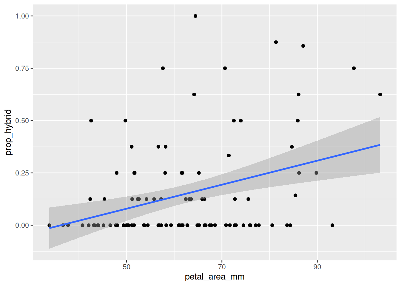
Remember ABP - Always Be Plotting. The first step in any analysis is to look at your data. The code below generates a simple plot with a regression line, like Figure 1.
ggplot(gc_rils, aes(x = petal_area_mm, y = prop_hybrid)) +geom_point() +geom_smooth(method ="lm", se =TRUE)
Figure 1: Relationship between petal area and proportion hybrid seed in Clarkia RILs from the GC site. Points show individual RILs, and the blue line shows the fitted linear regression.
Step 2: Build a model
Now we fit the linear model of the expected proportion of hybrid seed as a linear function of petal area, with R’s lm() function.
hybrid_lm <-lm(prop_hybrid ~ petal_area_mm, data = gc_rils)
Step 3: Extract estimates and uncertainty
Base R’s summary() function gives a lot of useful information about the model:
summary(hybrid_lm)
Call:
lm(formula = prop_hybrid ~ petal_area_mm, data = gc_rils)

Residuals:
     Min       1Q   Median       3Q      Max
-0.32681 -0.14608 -0.05947  0.08676  0.83802

Coefficients:
               Estimate Std. Error t value Pr(>|t|)
(Intercept)   -0.207834   0.099466  -2.089 0.039176 *
petal_area_mm  0.005738   0.001555   3.691 0.000362 ***
---
Signif. codes:  0 '***' 0.001 '**' 0.01 '*' 0.05 '.' 0.1 ' ' 1

Residual standard error: 0.2246 on 101 degrees of freedom
Multiple R-squared:  0.1188,    Adjusted R-squared:  0.1101
F-statistic: 13.62 on 1 and 101 DF,  p-value: 0.0003625
We can also find confidence intervals with R’s confint() function: confint(hybrid_lm). Broom’s tidy function is even slicker!
tidy(hybrid_lm, conf.int =TRUE)
term
estimate
std.error
statistic
p.value
conf.low
conf.high
(Intercept)
-0.2078
0.0995
-2.0895
0.0392
-0.4051
-0.0105
petal_area_mm
0.0057
0.0016
3.6909
0.0004
0.0027
0.0088
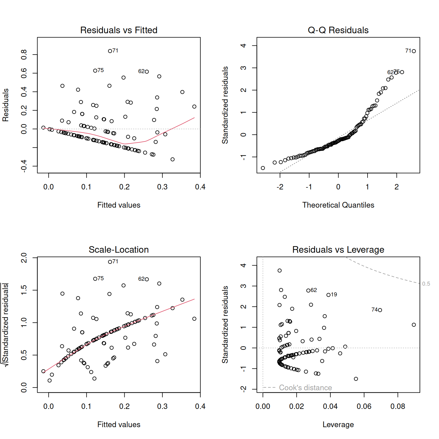
Step 4: Generate diagnostic plots
Before trusting the model too much, we should check whether the model looks reasonable. The plot() function in Base R generates a useful set of diagnostic plots (Figure 2) for lm() objects. See the section on regression assumptions for help on how to interpret these.
plot(hybrid_lm)
When you run this on your computer, R will show you one plot at a time. So for reproducible code, try the trick in the box below.
par(mfrow =c(2, 2))plot(hybrid_lm) # make base r plots 2x2par(mfrow =c(1, 1)) # reset layout
Figure 2: Diagnostic plots for the linear model of proportion hybrid seed as a function of petal area. The residuals vs. fitted plot helps identify nonlinearity or unequal variance; the Q-Q plot helps evaluate whether residuals are approximately normal; the scale-location plot gives another view of changing residual spread; and the residuals vs. leverage plot helps identify observations that may have unusually strong influence on the fitted model.
When data violate assumptions
If data violate assumptions you can:
Build a more appropriate model (we will discuss this later).