Motivating Example: You have data from two groups and want to take a look before doing any formal statistics.
Learning Goals: By the end of this section, you will be able to:
Plot data from two groups:
To compare distributions with histograms and density plots.
To compare means and quantiles with a box plot.
To compare the entire data with jitter or sina plots.
And to show means and uncertainty in this plot.
Choose among these plots depending on your goal, and recognize common pitfalls.
Identify over-plotting and use simple strategies to address it.
For this section we will compare the average number of pollinator visits over a 15 minute interval to white and pink Clarkia RILs at site SR. I’ll load and prep the data to get started.
The first step in any data analysis is to look at the data. Here we’ll reintroduce some of the best ways to do this when comparing two groups. See our introduction to ggplot for our initial presentation of these ideas.
Visualizing distributions
Parametric statistical approaches - like the two sample t-test, which we focus on in this chapter, make assumptions about the distribution of data. Specifically, linear models assume a normal distribution of residuals. We will consider these assumptions later in this chapter. But here I introduce two kinds of plots – histograms and density plots – that highlight the distribution of the data.
Histograms show the distribution of our data by putting each data point in a “bin” within a range. That bin-range is shown on the x-axis. The y-axis – labelled “count” by default in ggplot – shows the number of data points in each bin. Of course, there is rarely a “natural” or “correct” size of a bin, rather we must choose which size is appropriate. This choice involves a trade-off:
If you do not make an explicit choice, you are choosing 30 bins (R’s default).
The fewer bins the “smoother” the plot. This means variability due to noise is unlikely to distract us, but truly interesting patterns (e.g. subtle bimodality) may be “smoothed over.”
The more bins, the more “granular” the plot. This can reveal subtle patterns that could be missed with fewer bins, but any such pattern may be a mirage.
Specifying bin size in R
Fortunately, you are not bound by an initial choice. In fact, I suggest experimenting with a few bin sizes to help you best understand your data, before choosing one that best communicates your results. There are two ways to specify the smoothing of a histogram in ggplot:
Specifying the width of the bin with the binwidth argument in geom_histogram().
Specifying the number of bins with the bins argument in geom_histogram().
Visually comparing groups with histograms
There are a few ways to use a histogram to compare the distributions between groups. The code below shows that you can do this by noting group by color and piling observations on top of one another. But, I find this difficult to interpret, and prefer using small multiples by adding:
facet_wrap(~petal_color, ncol = 1) to show the data in one column (“commented out” below).
facet_wrap(~petal_color, nrow = 1) to show the data in one row (change ncol = 1 to nrow = 1 in the “commented out” section below).
Histogram Practice
Use the webR environment, below, to compare the distribution of the pollinator visits of white- and pink-flowered Clarkia RILs. Then answer the challenge questions. In doing so:
Be sure to change the “smoothing”.
Experiment with different arrangements of “small multiples” with ncol and nrow arguments in the facet_wrap function.
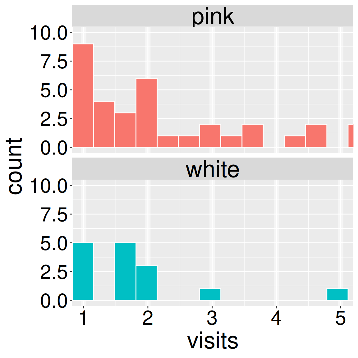
Figure 1: Use this snippet of the histogram to answer question three (left).
Before starting these questions, change the number or width of bins to find a reasonable “smoothing”.
Q1. Which of the following is FALSE?
Q2. Because on average pink-flowered genotypes receive more pollinator visits than white-flowered genotypes, the data appear bimodal before considering petal color.
Q3. Visually approximate the binwidth for the data shown in Figure 1. .
Density plots
Rather than counting the observations in a bin, we can fit a mathematical function to the shape of the distribution. Such “density plots” often allow readers to better compare distributions than histograms. A density plot displays the same message as a histogram, but now the y-axis is labelled “density” and represents the relative proportion of the data estimated to lie at a specific x-value from the model of counts. Thus the area under the curve integrates to one.
Specifying the “kernel density” (smoothing) in R
As in a histogram, we can control the smoothness of a density plot, and again we have the same trade-off between smoothing over noise (raising geom_density’s adjust argument above one), and revealing subtle patterns (lowering geom_density’s adjust argument below one).
Visually comparing groups with density plots
Finding the right transparency.
Setting alpha to zero makes the fill fully transparent.
Setting alpha to one makes it fully opaque.
I suggest experimenting with alpha between 0.3 and 0.8, and seeing which works best for your purpose.
A major advantage of density plots over histograms is that we can visually compare overlaid distributions. However to do so we must be able to see both distributions. So we must make the plots semi-transparent. In ggplot, this is controlled by the alpha argument.
Density plot practice
Use the webR environment, below, to compare the distribution of the pollinator visits of white- and pink-flowered Clarkia RILs. Then answer the challenge questions. In doing so:
Experiment with different transparencies. Try setting alpha to 0.8, 0.5, 0.2, and 0.
Be sure to change the “smoothing”. Note that I initially set adjust to a stupidly large number. Start by trying adjust values of 2, 1, and 0.5.
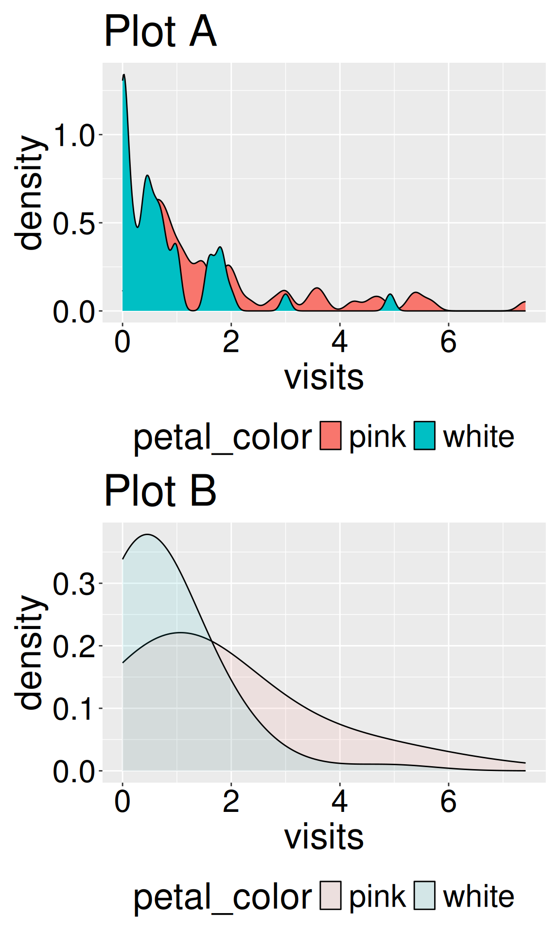
Figure 2: Use these density plots to answer questions four through six, below.
Use your R efforts and Figure 2 below to answer the following questions:
Q4.geom_density(adjust =0.3, alpha= 1) makes .
Q5.geom_density(adjust =1, alpha= 1) makes .
Q6.geom_density(adjust= 3, alpha= 0.1) makes .
Density plots do not show the actual data. Rather density plots show a function that is meant to approximate the data. Always look at the actual data to be sure that the density plot is not misleading you.
Visualizing width and center
Histograms and density plots are the first step in exploratory data analysis. As such, these plots are for the person analyzing the data (you), and others deeply interested in the data analysis (your collaborators and mentors etc). Histograms and density plots are rarely best for communicating differences in means for a broad audience. Rather than highlighting the distribution, a good presentation of a between-group comparison should show:
All of the underlying data.
The estimated mean for each group.
The uncertainty in this estimate, usually as a 95% confidence interval.
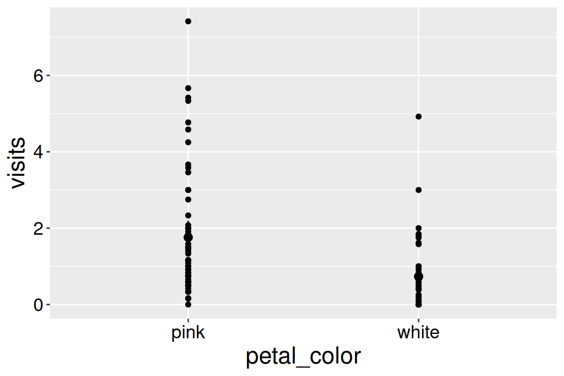
Let’s get started with our first attempt at such a plot. To show our data, we map our explanatory variable onto the x-axis, and our response variable onto the y-axis. To show the estimated mean and uncertainty about it, we use the stat_summary() function. It is best to have our plots match our stats, so in stat_summary() we set fun.data = "mean_cl_normal". When we specify mean_cl_normal for the fun.data argument, ggplot uses a function from the Hmisc package, so you may need to install it by entering install.packages("Hmisc") and load it by entering library(Hmisc).
library(Hmisc)SR_visits |>ggplot(aes(x = petal_color, y = visits)) +geom_point()+stat_summary(fun.data ="mean_cl_normal")
Figure 3: Pollinator visits by petal color. Error bars show 95% confidence intervals.
Say what error bars represent! Most scientists know to add “error bars” to their plots. But unfortunately, many different “error bars” accompany an estimate. The most common are 95% confidence intervals (like those above), or some number of standard errors. Sometimes people use bars, not to show uncertainty but rather to summarize variability (e.g. as standard deviations).
The best practice is to show 95% confidence intervals and tell the reader that in the figure caption.
Overplotting and its solution
Showing all the data plus the estimated mean and uncertainty is not as easy as it sounds. As you can see from Figure 3, simply using geom_point() hides a bunch of data. For example, we know from our histograms that white-flowered genotypes have many “zero” visits, but we can only see one because they are all on top of each other. This phenomenon, known as “overplotting”, ironically hides your data in trying to show it all.
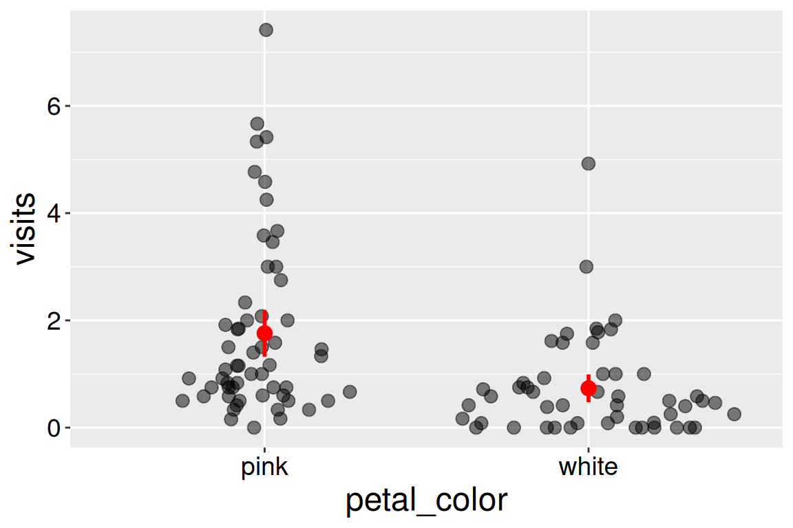
(almost) always set height = 0 in geom_jitter() – We do not want to mislead by giving the impression of excess variation in our response variable. Similarly, you can experiment with width but be sure that a reader can unambiguously know which data point is associated with which value of the categorical predictor.
As you can see from Figure 4, the sina plot spreads data out - much like a jitter plot - but in doing so, it makes the local spread of the data on the x-axis proportional to the density of these data. I also made the points larger and more transparent to better see each data point, and showed estimated means and uncertainty in red to ensure these summaries do not get confused for raw data.
library(Hmisc)library(ggforce)SR_visits |>ggplot(aes(x = petal_color, y = visits)) +geom_sina(size =3,alpha = .5)+stat_summary(fun.data ="mean_cl_normal", color ="red", size = .7, linewidth =1)
Figure 4: Pollinator visits by petal color. Red points and lines show the estimated means and 95% confidence intervals. Points are spread horizontally according to local data density to reduce overplotting.
What we see in these visualizations
From our visualizations we see that very few white- and pink-flowered RILs receive many visits while most receive few visits - i.e. the data are right-skewed. In particular many white-flowered RILs received no visitors. We also see that pink-flowered RILs receive more pollinator visits on average than do white-flowered RILs, and that the 95% confidence intervals hardly overlap.
Next steps
The rest of this chapter is dedicated to estimating the difference in means, the uncertainty about this difference and how to test the null that the observed difference represents sampling error from a single population with the same mean.
To do this, we will build off of our understanding of the t-distribution from the previous chapter. But doing this requires that we evaluate whether data fit the model assumptions.