Here’s a brief run down of the key functions and pipelines used in this chapter.
Two categorical variables
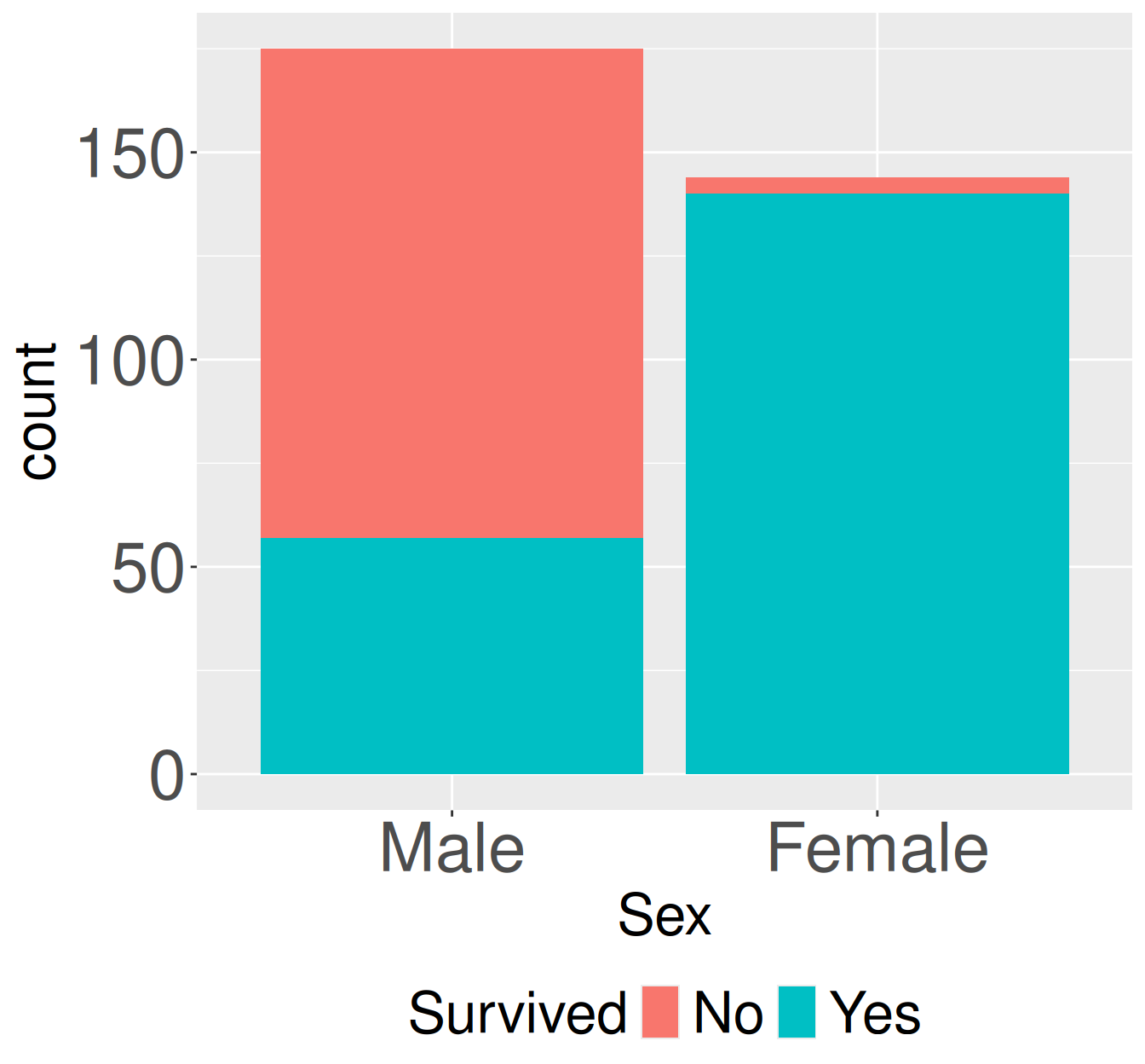
Lets look at a new (classic) data set - the survival of adults sitting first class on the Titanic. The code below takes the data from old-R style into the tidyverse framework we’re used to. The data now look like this:
Rows: 319
Columns: 2
$ Sex      <fct> Male, Male, Male, Male, Male, Female, Male, Female, Female, M…
$ Survived <fct> No, Yes, Yes, No, No, Yes, Yes, Yes, Yes, No, Yes, Yes, Yes, …
Survival counts for adult first-class passengers on the Titanic by sex. Stacked bars show the number of adult first-class passengers who did or did not survived, separated by sex.
Sex
prop_survived
Male
0.326
Female
0.972
library(dplyr)library(janitor)library(ggplot2)# making plottitanic_first_class_adults |>ggplot(aes(x = Sex, fill = Survived))+geom_bar()# finding conditional proportionstitanic_first_class_adults |>tabyl(Sex, Survived) |>mutate(n_tot = No + Yes) |>mutate(prop_survived = Yes / n_tot) |>select(Sex, prop_survived)
     Sex Survived Freq
1   Male       No  118
2 Female       No    4
3   Male      Yes   57
4 Female      Yes  140
Often categorical data comes summarized as counts, as above. When this is the case we can still proceed without much delay. We just need a few different R tricks.
For plotting, map the “count” column (in this case Freq) onto y in aes and use geom_col() instead of geom_bar().
For counting and summarizing we “munge” the data to make it easy to deal with. In this case, we first make the data wide with tidyr’s pivot_wider() function.
library(dplyr)library(janitor)library(ggplot2)library(tidyr)# making plottitanic_first_class_adults_counts |>ggplot(aes(x = Sex, y = Freq, fill = Survived))+geom_col()# finding conditional proportionstitanic_first_class_adults_counts |>pivot_wider(names_from = Survived, values_from = Freq) |>#make it wide# now were back to the previous version after tabylmutate(n_tot = No + Yes) |>mutate(prop_survived = Yes / n_tot) |>select(Sex, prop_survived)
A binary and continuous variable
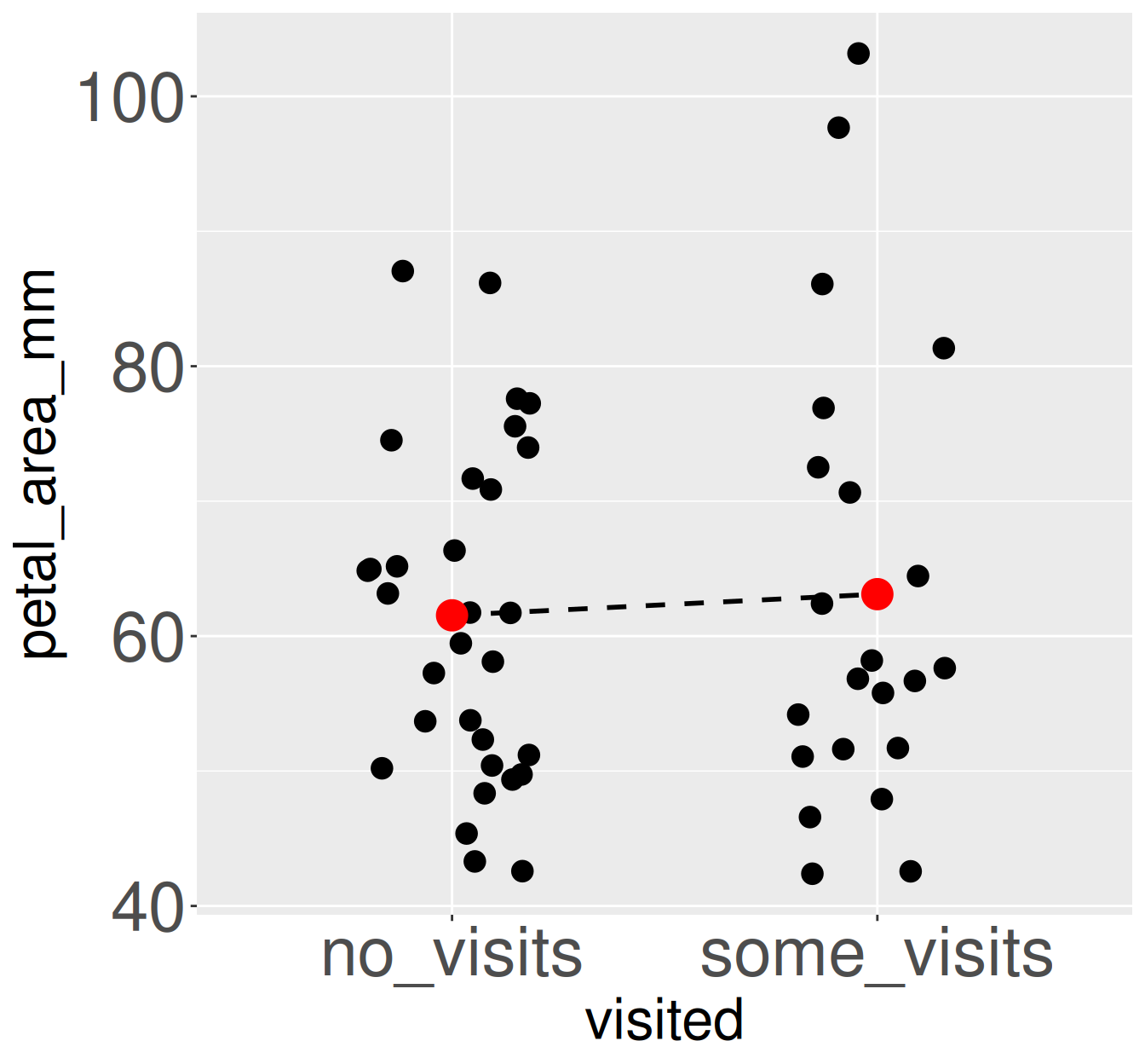
Returning to Clarkia RIL’s let’s compare petal area of pink plants at GC that were and were not visited by pollinators.
Mean petal area differs slightly between visited and unvisited pink-flowered RILs at the GC site. Each point represents an individual pink-flowered recombinant inbred line (RIL). Black points show individual observations. Red points indicate group means for plants receiving no visits and those receiving at least one visit. The dashed line connects the group mean.
visited
mean_petal_area
no_visits
61.5
some_visits
63.1
Cohens_d
CI
CI_low
CI_high
0.11
0.95
-0.44
0.66
library(effectsize)library(ggplot2)library(dplyr)# Make a plotpink_gc_rils |>ggplot(aes(x = visited, y = petal_area_mm))+geom_jitter(width = .2)+stat_summary(aes(group =1), geom ="line", lty =2)+stat_summary(geom ="point", color ="red",size =2)# Conditional meanspink_gc_rils |>group_by(visited) |>summarise(mean_petal_area =mean(petal_area_mm))# Cohen's Dcohens_d(petal_area_mm ~ visited, data = pink_gc_rils,reference ="no_visits")