library(GGally)
ggpairs(gc_rils)6. Associations: Part I
Motivating Scenario:
You’re curious to know the extent to which two variables are associated and need background on standard ways to summarize associations.
Learning Goals: By the end of this chapter, you should be able to:
Recognize the difference between correlation and causation
- Memorize the phrase “Correlation does not necessarily imply causation,” explain what it means and why it’s important in statistics, and know that this is true of all measures of association.
- Identify when correlation may or may not reflect a causal relationship.
- Memorize the phrase “Correlation does not necessarily imply causation,” explain what it means and why it’s important in statistics, and know that this is true of all measures of association.
Explain and interpret summaries of associations with a binary explanatory variable
- Describe an association between two binary variables.
- As differences in conditional proportions.
- As differences in conditional proportions.
- Describe an association between a binary explanatory variable and a continuous response
- As differences in conditional means.
- As an “effect size”.
- As differences in conditional means.
- Use R to calculate and interpret summaries of association.
- Use R to visualize difference between two categorical predictor values.
- Describe an association between two binary variables.
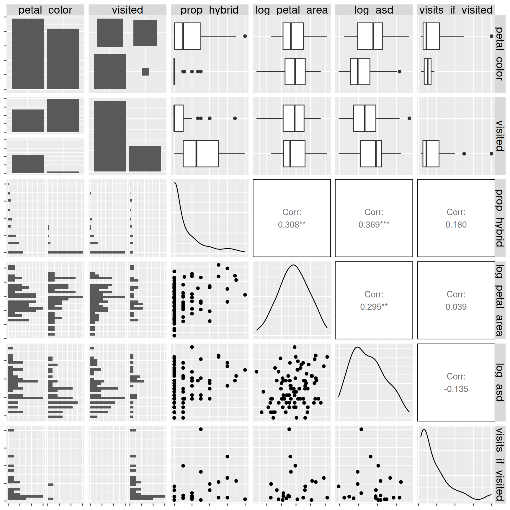
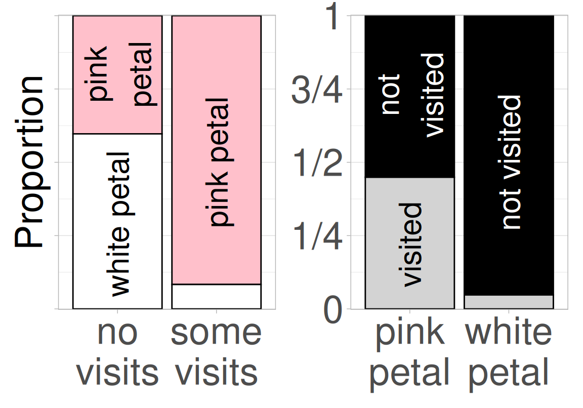
- It looks like pink flowers have a way better chance of receiving at least one pollinator than white flowers do.
- Despite our attempts to genetically disentangle floral traits by creating Recombinant Inbred Lines (RILs), an association between petal area and anther stigma distance remains.
Of course, our ultimate ambition is to do more than just characterize the association between variables. Rather, we ultimately aim to know what such associations imply. We want to:
- Predict one variable from another.
- Anticipate what some intervention will do to a biological system.
In future chapters we will see when and how we can achieve these higher goals. But for now, know that a correlation is just a description. That is:
We cannot make causal claims or even good predictions from correlations alone.
Correlation is not causation
“Correlation is not causation.” While you’ve heard this before, let’s break it down to internalize this idea. Let’s look at the two key concepts in that statement:
I am using the concept of “correlation” broadly for all types of associations. So this is not limited to the strict quantification of correlation as \(r = \frac{Cov_{x,y}}{s_x \times s_y}\) which we will learn soon.
- Correlation means that two variables are statistically associated.
- A positive association means that when one variable is large (or small) the other is often large (or small).
- A negative association means that when one variable is large (or small) the other is often small (or large).
- A positive association means that when one variable is large (or small) the other is often large (or small).
- Causation means that changing one variable produces a change in the other (see Wikipedia for more discussion of “causation”.)
Correlation is often confused for causation because it’s easy to assume that if two things are associated, one must be causing the other. This is especially tempting when the association makes sense to us. But of course, this is wrong. While correlation may hint at causation, a direct cause is neither necessary nor sufficient to generate a correlation. Take the video in Figure 2 – an alien might think this man is starting and stopping the train, but clearly he has nothing to do with the train starting or stopping.
Three mechanisms may underlie a correlation without a causal relationship: Coincidence, Confound, and Reverse causation.
- Coincidence: Chance is surprisingly powerful. In a world full of many possible combinations between variables, some strong associations will arise purely by luck. Later sections of the book will show how to evaluate the “NULL” hypothesis that an observed association arose by chance.
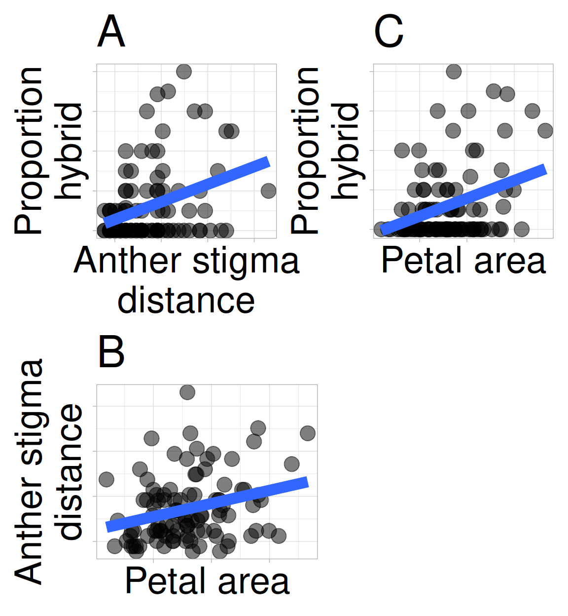
Confounding: An association between two variables may reflect not a causal connection between them – but rather the fact that both are caused by a third variable (known as a confound). Such confounding may be at play in our RIL data – we observe that anther–stigma distance is associated with the proportion hybrid seed, but anther–stigma distance is also associated with petal area (presumably because both are caused by flower growth), which itself is associated with the proportion of hybrids (Figure 2.1). So, does petal area or anther stigma distance (or both or neither) cause an increase in proportion of hybrid seed? The answer awaits better data, or at least better analyses (see section on causal inference), but I suspect that petal area, not anther stigma distance “causes” proportion hybrid. Unfortunately, we rarely know the confound, let alone its value. So, interpreting any association as causation requires exceptional caution.
Reverse causation: Figure 4 shows that pink flowers are more likely to receive a pollinator than are white flowers. We assume this means that pink attracts pollinators, and with the caveat that we must watch out for coincidence and confounds, this conclusion makes sense. However, an association alone cannot tell if pink flowers attracted pollinators or if pollinator visitation turned plants pink. In this case the answer is clear – petal color was measured for RILs in the greenhouse, and there’s no biological mechanism by which a pollinator could change petal color. However, these answers require us to bring in biological knowledge – the data alone can’t tell us which way the effect goes.
I’m dealing with this issue right now! In natural hybrid zones, white-flowered parviflora plants tend to carry less genetic ancestry from xantiana (their sister taxon) than do pink-flowered parviflora plants. There are two potential explanations for this observation:
Perhaps, as the RIL data suggests, white-flowered parviflora plants are less likely to hybridize with xantiana than are pink-flowered parviflora. Thus, white parviflora came from a lineage of white-petalled plants whose petal color helped prevent introgressive hybridization. As such white-flowered plants have less xantiana ancestry (pink flowers cause more gene flow).
Alternatively, because all xantiana are pink-flowered, while parviflora can be white or pink, it’s possible that pink-flowered parviflora plants acquired their pink color from introgressive hybridization with xantiana (more gene flow causes pink flowers).
I do not yet know the answer.
TipMaking things independent
If we cannot break the association between anther stigma distance and petal area by genetic crosses maybe we could do so by physical manipulation. For example, we could use tape or some other approach to move stigmas closer to or further from anthers.
There is still value in finding associations
The caveats above are important, but they should not stop us from finding associations. With appropriate experimental designs, statistical analyses, biological knowledge, and humility in interpretation, quantifying associations is among the most important ways to summarize and understand data.
The following sections provide the underlying logic, mathematical formulas, and R functions to summarize associations.
Let’s get started with summarizing associations!
The following sections introduce how to summarize associations between variables by:
- Describing associations between two categorical variables, and
- Describing associations between a categorical explanatory and numeric response variable including differences in conditional means, and Cohen’s D, and tools for visualizing associations between a categorical explanatory variable and a numeric response.
Then we summarize the chapter, present practice questions, a glossary, a review of R functions and R packages introduced, and present additional resources.
In the next chapter we will continue our study of associations as we will investigate relationships between continuous variables!