• 2. Many explanatory vars
Motivating scenario: You want to visualize associations between a response variable and numerous explanatory variables.
Learning goals: By the end of this sub-chapter you should be able to
- Use the
colororfillaesthetics to map categorical variables.
- Use “small multiples” with
facet_wrap()andfacet_grid()
NoteUnscroll for code to access the
ril_data dataset for this section
# Be sure the readr, dplyr, and ggplot2 packages are installed
library(readr)
library(dplyr)
library(ggplot2)
ril_link <- "https://raw.githubusercontent.com/ybrandvain/datasets/refs/heads/master/clarkia_rils.csv"
ril_data <- readr::read_csv(ril_link)|>
  dplyr::select(location,  ril, prop_hybrid,  mean_visits,
                petal_color, petal_area_mm,  asd_mm)|>
  dplyr::mutate(visited = mean_visits > 0)
The challenge of many explanatory variables
There is usually more than one thing going on in a scientific study, and we may want to see how different combinations of explanatory variables are associated with a response. This can be a challenge. Over the term you will encounter many tips and tricks to help in this task. For now we will look at two useful approaches:
- Mapping different explanatory variables to different aesthetics.
- The use of “small multiples”.
Multiple aesthetic mappings
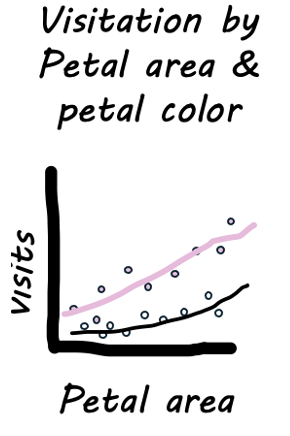
We saw that the number of pollinator visits increased with petal size and was greater for pink than white flowers. However, visualizing a response variable as a function of its multiple explanatory variables together can clarify the patterns.
- To do so we can make a scatterplot and map petal color onto the color aesthetic.
- We can even use size and color as extra aesthetics to map onto. I show you how to do this, but use it sparingly, because too many extra aesthetics may provide more distraction than insight.
ril_data |>
  filter(!is.na(petal_color))|>
  ggplot(aes(x = petal_area_mm,
             y = mean_visits,
             color  = petal_color))+
  geom_point(size = 3, alpha = .4)+
  geom_smooth(method = "lm", se = FALSE)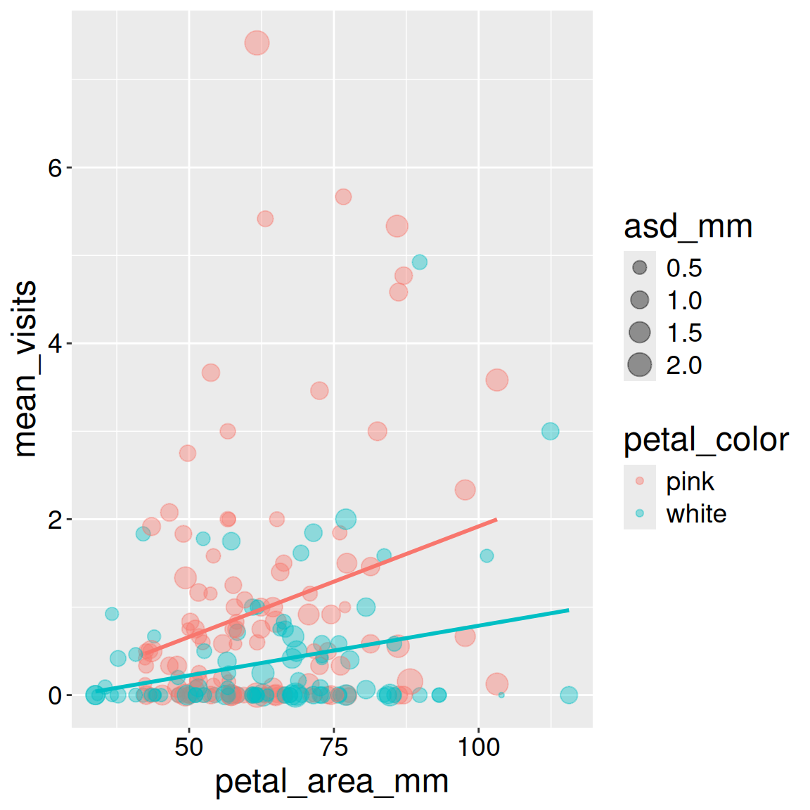
Here I added anther stigma distance as another explanatory variable by mapping it onto size. Note that:
- I removed the
size = 3argument fromgeom_point()otherwise it would not map asd onto size.
- In this case, it did not reveal much and was probably not worth doing.
ril_data |>
  filter(!is.na(petal_color))|>
  ggplot(aes(x = petal_area_mm,
             y = mean_visits,
             color  = petal_color))+
  geom_point(aes(size = asd_mm), alpha = .4)+
  geom_smooth(method = "lm",show.legend = FALSE, se = FALSE)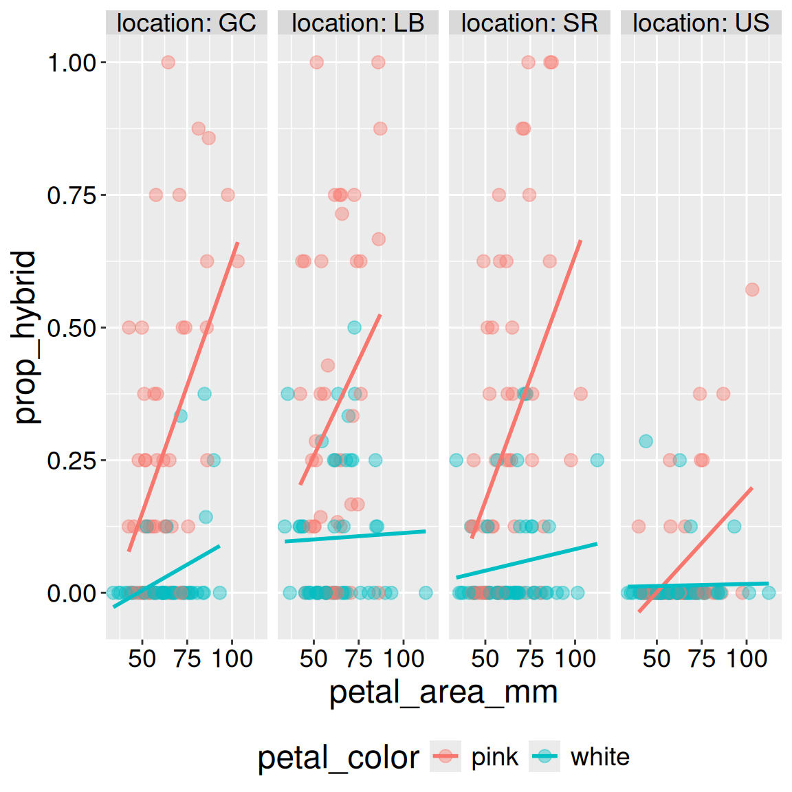
Interpretation: Returning to the motivating question, we see that visitation increases with both petal area (positive slope) and pink petals (the red line is higher than the blue line). Later in the term, we will address this question more rigorously.
Small multiples
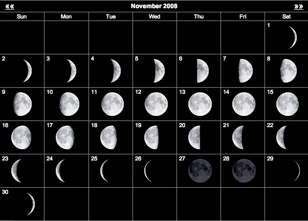
At the heart of quantitative reasoning is a single question: Compared to what? Small multiple designs, multivariate and data bountiful, answer directly by visually enforcing comparisons of changes, of the differences among objects, of the scope of alternatives. For a wide range of problems in data presentation, small multiples are the best design solution.
- Edward Tufte (Tufte, 1990)
Edward Tufte, a major figure in the field of data visualization, popularized the concept of small multiples. Small multiples show data with the same structure across various comparisons. Tufte argued that such visualizations can help our eyes make powerful comparisons (see quote above). For example, the lunar phase can be well visualized by using small multiples (Figure 1).
For our analyses, we may find that adding location as a variable helps us better see and understand patterns. Additionally, small multiples are sometimes preferable to mapping different categorical variables onto different aesthetics. I show these examples below:
We can add a small multiple with a “facet”. For a single categorical variable, use the facet_wrap() function. Here are some notes and options:
- The first argument is
~ <Thing to facet by>, e.g.~ location.
- You can specify the number of rows or columns with
nroworncolarguments.
- The
labeller = "label_both"shows the variable name in addition to its value.
- Occasionally, you may want different facets on different scales. You can use the
scalesargument with options,free_x,free_y, andfree.
ril_data |>
  filter(!is.na(petal_color))|>
  ggplot(aes(x = petal_area_mm,
             y = prop_hybrid,
             color  = petal_color))+
  geom_point(size = 3, alpha = .4)+
  facet_wrap(~ location, nrow = 1, labeller = "label_both")+
  geom_smooth(method = "lm", se = FALSE)+
  theme(legend.position = "bottom")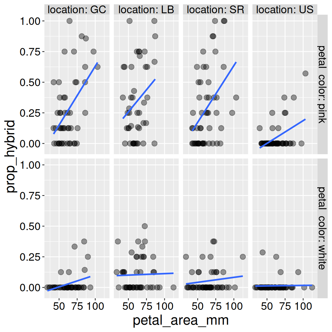
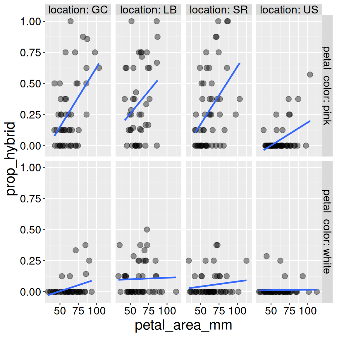
For two categorical variables, use the facet_grid() function. Here are some additional notes and options:
- The first argument is
<Row to facet by> ~ <Column to facet by>, e.g.petal_color ~ location.
- You can no longer specify the number of rows or columns.
- I have shown the same data as the previous plot in a different way. But you can see that this adds room for mapping another variable.
ril_data |>
  filter(!is.na(petal_color))|>
  ggplot(aes(x = petal_area_mm,
             y = prop_hybrid))+
  geom_point(size = 3, alpha = .4)+
  facet_grid(petal_color ~ location, labeller = "label_both")+
  geom_smooth(method = "lm", se = FALSE)