![An xkcd comic with the title, My Hobby: Extrapolating. [There is a graph. Time runs along the horizontal axis; Number of Husbands on the vertical graph. Yesterday and today are labeled in time, 0 and 1 in number of husbands. Points are plotted with 0 at yesterday, 1 at today. A straight line is fitted through them, and dotted lines joining perpendicularly the points to the axes.] [Cueball is holding a pointer to the graph, and looking at Megan wearing a bridal train and veil, who seems to be thinking.] Cueball: As you can see, by late next month you'll have over four dozen husbands. Cueball: Better get a bulk rate on wedding cake.](https://imgs.xkcd.com/comics/extrapolating.png)
• 18. Regression caveats
Motivating example: You now have a linear model that you feel good about! You are excited to unleash it on the world and make predictions. Before you get carried away, consider these limitations.
Learning goals: By the end of this section, you should be able to:
Explain when and where it is (un)safe to generate predictions from a linear regression equation.
Judge if a rogue data point or two are hijacking your model.
Recognize the impact of error in measuring explanatory and/or response variables on the estimation of slopes and correlations.
To me, at least, the idea of having an equation to make predictions is super compelling. I mean you collect some data, fit a model, and now you can suddenly make predictions about the world. I often find myself getting carried away. So before getting too wild, I wanted to provide a few notes about when we can and cannot trust regression predictions..
Be Wary of Extrapolation
Someone\(^*\) famously said:
\(^*\) It is not clear who said this first – it has been attributed to Niels Bohr, Yogi Berra, Mark Twain, and even Nostradamus. This is an example of how “famous things that are said… tend to be attributed to even more famous people.” Have a listen to this fun episode of Under Understood for more.
Det er vanskeligt at spaa, især naar det gælder Fremtiden.
It is difficult to predict, especially when it comes to the future.
This quote captures a challenge in using the regression equation (or any statistical model) to make predictions. Models can make useful predictions, but those predictions are most trustworthy for cases that resemble the data used to fit the model. This issue has inspired a related quote:
It is difficult to predict from a linear regression, especially when it comes to data outside the model’s range or context.
NOTE: This issue goes beyond the standard linear modeling assumptions, even if all assumptions are met (see regression assumptions), predictions made outside the range or context of a model cannot be trusted.
Do not predict out of range
Recall our linear model:
\[\text{PROP HYBRID} = -0.208 + 0.00574 \times \text{PETAL AREA}\]
This model can predict the proportion hybrid seed of a RIL with a petal area \(10\text{ mm}^2\) or \(150\text{ mm}^2\) as -0.15 and 0.65, respectively. The problem is that these predictions are garbage.
We should not trust them because the petal areas are outside of the range for which we collected data. The prediction of a negative proportion of hybrid seeds for the hypothetical RIL with a petal area of \(10 \text{ mm}^2\) makes this obvious. But even the plausible sounding prediction for a RIL with a petal area of \(150 \text{ mm}^2\) is suspect for the same reason – we have no observations to ground this prediction. Figure 1 shows how silly such extrapolation can get.
Do not predict out of context
Just like we should not trust prediction for values outside the range in which we collected our data, we should be skeptical of predictions in conditions that differ from the context of our data.
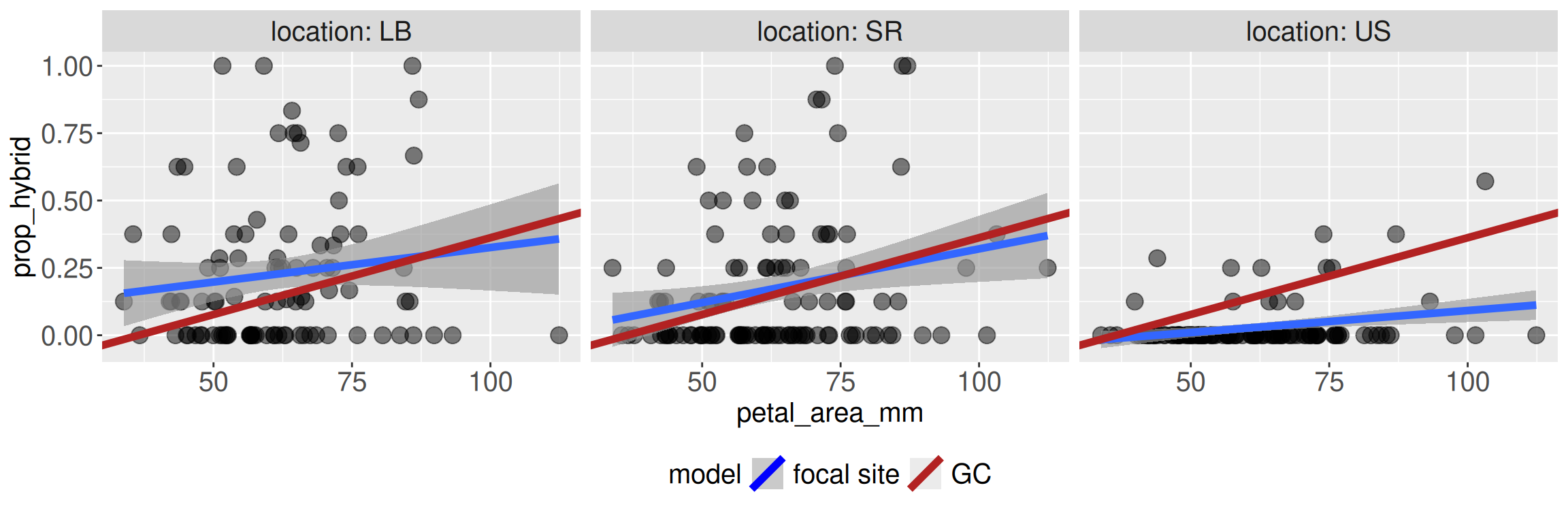
For example, in our study we examined RILs planted in four different field sites. Predictions from site GC may not apply to other sites. Why? Because they are different! They could have different numbers and types of pollinators, or different weather etc. Figure 2 shows that the predictions from the model built from GC data (red line) happen to fit the Sawmill Road (SR) data relatively well, but makes terrible predictions at the Upper Sawmill (US) location.
The problem in porting predictions is not that the regression equation stopped working mathematically. The problem is that we asked it a biological question that the GC data alone could not answer.
Do not get pushed around by extremes
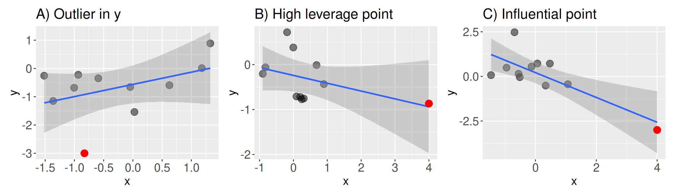
A linear model finds the line that best fits all of the data. But not all data points are the same. Occasionally a scatter plot reveals some extreme observations (e.g. Figure 3).
An Outlier has an extreme value of \(Y\), or more precisely, an extreme residual value (Figure 3 A). What is extreme? As a rule of thumb, a data point two standard deviations away from its expected value (a standardized residual of two or more) is somewhat suspect.
A High Leverage Point: has an extreme value of \(X\) (Figure 3 B).
An Influential Point: strongly changes the result of a regression. Influential points are both outliers and high leverage points (Figure 3 C).
Identifying extreme points
You can usually spot extreme values by looking at a scatter plot like Figure 3. Of course, in real life, points do not come colored by how extreme they are. However, there are some standard numerical summaries that can help us identify extreme points (Table 1).
| Summary | What it tells us | When to take note |
|---|---|---|
Standardized residual (augment header: .std.resid) |
Quantifies how “outlier-\(y\)” a point is. Calculated as the residual divided by the standard deviation of residuals | When it is greater than two. |
Leverage (augment header: .hat) |
Quantifies how “outlier-\(x\)” a point is. The calculation is complicated so check Wikipedia for more. | When it is greater than two times the number of model parameters divided by the sample size. |
Cook’s distance (augment header: .cooksd) |
Quantifies “influence” as how much the fitted model would change if that observation were removed. | When it is either greater than one or if it is greater than four divided by the sample size. |
Identifying exteme points with augment()
All summaries in Table 1 are output by broom’s augment() function. The code below reminds you of the syntax required to generate something like Table 2:
extreme_example <- lm(y ~ x, data = influential_point)
augment(extreme_example)Identifying exteme points with plot() or autoplot()
We could peruse all of augment()’s output for each data point, or use our dplyr skills to find potentially concerning data points using thresholds in Table 1. However, these approaches are tedious.
In R we can make “Residuals vs Leverage” plots by providing the linear model to either the plot() function in Base R, or the autoplot() function in the ggfortify package. These are the same functions we previously used to generate “diagnostic plots”.
It’s easiest to just look at these summaries and spot potentially concerning data points. In addition a plot of the raw data (e.g. Figure 3), a “Residuals vs Leverage” plot can help identify potentially problematic points. As seen in Figure 4, such plots display “leverage” (how extreme a point is for the explanatory variable) on the x-axis, and the standardized residual (how extreme a point is for the response variable) on the y. While extremes in leverage or residuals are worth noting, the most concerning data points (i.e. the “influential points”) are extreme for both. Thus, we pay special attention to the points in the top or bottom right of the residuals vs leverage plot. Helpfully when making this plot with the plot() function, R provides lines to show Cook’s distance.
extreme_example <- lm(y ~ x, data = influential_point)
plot(extreme_example, which = 5)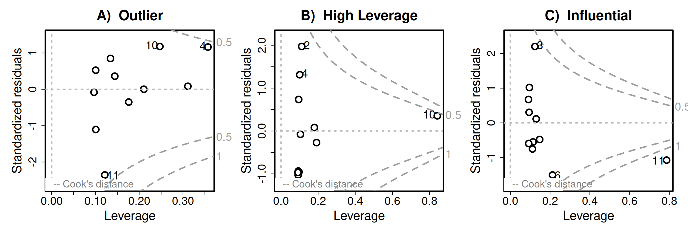
What to do with extreme points?
Whenever you encounter an extreme point, first verify that the point is real, and if it is real ask whether it influences your results, and then draw an honest conclusion.
Verify the data. We all make mistakes, so before getting carried away, make sure the extreme point is legit. Go back to the original data sheet and see if something obvious went wrong. Perhaps a value was reported in centimeters rather than millimeters, an eight was mistaken for a zero, or a decimal point was entered in the wrong place. If the extreme value was simply a mistake, fix it if you know the correct value. If you do not know the correct value, document the problem and treat the value as missing.
See if your results are sensitive to the extreme point. In a sensitivity analysis, we rerun our analysis after making a reasonable change to the data (or model in other cases). So, compare results of a model with and without the extreme point, and compare the results. Did the slope change a little or a lot? Did the sign change? Did our biological conclusion change? It is usually best to report both analyses, especially if they lead to different interpretations.
Come to a conclusion. If your sensitivity analysis revealed that your results are robust to this extreme point, that’s great. If not, be honest that the conclusion depends on that observation. Then interpret results from both models cautiously. If you want a more formal approach, you can also try a robust regression method (Wikipedia page, review paper).
Take-home message. As with all topics in statistics our goal is not to have a clean result, or achieve statistical significance. Rather, our goal is to understand our results and clearly communicate this understanding.
An extreme example
Let’s take a quick break from our Clarkia data (because there weren’t super obvious worrisome points), and turn to a data set that is quite easy to generate - the association between height (in inches) and shoe size (in centimeters). The data (available here comes from 33 male college students.
I will first make a simple x-y scatter plot – with X as foot length and y as height. But rather than making a simple plot, I will:
- First put the data through a simple linear model and give the model output to
broom’saugment()function. This will not change the data I plot at all.
- But I can now attach additional information to each data point (including
id = 1:n()).
- Then I can make a plot and then make it interactive with the
ggplotly()function in theplotlypackage.
You don’t need to do this - but I am to give you a more thorough view:
# Loading the data and libraries
library(readr)
library(ggplot2)
library(broom)
library(plotly)
library(dplyr)

shoe_link <- "https://online.stat.psu.edu/stat462/sites/onlinecourses.science.psu.edu.stat462/files/data/height_foot/index.txt"
shoe_data <- read.delim(shoe_link) # I use read_delim instead of read_csv because it's a .txt file, not a .csv
shoe_lm <- lm( height ~ foot , data = shoe_data)
augmented_shoe <- augment(shoe_lm)  |>
  mutate(sample_id = 1:n())|>
  mutate_all(round, digits = 3)

shoe_plot <- augmented_shoe |>
  ggplot(aes(x = foot, y = height,   ID = sample_id, Leverage = .hat,
             Std_Resid = .std.resid, Influence = .cooksd))+
  geom_point() +
  geom_smooth(method = "lm")

ggplotly(shoe_plot)Looking at Figure 5, we clearly see one extreme outlier. Rolling our mouse over it, we see that this extreme point:
- Is in row 28, of the dataset.
- Has a HUGE standardized residual of 4.263 (i.e. the
2 * pnorm(4.263, lower.tail = FALSE)equals the 0.002 percent tail of the standard normal).
- Has relatively little leverage,
- Might be somewhat influential. That is, while Cook’s distance is way less than one, it is greater than four divided by n = 33).
The residuals vs leverage plot (Figure 6) tells the same story.
plot(shoe_lm , which = 5)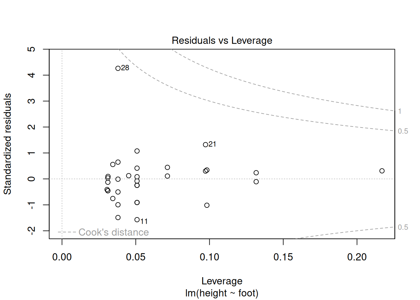
This all looks fine to me! But to be sure, let’s compare model parameters with and without this outlier:
# Full data set
lm( height ~ foot , data = shoe_data)  |>
  coef() |>
  round(digits = 3)
(Intercept) foot
34.336 1.359 lm( height ~ foot , data = slice(shoe_data , -28)) |>
coef() |>
round(digits = 3)(Intercept) foot
30.150 1.495 Attenuation: The effect of measurement error:
Measurements are rarely perfect. This imperfection can occur because we measured hurriedly (e.g. quickly measured flower length with a tape measure), or because sampling error caused observations of the variable we measured deviated from their true values by sampling error (e.g. we only watched pollinators visit plants for 15 minutes and only estimated the maternal proclivity to set hybrid seed by genotyping eight offspring etc..)
So because we rarely measure all values of \(X\) and \(Y\) perfectly, we must consider how measurement error in \(X\) and/or \(Y\) affect our estimated correlations and slopes.
The impact of noisy data on estimated associations is called attenuation. Grokking the effect of such noise is a bit tricky because it differs depending on the measure of association (slope vs correlation) and the noisy variable (\(X\), \(Y\), or both):
For correlation, measurement error in \(X\) and/or \(Y\) both increases the variance of residuals and biases the correlation closer to zero, pulling it away from its true value.
For the slope, measurement error in \(X\) increases the variance of residuals and similarly biases the slope closer to zero, moving it away from its true value.
For the slope, measurement error in \(Y\) does not systematically increase or decrease the slope estimate. However, it tends to increase the standard error, the residual variance, and the p-value.
I find these ideas hard to make sense of. Luckily this fantastic tweet and blog post include visualizations that clarify attenuation. I present a modified version of these visualizations below:
NOISY X brings correlations and slopes closer to zero (on average).
D. Measurement error in x: the slope is attenuated
0.00
Gray points show the original data. Black points show the measured data after adding error to x.
The dashed gray line is the true relationship; the red line is the regression line fit to the measured data.
As measurement error in x increases, the fitted slope is pulled toward zero.
NOISY Y brings correlations closer to zero, and makes slopes noisy.
E. Measurement error in y: more noise, but no systematic attenuation
0.00
Gray points show the original data. Black points show the measured data after adding error to y.
The dashed gray line is the true relationship; the red line is the regression line fit to the measured data.
Measurement error in y makes the relationship noisier, so the fitted slope wiggles from frame to frame,
but it is not systematically pulled toward zero.
FINALLY: Do not confuse association with causation
We’ve been over this before, but this is a good place to re-remind you.
A linear model is descriptive and can make predictions on the scale and context of our study. A linear regression model predicts the value of \(Y\) for a data point at position \(X\).
Unless, of course, your linear model comes from an appropriately designed causal study.
A linear model is not a causal model. It does not tell us what will happen to \(Y\) if you change \(X\) experimentally\(^*\).