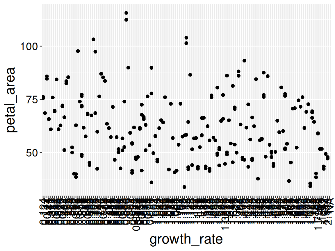
Perhaps the most important rule in statistics is not to lie, cheat, or deceive. With that in mind, you might wonder why we should ever modify values in a column. Figure 1 shows an example of the need to modify columns. Such modifications are not “cheating” or dishonest, they are necessary for honest analyses.
library(ggplot2)ggplot(ril_data, aes(x = growth_rate, y = petal_area))+geom_point()
Figure 1: A plot of petal area across growth rates. Can you spot something fishy? This is not a pretend example. I did not “cook it up” for this story. I see this mistake numerous times every year.
Q): Identify a few weird things about Figure 1. Then guess why they may arise and how this plot could be fixed. (Write at least 20 words to reveal my explanation.)
Word count: 0
Explanation:
The x-axis has a ridiculous number of ticks/labels because R is treating growth_rate as a character, not a number. That means 0.12 and 0.121 become different categories rather than nearby numbers on a continuous scale. Converting growth_rate to numeric fixes it.
Warning: There was 1 warning in `mutate()`.
ℹ In argument: `growth_rate = as.numeric(growth_rate)`.
Caused by warning:
! NAs introduced by coercion
The error above is telling us that there was a character that could not be turned into a number, and was converted to NA.
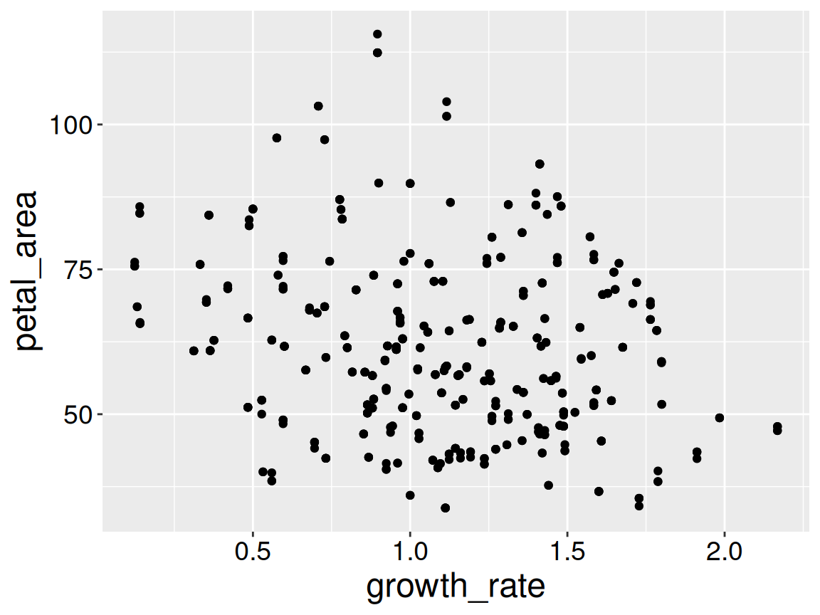
It turns out the mistake was that I entered “1.80” as “1.8O.” If you knew that to be true you could fix the data directly in the spreadsheet. Better yet make this correct in the R script, so the correction is documented and reproducible.
library(ggplot2)library(dplyr)ggplot(ril_data, aes(x = growth_rate, y = petal_area))+geom_point()
Figure 2: A corrected plot of petal area across growth rates.
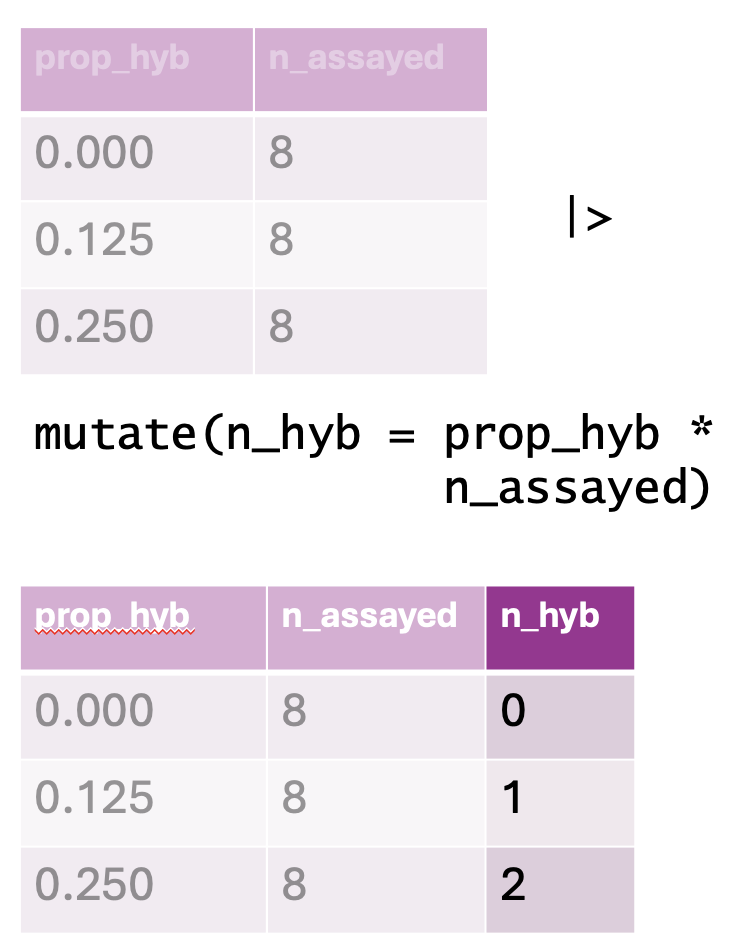
Figure 3: An illustration of the mutate() function. The top table represents the original dataset, containing columns for the proportion of hybrids (prop_hyb) and the number of individuals assayed (n_assayed). The mutate() function is then applied to compute n_hyb, the total number of hybrid individuals, by multiplying prop_hyb by n_assayed. The resulting dataset, shown in the bottom table, includes this newly created n_hyb column.
Our data often include important information that is not directly noted. For example we may want to know
If a plant received any pollinators
If a plant set any hybrid seeds
If a plant’s anther stigma distance is unusually large for its petal area
Here we want to add columns, not overwrite old ones. No worries, we can also add columns with mutate() – just be sure to use a new column name:
Below, I show this transformation after temporarily removing location (for space, I do not save this change). Note a new dplyr::select() trick – you can select all but specified columns with a minus sign.
library(dplyr)ril_data |>rename(prop_hyb = prop_hybrid)|>select(-location) # select everything but location