• X1. Dataviz Summary
Links to: Summary. Chatbot tutor. Questions. Glossary. R functions. R packages. More resources.
Chapter Summary
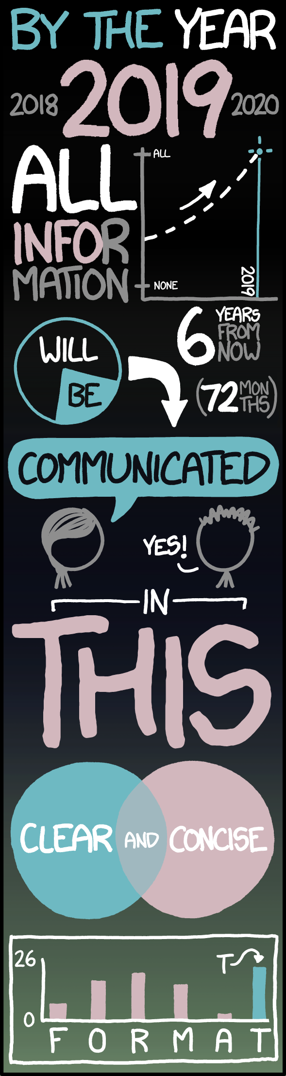
An effective visualization allows you to rapidly communicate your key findings to your audience. The best visualizations are honest, transparent, clear, and accessible. They highlight important patterns while minimizing confusion or distraction, and they are thoughtfully tailored to both the audience and the format. Great figures avoid misleading elements and use design choices (e.g. captions, color, and labels) to guide interpretation.
Chatbot tutor
Please interact with this custom chatbot (link here) I have made to help you with this chapter. I suggest interacting with at least ten back-and-forths to ramp up and then stopping when you feel like you got what you needed from it.
Practice Questions
Try these questions!
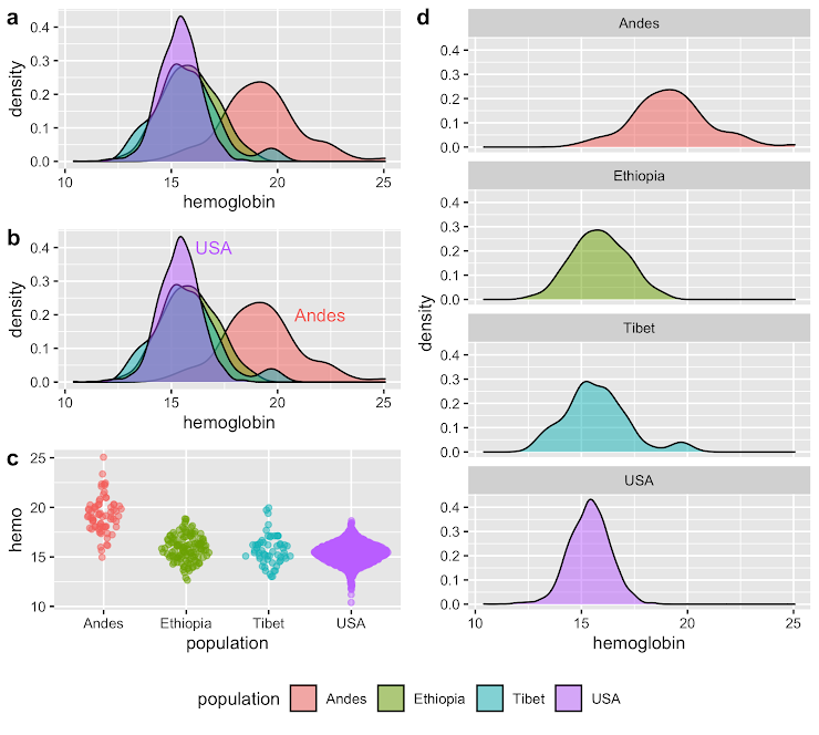
Q1) Which of the plots in Figure 1 keep all information even if printed in black and white?
Q2) Which of the plots in Figure 1 is still somewhat useful but loses some information?
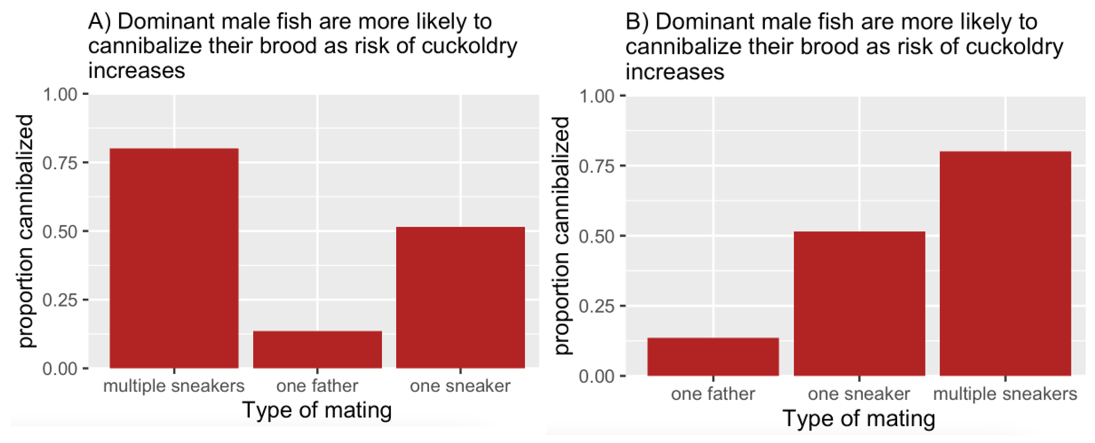
Q3) Which plot in Figure 2 is better?
Q4) You chose your answer, above, because the better plot
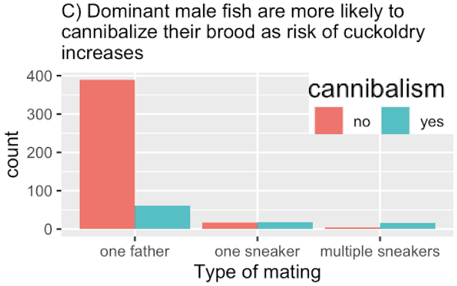
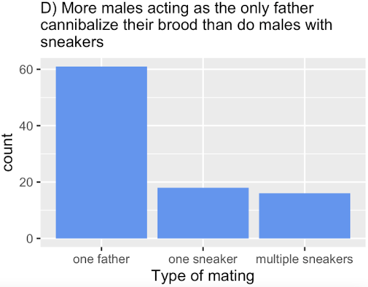
Q7) What is the biggest problem with Figure 4?
Q8) Which of the figure above do you like the best and why?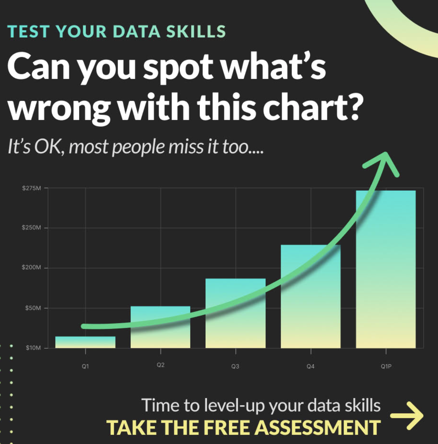
📊 Glossary of Terms
🏷 1. ️ Figure Elements & Interpretation
Legend: A guide that explains the meaning of colors, symbols, or line types in a plot. Helpful when symbols are ambiguous, but often unnecessary when direct labeling is used.
Caption: Text beneath a figure that highlights the main point and guides the reader’s interpretation. A good caption doesn’t just restate what’s shown—it helps make sense of it.
Direct Labeling: Placing labels directly on or near data elements (e.g., lines, points, bars), so viewers don’t have to cross-reference with a legend. Especially useful in talks and posters.
Redundant Coding: Encoding the same variable multiple ways (e.g., using both color and shape for species). Can increase accessibility but should be used carefully to avoid clutter.
♿ 2. Accessibility & Universal Design
Alt Text: A textual description of a figure, written for people who cannot see it. Good alt text conveys the message of the figure, not just its parts.
Accessibility: Designing figures so they can be understood by people with diverse abilities (e.g., colorblindness, low vision, screen reader users). Often overlaps with universal design.
Colorblindness: A common visual condition that affects how people perceive color. Plots should use color palettes and redundancy (e.g., line types) to remain interpretable without relying on color alone.
Universal Design: The principle of creating products and experiences—like data visualizations—that work well for as many people as possible, regardless of ability.
💥 3. Visual Clarity & Distraction
Overplotting: When data points are so densely packed they obscure patterns or hide important features. Common with large datasets; solutions include transparency, jittering, or summarizing.
Chartjunk: Any visual element in a plot that doesn’t help convey the data—like heavy gridlines, excessive shading, or unnecessary 3D effects. Coined by Edward Tufte.
Data Viz “Duck”: A graphic with unnecessary visual decoration (named after a duck-shaped building in Long Island). A plot that prioritizes aesthetics or novelty over clarity.
Cognitive Burden: The mental effort required to interpret a figure. Good visualizations reduce cognitive burden by being clear, consistent, and well-structured.
Key R Functions
This section did not focus on R, but rather concepts for data visualization.
R Packages Introduced
This section did not focus on R, but rather concepts for data visualization.
Additional resources
Other web resources:
- Fundamentals of Data Visualization (Wilke (2019)): A free online book about best practices in data viz. Also available in physical form.
- Storytelling with Data: The work of Cole Nussbaumer Knaflic. This website links to her books, a useful chart guide and more (see links to her most relevant podcast episodes below).
- Thoughts on poster presentations: NPR article on a brief trend in minimal poster design. A critique of this idea in Forbes.
- Axes of evil: How to lie with graphs: This short blogpost goes over some classic dishonest graphs.
Videos:
The Art of Data Visualization | Off Book | PBS Digital Studios.
Calling Bullshit: Misleading axes, Manipulating bin size Data viz ducks and Duck hunting, Glass slippers, The Principle of Proportional Ink.
Podcasts:
- Storytelling with data: Here are some episodes that I think best complement this chapter #4 it depends…., #8 the many myths of data visualization, #10 right place, right graph, #17 which graph should I use?, #43 misleading graphs, #64 Beginner mistakes in data viz.
Social: