Motivating example: We often want to describe the association between two numeric variables before fitting a full regression model. To do so, we will review three related summaries of association: covariance, correlation, and slope.
Learning goals: By the end of this section, you should be able to:
Explain what covariance, correlation, and slope each summarize about the association between two numeric variables.
Distinguish between correlation and slope.
Recognize that the slope is useful for interpreting data and making predictions.
Recognize that the correlation is a better measure of effect size.
Show that the correlation is the slope of Z-transformed \(X\) and \(Y\).
Recognize that \(R^2\) describes the proportion of variation in \(Y\) explained by the model.
Calculate covariance, correlation, and slope in R.
Interpret the slope and correlation in the context of a biological example.
Use a scatterplot and best fit line to visually connect the data to these numerical summaries.
Review: Describing Associations
There are three standard summaries of the association between two numeric variables:
The covariance describes the extent to which two variables jointly differ from their means. When high values of \(X\) and \(Y\) tend to co-occur their covariance is positive. When high values of \(X\) tend to occur with low values of \(Y\), covariance is negative. A covariance near zero indicates little linear relationship between \(X\) and \(Y\).
The correlation (\(r\)) standardizes the covariance by dividing by the product of standard deviations. So the correlation ranges from -1 to 1, and correlations can be meaningfully compared across variables measured on different scales.
The slope (\(b\)) describes the amount by which \(Y\) changes for each unit increase in \(X\). It is the covariance divided by the variance of \(X\), \(s_x^2\).
The covariance is mathematically useful, but often difficult to interpret or compare because it depends on the scale and variance of the variables. The correlation and slope are both important summaries, each communicating a different component of an association. The slope describes how much \(Y\) changes per unit increase in \(X\). The correlation describes how tightly the data cluster around a linear trend. Another way to say this is that the slope describes the steepness of the line of best fit, while the correlation describes the proximity of data points to this line.
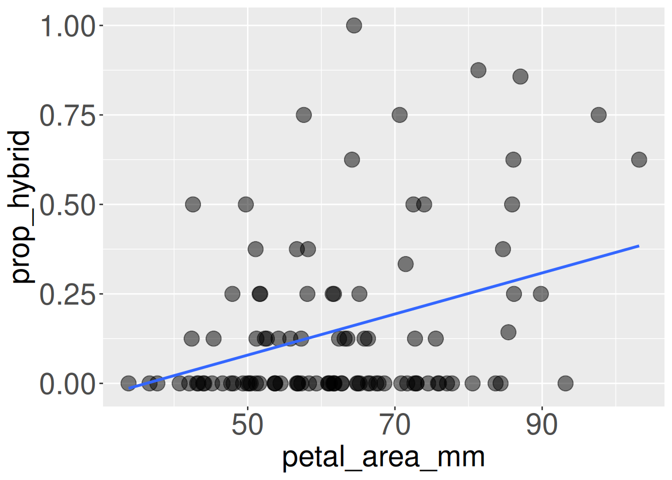
Example: Petal area predicts proportion hybrid seeds
Let’s address linear regression with our familiar dataset concerning the association between petal area and proportion hybrid seeds in our parviflora RILs. This association is presented in Figure 1. Note that we can show the best fit line with the command, geom_smooth(method = "lm", se = FALSE):
ggplot(gc_rils, aes(x = petal_area_mm, y = prop_hybrid))+geom_point(size =5, alpha = .5)+geom_smooth(method ="lm", se =FALSE)+theme(axis.title =element_text(size =22),axis.text =element_text(size =22))
Figure 1: Proportion hybrid seed as a function of petal area for Clarkia parviflora RILs at the GC field site. Each point represents one RIL, and the blue line shows the best-fit linear regression.
We can use R to quantify the associations between these variables as follows:
We see that petal area somewhat reliably (but imperfectly) predicts the proportion of hybrid seeds – RILs with bigger flowers tend to set more hybrid seed. We should not let the very small slope mislead us as it depends on the scale of \(X\) and \(Y\). For example, if we reported hybrid seed as a percentage rather than a proportion, the slope would be 100× larger, but the correlation would be unchanged.
As a brief summary we could say:
For each \(1\text{ mm}^2\) increase in petal area, we expect an additional 0.57 percentage-point increase in the proportion of hybrid seeds.
The correlation as the standardized regression coefficient
It is natural and useful to think in units of the explanatory (\(mm^2\)) and response (proportion) variables. However, as discussed above, this is not the best summary of the effect size.
If we present results in units of standard deviations in \(X\) and \(Y\), it is easier to compare across traits and study systems. To do so we will Z-transform both variables and find the slope of these transformed variables, returning the “standardized regression coefficient.” The “standardized regression coefficient” is a common measure of “effect size” for a linear regression.
The standardized regression coefficient is also equal to both the standardized covariance and standardized correlation coefficient. This makes sense, because the slope is the correlation divided by the variance in X, and the correlation is the covariance divided by the product of standard deviations in X and Y. Because Z- transforming ensures a variance and standard deviation of one, these values are all the same.
As you can see, the standardized regression coefficient simply equals the correlation from above. So we now say
For each standard deviation increase in petal area, the expected proportion hybrid seeds increases 0.34 standard deviations.
This result is relatively large as the maximum possible standardized regression coefficient equals one.
What’s the deal with the standardized regression coefficient? Why not just report the correlation?
In this case the standardized regression coefficient equals the correlation. This is always true in a model with one predictor, so present whatever you like, and explain it clearly. When there are numerous predictors, the correlation and standardized regression coefficient can differ.
\(R^2\): the proportion of variance explained
Another standard summary of the strength of a linear relationship is \(R^2\), In simple linear regression, \(R^2\) is just the square of the correlation coefficient: \(R^2 = r^2\). In our example, the correlation between petal area and proportion hybrid seed is about 0.34. So:
\[R^2 = 0.34^2 = 0.12\]
This means that petal area explains about 12% of the variation in proportion hybrid seed among these RILs.
Later in this chapter, we will see that \(R^2\) falls out of the ANOVA table for regression. There, we will see that regression can be understood as dividing the total variation in \(Y\) into variation explained by the model and variation left unexplained as residual error.
Be careful! an \(R^2\) of 0.12$ does not mean that petal area causes 12% of hybrid seed production. It also does not mean we can predict each RIL’s hybrid seed production with 88% error.
Rather, an \(R^2\) 0.12 means that, in this sample, a linear model using petal area accounts for about 12% of the total variation in proportion hybrid seed.
Unlike the slope, \(R^2\) has no meaning outside of the specific data set we are considering.