Motivating Scenario:
You are continuing your exploration of a new dataset. After checking its shape and making transformations you thought were appropriate, you’re now ready to explore how two numeric variables are associated.
Learning Goals: By the end of this subchapter, you should be able to:
Calculate and explain a covariance: Both as the “mean of the product minus the product of the mean” and the “mean of cross products”.
Calculate and explain a correlation coefficient and why this standardized measure can be more useful than covariance when comparing associations.
The covariance
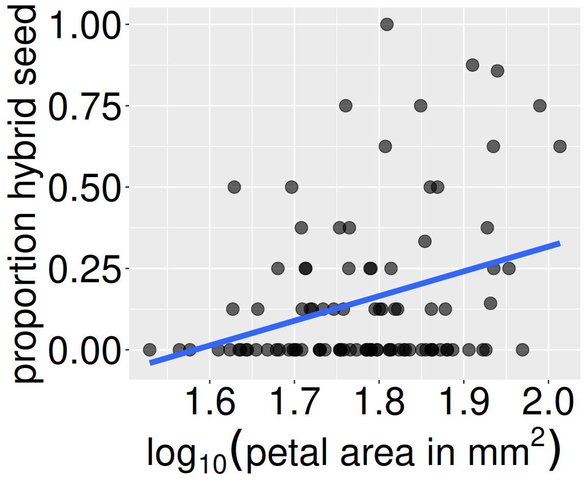
Figure 1: Association between petal size and hybrid seed production in Clarkia RILs. Each point represents an individual recombinant inbred line planted at the GC site. The blue line is the line of best fit (more on that later).
In the previous section we used covariance to describe associations between two binary variables. We saw that – for two binary variables – the covariance measures how much the observed combination of values (\(p_{A,B}\)) differed from expectations under independence (\(p_A-p_B\)).
Here, we extend this idea to numeric variables. Instead of asking whether two categories occur together more often than expected, we ask whether large values of one variable tend to occur with large (or small) values of another. For example, in our Clarkia RIL data, we could describe the association between \(\text{log}_{10}\) petal area and the proportion of hybrid seeds using a covariance.
There are two ways to calculate covariance:
As a deviation from expectations: (\(\overline{XY} - \bar{X}\bar{Y}\)).
As a shared deviation from the mean: \(\sum{(X_i-\bar{X})(Y_i-\bar{Y})}/(n-1)\).
I introduce both because each provides a different lens for understanding the concept. Reassuringly, they give the same answer, so yu can decide which makes most sense to you.
The covariance as a deviation from expectations
In the previous section, I introduced the covariance as the difference between the proportion of observations with a specific pair of values for two variables (e.g., pink flowers and being visited by a pollinator) and how frequently we would expect to see this pairing if the variables were independent: \(\text{Covariance}_{A,B} = (P_{AB}-P_{A} \times P_{B})\). Because we can think of proportions as a mean, we can use this same math to describe the covariance of two numeric variables, X and Y, as the difference between the mean of the products and the product of the means:
As in the previous section this formula is slightly wrong because it implicitly has a denominator of \(n\), not \(n-1\). We apply Bessel’s correction to get the precise covariance (multiplying our answer by \(\frac{n}{n-1}\)). But when \(n\) is big, this is close enough.
So, we can find the covariance between (\(\text{log}_{10}\)) petal area and the proportion of hybrid seeds as the mean of a plant’s (\(\text{log}_{10}\)) petal area times its proportion of hybrid seeds minus the mean (\(\text{log}_{10}\)) petal area times the mean proportion of hybrid seeds, which equals 0.00756 (after applying Bessel’s correction).
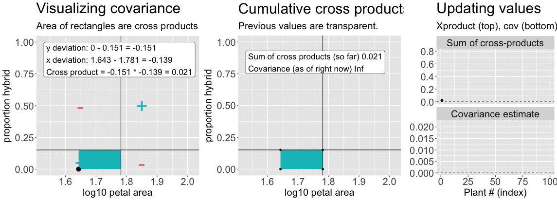
Find the deviation of X and Y from their means for each individual – \((X_i-\overline{X})\), and \((Y_i-\overline{Y})\), respectively (Figure 2, left).
Multiply these deviations to get a cross-product. In the left side of Figure 2, this corresponds to the area of the rectangle formed by the two deviations.
Sum them to find the sum of cross products (Figure 2, right, top).
Divide by the sample size minus one (Figure 2, right, bottom).
Figure 2: An animation to help understand the covariance. Left: We plot each point as the difference between x and y and their means. The area of that rectangle is the cross product. Middle: Shows how these cross products accumulate. Right: The cumulative sum of cross products and the running covariance estimate. The lower plot (covariance) is simply the top plot divided by (n-1).
gc_rils |>filter(!is.na(log10_petal_area_mm), !is.na(prop_hybrid)) |>rename(x = log10_petal_area_mm, y = prop_hybrid ) |># easier to read, not essentialmutate(mean_x =mean(x), mean_y =mean(y) ) |>mutate(dev_x = x -mean(x), dev_y = y -mean(y)) |>summarise(sum_X_prod =sum(dev_x * dev_y),covar = sum_X_prod / (n()-1))
You can compute this yourself with the R code below or look at this flipbook.
sum_X_prod
covar
covar_R
0.7413
0.0076
0.0076
The equation for the covariance \(\text{Cov}_{X,Y} = \frac{\Sigma{(X_i-\overline{X})(Y_i-\overline{Y})}}{(n-1)}\) should remind you of the equation for the variance \(\text{Var}_{X} = \frac{\Sigma{(X_i-\overline{X})(X_i-\overline{X})}}{(n-1)}\) (compare Figure 2 to Figure 2 from 5. Summarizing variability). In fact the variance is simply the covariance of a variable with itself. See our section on summarizing variability for a refresher link. In fact you, can calculate the variance as the mean of the square minus the square of the mean.
Both ways of computing the covariance — as the mean of cross-products and as the difference between the product of means and mean of products — are helpful for understanding association. But students are practical and often ask: “Which of these formulae should we use to calculate the covariance?” There are a few answers to this question — the first is “it depends,” the second is “whichever you like,” and the third is “neither, just use the cov() function in R.” Here’s how:
The use = "pairwise.complete.obs" argument tells R to ignore NA values when calculating the covariance — just like na.rm = TRUE does when calculating the mean. You can use this argument or filter out NA values first.
gc_rils |>summarise(covariance =cov(log10_petal_area_mm, prop_hybrid, use ="pairwise.complete.obs"))
# A tibble: 1 × 1
  covariance
       <dbl>
1    0.00756
The correlation
Much like the variance and the difference in means, the covariance is a very useful mathematical description, but its biological meaning can be difficult to interpret and communicate. We therefore usually present the correlation coefficient (represented by the letter, r) – a summary of the strength and direction of a linear association between two variables. This also corresponds to how closely the points fall along a straight line in a scatterplot: the stronger the correlation, the more the points cluster along a line (positive or negative).
Large absolute values ofr indicate a strong linear relationship between variables (i.e. points are near a line on a scatterplot).
rvalues near zero mean that we cannot accurately predict values of one variable from another (i.e. points are not near a line on a scatterplot).
The sign ofr describes if the values increase with each other (\(r > 0\), a positive slope), or if one variable decreases as the other increases ($ r < 0$, a negative slope).
Mathematically r is simply the covariance divided by the product of standard deviations (\(s_X\) and \(s_Y\)), and we can find it in R with the cor() function:
gc_rils |> dplyr::filter(!is.na(log10_petal_area_mm)) |> dplyr::filter(!is.na(prop_hybrid)) |>summarise(r =cov(log10_petal_area_mm, prop_hybrid) /## -- Divide by produce of standard devs -- ## (sd(log10_petal_area_mm) *sd(prop_hybrid)))
r
0.317
\(r\): effect size guide
As in Cohen’s D, what is a “large” or “small” correlation coefficient depends on the study, the question and the field of study, but there are rough guides (see below). So our observed correlation between \(log_{10}\) petal area and proportion hybrid of 0.317 is worth paying attention to, but not massive.
Size
Range of \(|r|\)
Not worth reporting
< 0.005
Tiny
0.005 – 0.10
Small
0.01 – 0.20
Medium
0.2 – 0.35
Large
0.35 – 0.50
Very large
0.50 – 0.75
Huge
\(> 0.75\)
Visualizing associations between continuous variables
We visualize associations between numeric variables with a scatterplot. In ggplot2 we do so with geom_point(). The geom_smooth() function highlights trends in the data, and specifying method = "lm" adds the linear trend implied by the correlation.
The geom_smooth() function highlights trends in the data, and specifying method = "lm" adds a straight line summarizing the overall linear pattern in the points. This line helps guide our interpretation of the correlation: the closer the points fall close to the line, the stronger the correlation.
For now, I am setting se = FALSE to highlight the trend, and not the uncertainty about it. As we introduce the ideas of uncertainty and its quantification through the standard error, you will have the tools to decide when it is useful to show the standard error around this line.
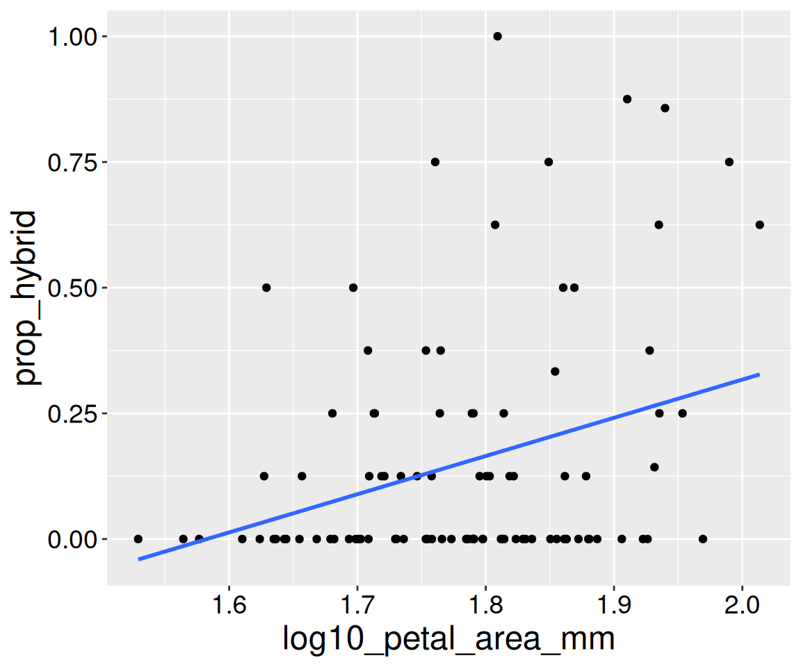
Figure 3: Association between petal size and hybrid seed production in Clarkia RILs. This is a recreation of Figure 1.