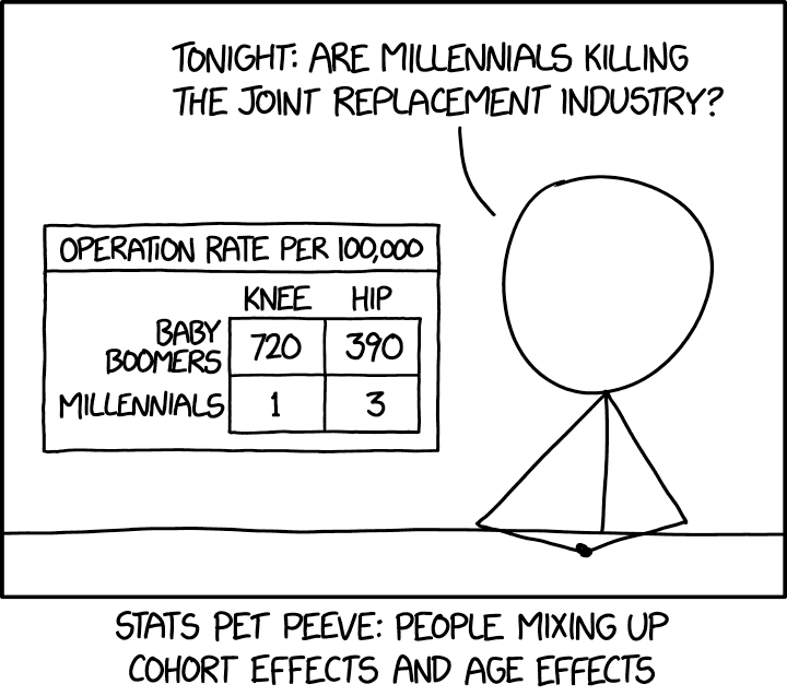
A cartoon on correlation from xkcd. The original rollover text says: “Younger people get very few joint replacements, yet they’re also getting more than older people did at the same age. This means you can choose between ‘Why are millennials getting so (many/few) joint replacements?’ depending on which trend fits your current argument better.” See this link for a more detailed explanation.
Associations describe how variables relate to one another. Here we introduced covariance as a quantitative summary of how two variables vary together relative to what we would expect if they were unrelated. The covariance can be quantified as the mean of the products minus the product of the means (\(\overline{XY} - \bar{X}\bar{Y}\)) or the mean of the shared deviation from each mean (\(\overline{(X_i-\bar{X})(Y_i-\bar{Y})}\). The correlation standardizes this to a unitless scale between -1 and 1. The strength of an association is just that, and in itself does not imply causation.
Chatbot tutor
Please interact with this custom chatbot (ChatGPT version here, Gemeni version) I have made to help you with this chapter. I suggest interacting with at least ten back-and-forths to ramp up and then stopping when you feel like you got what you needed from it.
Practice Questions
Try these questions! By using the R environment you can work without leaving this “book”. To help you jump right into thinking and analysis, I have loaded the ril data, cleaned it some, an have started some of the code!
Q1) Extend the analysis above to examine the association between leaf water content (lwc) and the proportion of hybrid seeds (prop_hybrid). The correlation between lwc and prop_hybrid is:
Q2) Based on the analysis above, which variable – leaf water content (lwc), or petal area (log10_petal_area_mm) is more plausibly interpreted as influencing proportion hybrid seed set (prop_hybrid)?
Q3) Based on the observed negative association between leaf water content and proportion hybrid seed set, which explanation best accounts for this pattern?
Look for correlations between lwc and other variables.
For example:
SETUP We collected 131 plants (74 parviflora, 57 xantiana) from a natural hybrid zone between xantiana and parviflora at Sawmill Road. We then genotyped these plants at a chloroplast marker that distinguishes between chloroplasts originating from parviflora and xantiana. All 74 parviflora plants had a parviflora chloroplast, while 49 of the 57 xantiana plants had a xantiana chloroplast (the remaining 8 had a parviflora chloroplast).
Q4) If having a xantiana chloroplast and being a xantiana plant were independent, what proportion of plants would you expect to be xantiana and have a xantiana chloroplast?
If two binary variables are independent, the expected joint proportion (i.e. the probability of A and B) is the product of their proportions:
\[ P(A \text{ and } B) = P(A) \times P(B) \]
Q5) Quantify the difference between the proportion of plants that are xantiana and have xantiana chloroplasts vs. what we expect if these two binary variables were independent.
Q6) What is the covariance between being a xantiana plant and having a xantiana chloroplast? Hint: remember Bessel’s correction.
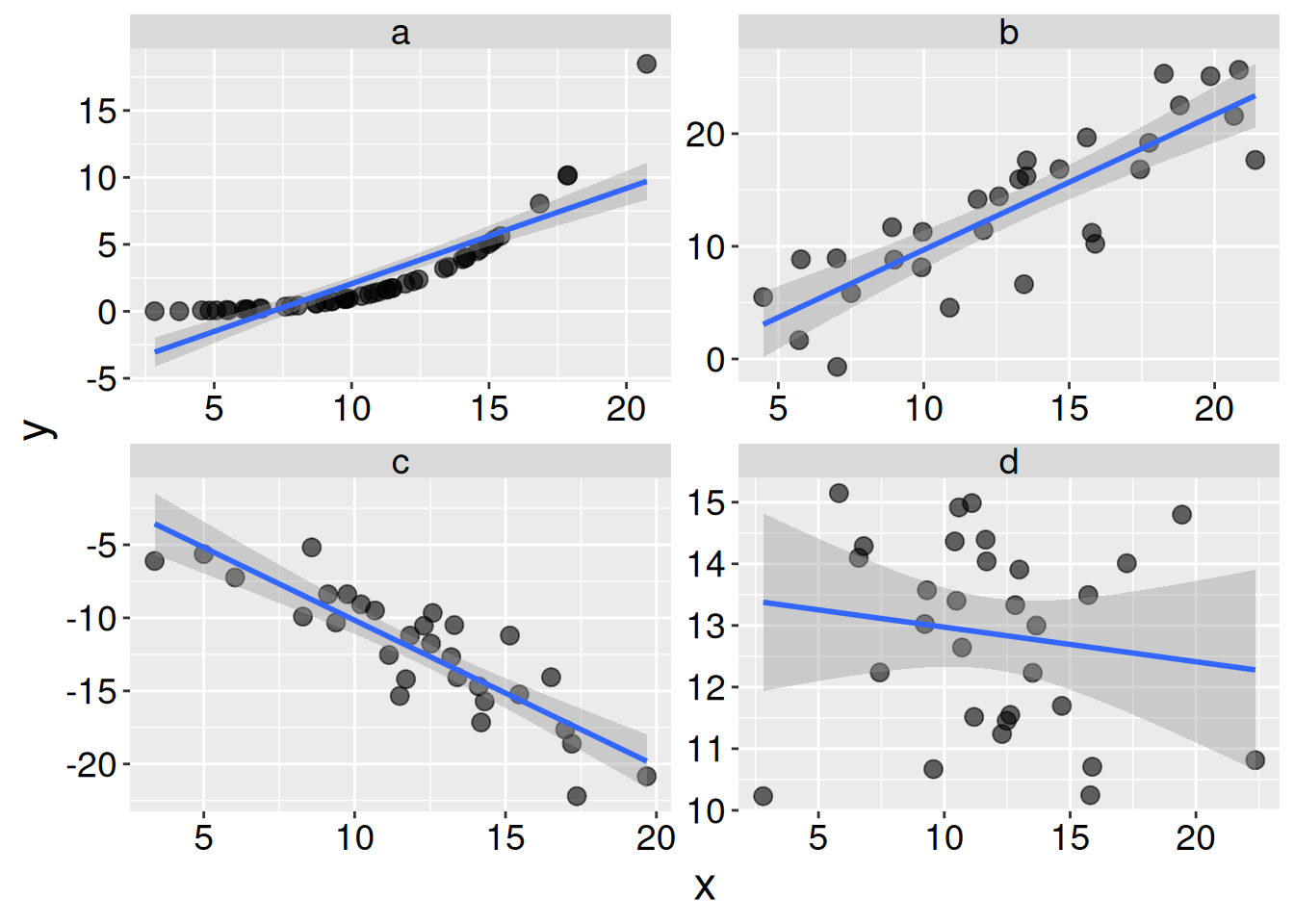
Q9 SETUP Consider the plots below for the next few questions:
Q7) In which plot are x and y most tightly associated?
Q8) In which plot are x and y most tightly linearly associated?
Q9) In which plot do x and y have the largest correlation coefficient?
Q10) In which plot does x do the worst job of predicting y?
📊 Glossary of Terms
🔗 1. Types of Association
Association: A relationship or pattern between two variables, without assuming causation.
Correlation: A numerical summary of how two variables move together.
Positive: As one increases, the other tends to increase.
Negative: As one increases, the other tends to decrease.
Causation: A relationship in which changes in one variable directly produce changes in another.
Confounding Variable: A third variable that creates a false appearance of association between two others.
⚖️ 2. Categorical Associations
Conditional Proportion: The proportion of a category (e.g., visited flowers) within levels of another variable (e.g., pink or white petals).
Written as \(P(A|B)\), the probability of A given B.
Multiplication Rule: If two variables are independent, then \(P(A \text{ and } B) = P(A) \times P(B)\).
Covariance: Measures how associations between two variables deviate from their expectation. For two categorical variables \(COV = P_{AB} - P_A \times P_B\).
🔢 3. Numeric Associations
Cross Product: For two variables, the product of their deviations from their means: \((X_i - \bar{X})(Y_i - \bar{Y})\)
Covariance: Measures how two numeric variables co-vary.
Positive: variables increase together.
Negative: one increases as the other decreases.
Sensitive to scale.
Two equivalent calculations:
The average cross product \(\frac{\sum{(X_i - \bar{X})(Y_i - \bar{Y}})} {n-1}\)
Mean of product minus product of mean \((\overline{XY}-\bar{X}\bar{Y}) \frac{n}{n-1}\)
The n-1 weirdness provides a somewhat better estimate than the raw average.
Correlation Coefficient: A unitless summary of linear association, ranging from -1 to 1. \(r = \frac{\text{Cov}_{X,Y}}{s_X s_Y}\)
r ≈ 0: No linear relationship
r > 0: Positive linear relationship
r < 0: Negative linear relationship
📈 4. Visual Summaries of Associations
Scatterplot: Plots individual observations for two numeric variables. Good for spotting trends and calculating correlation.
Barplot of Conditional Proportions: Visualizes proportions of one categorical variable within levels of another.
Key R Functions
📊 Visualizing Associations
stat_summary(): Adds summary statistics like means and error bars to plots.
group_by()([dplyr]): Groups data for grouped summaries like conditional proportions or means.
summarise()([dplyr]): Summarizes multiple rows into a single value, e.g., a mean, covariance, or correlation.
mean()([base R]): Computes means (or proportions). In this chapter we combine this with group_by() to find conditional means (or conditional proportions).
cov(): Calculates covariance between two numeric variables.
Guess the correlation: A fun video game in which you see a plot and must guess the correlation. This is great for building an intuition about the strength of a correlation.
Calling Bullshit has a fantastic set of videos on correlation and causation.
Correlation and Causation: “Correlations are often used to make claims about causation. Be careful about the direction in which causality goes. For example: do food stamps cause poverty?”
What are Correlations? :“Jevin providers an informal introduction to linear correlations.”
Correlation Exercise” “When is correlation all you need, and causation is beside the point? Can you figure out which way causality goes for each of several correlations?”
Common Causes: “We explain how common causes can generate correlations between otherwise unrelated variables, and look at the correlational evidence that storks bring babies. We look at the need to think about multiple contributing causes. The fallacy of post hoc propter ergo hoc: the mistaken belief that if two events happen sequentially, the first must have caused the second.”
Manipulative Experiments: “We look at how manipulative experiments can be used to work out the direction of causation in correlated variables, and sum up the questions one should ask when presented with a correlation.