ggplot(ril_data, aes(x = petal_area_mm ,
                     y = asd_mm))+
  geom_point()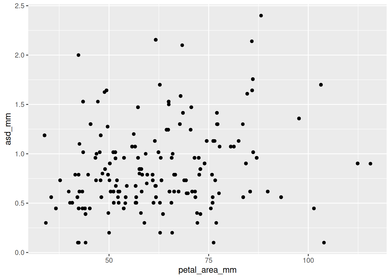
Links to: Summary, Chatbot Tutor, Practice Questions, Glossary, R functions and R packages, and Additional resources + BONUS CONTENT: ggplotly.

Solid data visualization starts with clear biological questions and curiosity about their potential answers. Before beginning coding, consider what you want to learn from your data and how best to visualize that information. After sketching out soe ideas, you are ready to use ggplot to bring these ideas to paper (or maybe your computer screen). ggplot is built around the idea that plots are constructed by layering components: you begin by mapping variables to aesthetic properties like position, color, or size, and then choose how to display those mapped variables using geometric elements like histograms, barplots, or points. With this approach, you can iteratively build visualizations that reflect your questions and highlight meaningful patterns.
Please interact with this custom chatbot (ChatGPT link here, Gemini link here) I have made to help you with this chapter. I suggest interacting with at least ten back-and-forths to ramp up and then stopping when you feel like you got what you needed from it.
Try the questions below. The R environment below will allow you to work without changing tabs.
ggplot(ril_data, aes(x = petal_area_mm ,
y = asd_mm))+
geom_point()
ggplot(ril_data, aes(x = petal_area_mm , y = asd_mm))+
  geom_point()+
  geom_smooth(method = "lm")
`geom_smooth()` using formula = 'y ~ x'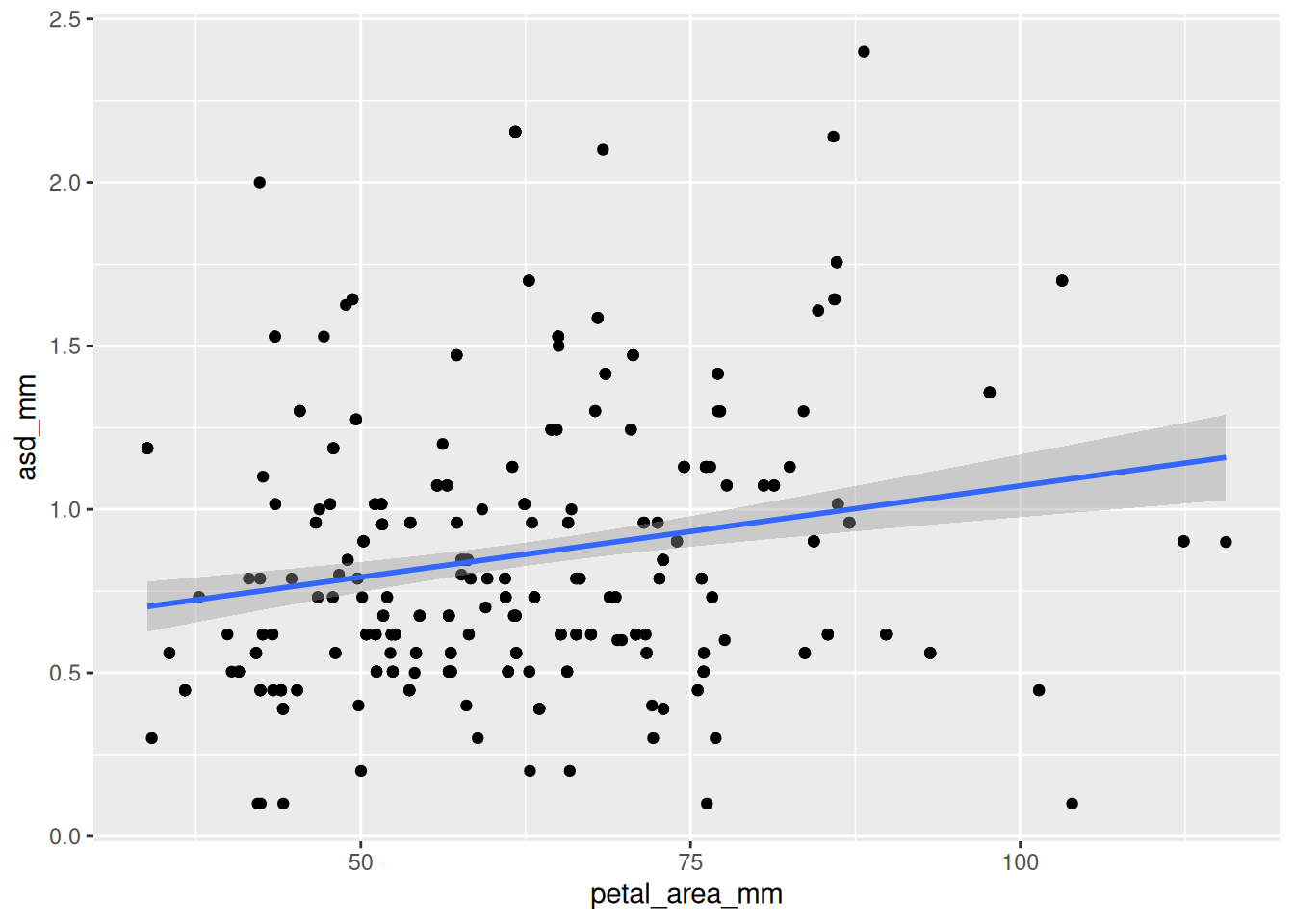
The slopes may be a bit different, but it is more obvious that the red line is higher than the turquoise.
ggplot(ril_data, aes(x = petal_area_mm ,
                     y = asd_mm,
                     color = petal_color))+
  geom_point()+
  geom_smooth(method = "lm")
`geom_smooth()` using formula = 'y ~ x'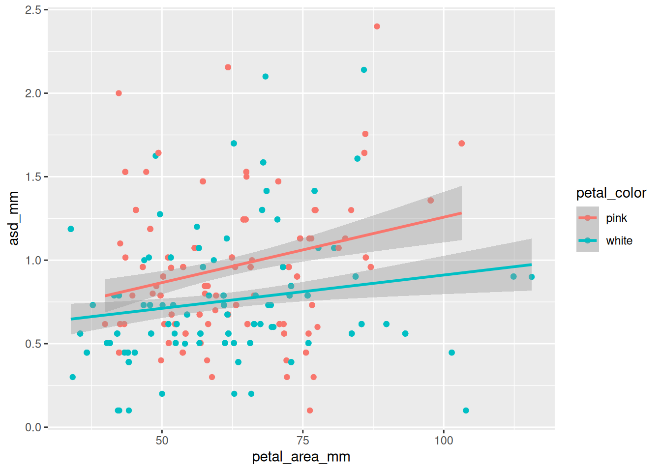
asd_mm with a binwidth of 0.25. What is the most common anther stigma distance (asd_mm) with this binning?
ggplot(ril_data, aes(x = asd_mm))+
  geom_histogram(binwidth = .25, color = "white")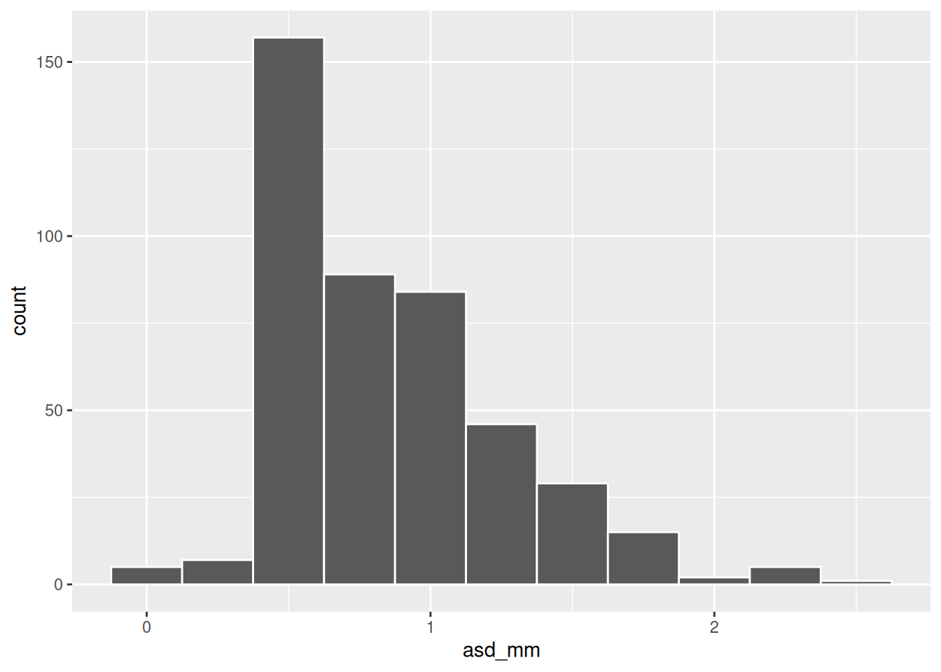
ggplot(ril_data, aes(x = asd_mm, color = "green"))+
geom_histogram()As you can see the bar’s color is the standard dark grey. The lines around the bars are reddish. This is because we mapped the variable “green” onto color. Instead keep it out of an aes() call. Also be sure to note the difference between color and fill arguments.
ggplot(ril_data, aes(x = asd_mm))+
    geom_histogram(color = "green")
`stat_bin()` using `bins = 30`. Pick better value `binwidth`.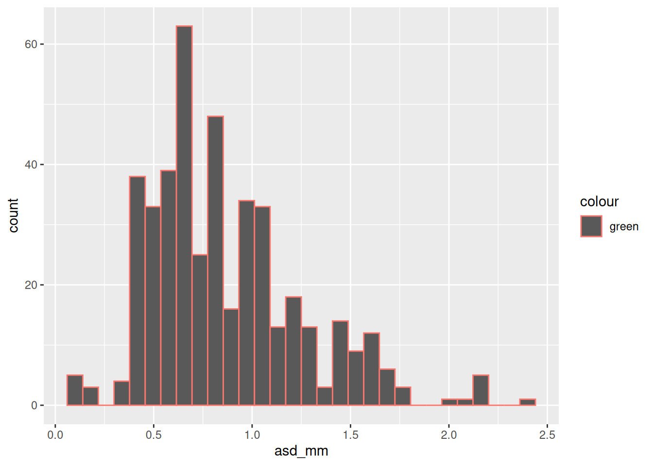
ggplot(ril_data, aes(x = asd_mm))+
    geom_histogram(fill = "green")
`stat_bin()` using `bins = 30`. Pick better value `binwidth`.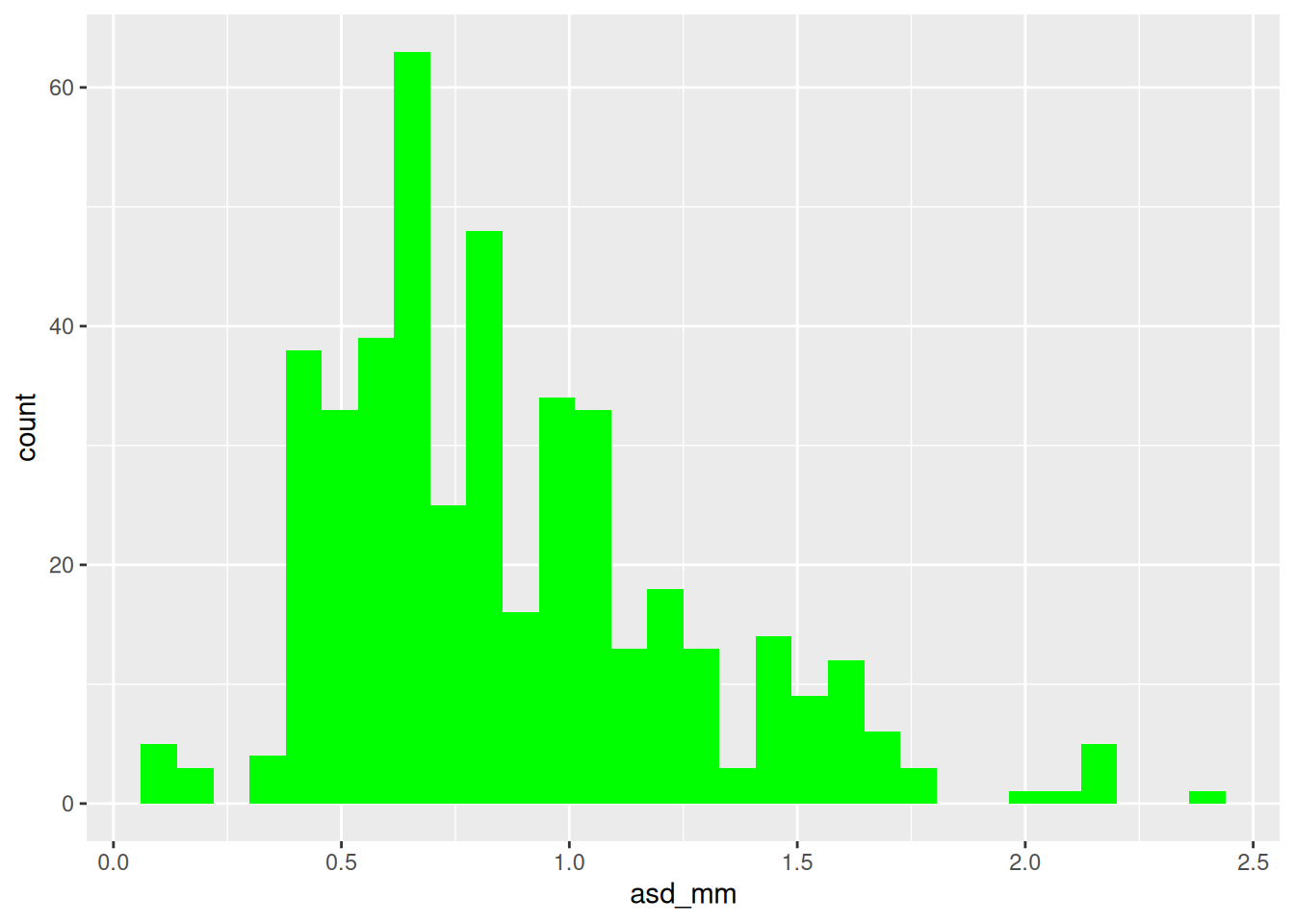
#A
ggplot(ril_data, aes(x = asd_mm, fill = "green"))+
    geom_histogram()

#B
ggplot(ril_data, aes(x = asd_mm))+
    geom_histogram(color = "green")

#C
ggplot(ril_data, aes(x = asd_mm))+
geom_histogram(fill = "green")aes()): Defines how variables map onto plot elements (e.g., x/y position, color, size).geom_*()): Defines how data is represented (e.g., geom_point() for scatterplots, geom_bar() for bar plots).facet_wrap() and facet_grid()): Divides plots into multiple panels based on categorical variables.alpha, geom_jitter(), or geom_violin().ggplot() (ggplot2): The base function to create a ggplot.aes() (ggplot2): Defines how data is mapped to visual elements.geom_point() (ggplot2): Creates scatterplots.geom_jitter() (ggplot2): Jitters points to reduce overplotting.geom_bar() (ggplot2): Creates bar plots from raw data.geom_col() (ggplot2): Creates bar plots from summarized data.geom_histogram() (ggplot2): Bins a continuous variable and shows counts per bin.geom_density() (ggplot2): Shows a smoothed distribution of a continuous variable.geom_boxplot() (ggplot2): Summarizes a continuous variable’s distribution with a box-and-whisker plot.geom_smooth() (ggplot2): Adds a trendline (e.g., linear or loess) to a plot.facet_wrap() (ggplot2): Creates multiple panels for categorical variables.facet_grid() (ggplot2): Creates a grid layout for multiple faceting variables.scale_x_continuous() (ggplot2): Modifies x-axis scales (e.g., log transformation).ggsave() (ggplot2): Saves the most recent (or a specified) ggplot to a file.ggplotly() (plotly): Converts a ggplot object into an interactive plot with hover, zoom, and pan.ggplot2: The core package for data visualization in the tidyverse.
plotly: Turns a ggplot into an interactive, hoverable/zoomable plot via ggplotly().
R Recipes:
Other web resources:
Chapter 3: Data visualization: From R for data science (Grolemund & Wickham (2018)).
Interactive web-based data visualization with R, plotly, and shiny
Videos:
Data often contain strange outliers, ambiguous patterns, or otherwise interesting individual points. When I run into these issues during exploratory data analysis I often want to know more about individual data points. To do so, I make interactive graphs with the ggplotly() function in the plotly package.
The example below shows how to do this. Note that you can make up random aesthetics that you never use and they show up when you hover over points – this helps with understanding outliers. You can also zoom in!
library(plotly)
big_plot <- ril_data |>
  filter(!is.na(petal_color))|>
  ggplot(aes(x = petal_area_mm,
             y = prop_hybrid,
             ril = ril,
             mean_visits =  mean_visits))+
  geom_point(size = 3, alpha = .4)+
  facet_grid(petal_color ~ location, labeller = "label_both")+
  geom_smooth(method = "lm", se = FALSE)

ggplotly(big_plot)